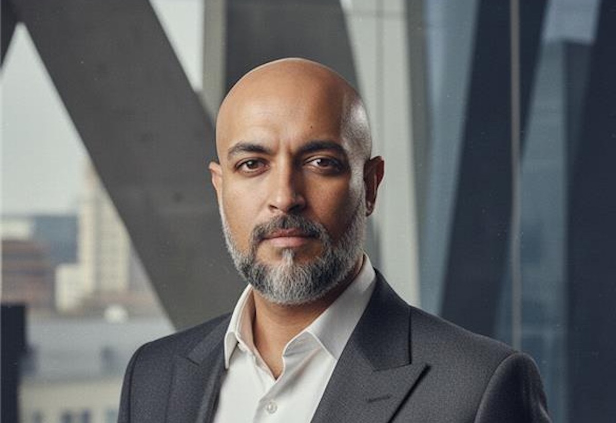
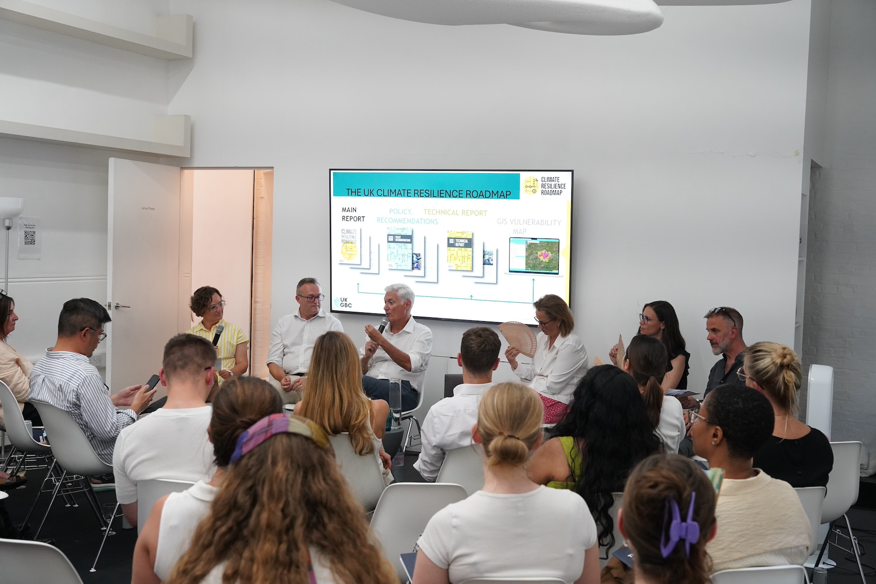
Developing a brand is a valuable opportunity for architectural practices to reflect on their identity and sense of purpose, says Greenspace CEO Adrian Caddy


There is this sense that branding is fluff. We get it: architects go through extensive education in an important discipline, and very often they feel that their work should speak for itself. As brand practitioners, we know that the most admired brands are the ones that convey their purpose, why they exist, beyond what they do or how they do it.
When we met Zaha Hadid, she was clear that she only wanted us to do one thing: create an online archive of everything the practice had ever made, built or not. But looking around the studio – which was nothing like the architecture emerging from it – we found more than 20 different brand identities in circulation. It transpired that whenever ZHA pitched for a new project, it would reinvent everything: logos, documents, business cards. If nothing else, this was a huge waste of time. When we presented it to her, she simply said, “So what do we do now?” When we start working on the brand of an architecture practice, the first thing we do is interview the practice partners, senior staff and – with permission – clients and collaborators. This builds an objective view of the practice, often a simpler, more positive view than it has of itself. Analogous with structural design, these interviews provide a great foundation for building the brand.

Top and above: logotype and typeface designed for ZHA
During 30 interviews for ZHA, four words kept recurring to describe its ethos: brilliant, charismatic, contradictory, and disorganised. This collection of descriptors became the brand DNA, inspiring a bespoke typeface, graphic identity and website.
Practices like ZHA occupy the extremes, but in most cases there are not significant divergences between the ways that different architects think about what they do. Pretty much everyone talks about collaboration, context, materiality and craftsmanship. The difference is in how they articulate their thoughts, and this takes careful listening.
When we tell them something we’ve noticed and their eyes widen and they say, “yes, that’s right”, then we both know we’re on the right track. We’ve been told more than once that working with us is like going to see a shrink. Hopefully there’s less crying, but our conversations do require practices to search inwards, define who they are and bring their sense of purpose out into the open. It’s a process we love, and regard as a real honour. It makes us want to raise our game, find good ideas and articulate them as best we can.


Website and logotype designed for Wilkinson Eyre
Wilkinson Eyre’s founding partners, Chris and Jim, brought us in because they wanted a new website. But it also happened that they were doing some soul-searching about the practice, as they were nurturing a new generation of architects to take more of a lead. Looking at the name, and considering overseas offices as part of the brand project, we saw that by dropping ‘Architects’, the acronym became WE. The initials of the founders perfectly representing the efforts of a collective was delightful in its simplicity. It was great to watch the smiles dawn across everyone’s faces. Later we arrived at a number of key statements starting with a capitalised ‘WE’ that express the purpose of the practice.


Brand identity guidelines for Apt
A lot of architects feel comfortable with naming their practice eponymously. There’s nothing wrong with this, but when a company names itself after its ethos – its principles instead of its principals – it immediately reveals something valuable that otherwise takes longer to discover. Robin Partington & Partners had a clear reason to rename when it became an employee ownership trust. The move prompted a re-examination of what the practice stood for. Robin was disarmingly un-egotistical, basically saying, “I don’t want it to be my name. We need a good name, and we’ll know it when we see it.” We presented about ten candidate names, and they loved Apt. When the client starts selling your idea back to you, you know you have a winner.


Brand identity guidelines for Pilbrow & Partners.
Sticking with an eponymous name can be the right thing to do. With Pilbrow & Partners, the studio output is personified by the passion and energy of founder Fred Pilbrow and, in equal measure, the technical and executional excellence of its partners and team. This led to the narrative about the practice being the sum of its parts, or “the power of &”. There happen to be lots of strong ‘p’ words in the English language – people, power, places, purpose – which we put to work in the communication materials we designed.
At Greenspace we call our brand-building strategy ‘creating legacy’. It is focussed on long-term thinking, with the purpose of producing lasting beneficial change. Because buildings can stand for centuries, architects are attuned to the notion of legacy – which is one reason we’ll never get tired of working with them. Another is that they value good design and the power of storytelling. In allowing a narrative to inform a design we see a parallel between our work and what architects do. Going through this process with architects is incredibly rewarding. We have a beautiful letter from one client, received after many months of interviews and reflection, talking about what a great experience it had been. It was incredibly touching, and it’s why we do what we do.