Tim Ronalds on Herzog & de Meuron’s ‘eccentric and inspiring’ Switch House

Tate Modern is currently the most visited museum of contemporary art in the world. By 2004, just four years after its opening, annual visitor numbers had reached four million (twice the planned capacity), and its galleries and facilities were becoming increasingly congested. Unsurprisingly, Herzog & de Meuron, Basel-based architect of the original, well-received power station conversion, was invited to design the extension.
A second phase of development of Tate Modern had been envisaged from the outset. Occupation of the southern third of the Bankside building depended on power company EDF removing its transformers, but this was not scheduled until 2011.

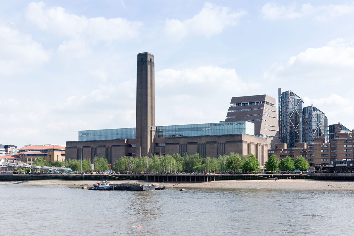
Tate Modern is a building with one very big idea – the Turbine Hall – and preserving, enhancing and exploiting this epic space was Herzog & de Meuron’s great concept. The gallery was essentially a seven-floor new building built inside the shell of the northern Boiler House alongside the vast void, which is entered down the great new ramp and overlooked by gallery circulation. People are awed and thrilled by the scale of the space. At the time of its opening, Herzog & de Meuron wrote memorably that their approach was “to accept the physical power of Bankside’s massive mountain-like brick building and even enhance it, rather than break or diminish it. This is a kind of aikido strategy, where you use your enemy’s energy for your own purposes. Instead of fighting it you take all the energy and shape it in an unexpected and new way.”
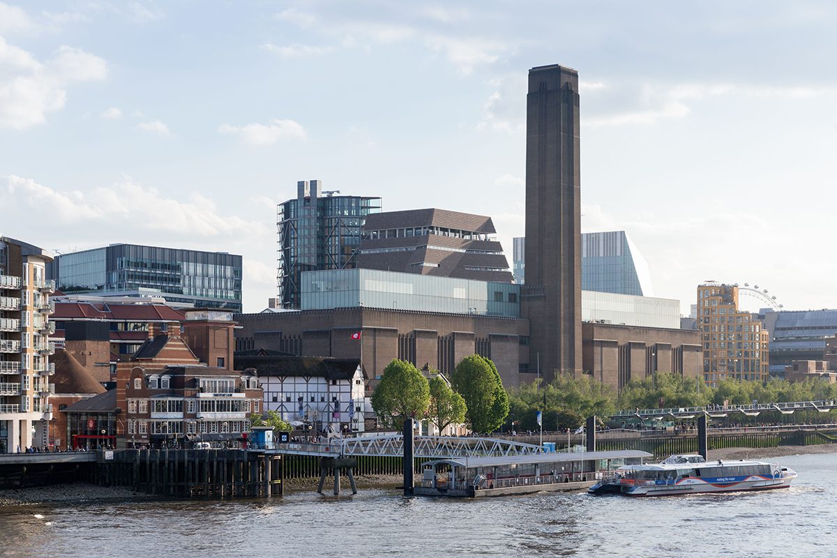
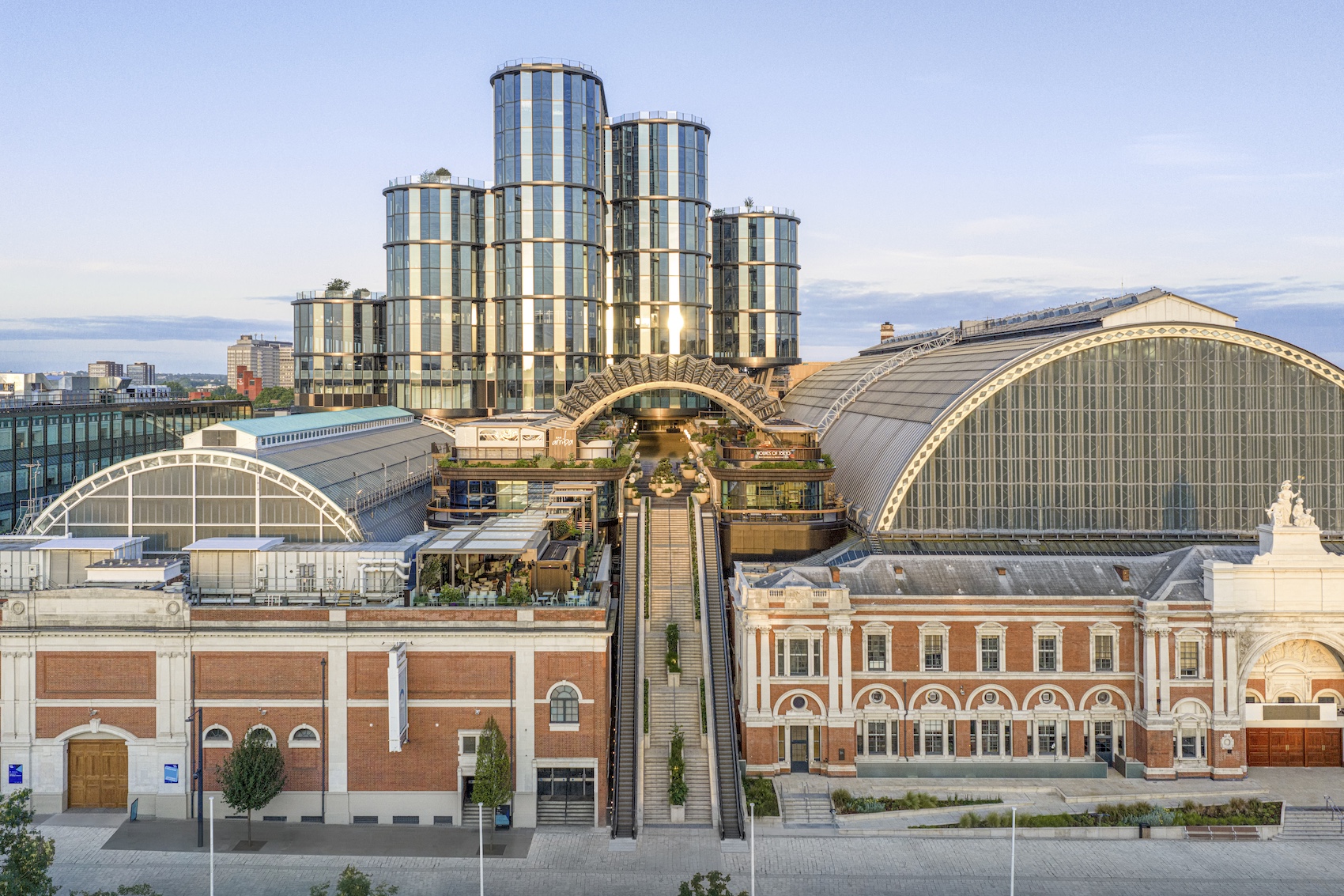
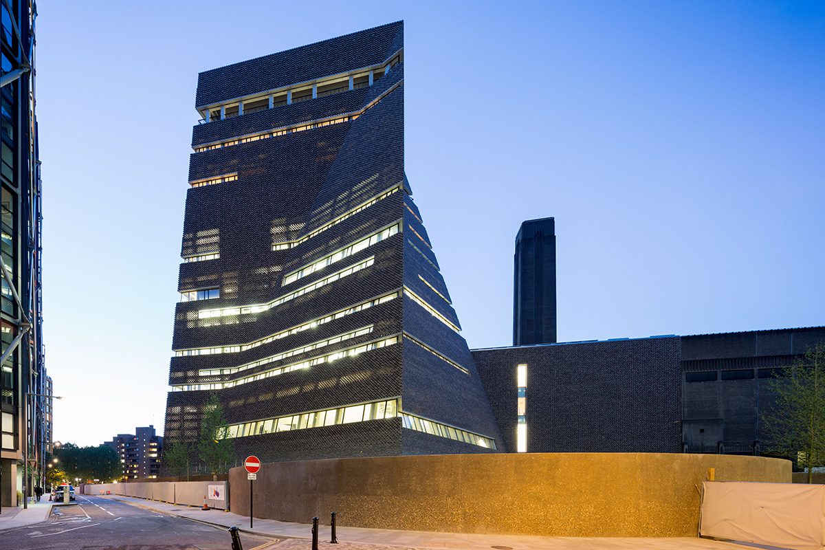
The additional territory to be occupied was the western half of the old Switch House on the south side, a structure as tall and nearly as wide as the adjacent Turbine Hall (the eastern half still houses transformers feeding power to the City of London), and beyond the Switch House three vast semi-subterranean concrete oil tanks that once held the fuel for the power station.
The obvious way to expand Tate Modern, one might have thought, would be to replicate on the south side of the Turbine Hall what had been done in 2000 on the north – to have circulation and public facilities overlooking the Hall, with new galleries beyond. These, built over the oil tanks, could be larger and freer in form than the existing galleries. The platform bridge which traverses the hall, constructed in the first phase, had been designed to make the connection.

The bricks were made by Gima to very tight tolerances. Each pre-bonded pair is dowelled to those adjacent. A consistent progressive colour blend was achieved by using a new clay mixing process that fed varying proportions of clay mix constituents directly to the extrusion line.
But the architect proposed something much less obvious. The Switch House structure is converted into galleries on three floors above the entrance level, and south of this is sited a new building on 11 floors containing space for public functions, education, events, members, staff, restaurant and so on. Crucially, the circulation is shifted away from the Turbine Hall to rise around the core in the new building.
The extension creates a new southern entrance and in the process a route through the building from the Millennium Bridge to Southwark. This is a low aperture, making it surreptitious and emphasising the scale of the huge brick edifice. The Turbine Hall’s great ramp remains – in concept – the entrance to the whole, but is apparently the least used in practice.

The main structural tower comprises reinforced concrete and steel-framed construction, which is coordinated with the basement oil tanks. The corners and creases of the brick rainscreen are column-free, emphasising continuity while opening views to the exterior.
Given that Tate director Nicholas Serota and Jacques Herzog and Pierre de Meuron all spoke of their desire to preserve the sense of the building as an entity, the design seems surprising. So how did it evolve?
A first scheme, which obtained planning consent in 2007, established the basic shape – a truncated twisting pyramid. But it was encrusted with prismatic rectilinear forms and clad in a reflective material and glass. A night view shows the interiors of most spaces on display. It looked like a gigantic crystal with retail overtones, an exuberant object rising in utter contrast to the sober perpendicular brickwork of Gilbert Scott’s power station. Attention-seeking and ostentatious, it perhaps had one eye on the philanthropists its realisation would depend upon. It certainly suggested a conception quite independent of that of the first phase.

Level three staircase with seating aedicule.
In 2009 a revised scheme was submitted for planning which looked very different. The complex crystalline forms and shiny surfaces were gone. What remained was the enigmatic form of the twisted pyramid, purified and clad in herringbone brickwork. Was it the recession? Had glamour and finance departed altogether? Did the prospect of glassy galleries displaying themselves to the interiors of their new luxury residential neighbours suddenly not appeal? For some reason the ambition shifted.
But what is the experience of this intriguing building, now officially named the Switch House? The visitor’s tour is likely to begin in the undercroft leading to the circular oil tanks, epic structures now repurposed as spaces for installations and performance art. Broad, gentle turning concrete stairs lead you back up to ground level where there is an entrance, shop and views out to the garden. The next stair is ahead of you, turning in a void with the external wall structure leaning in above. Ahead now is the largest of the new galleries made within the old switch room, a huge white space of new scale for Tate Modern.

A void opens between the floorplates and facade up to level four, where a new bridge connects across the Turbine Hall.
Emerging, you turn to the left to a stair in another corner and rise to find another gallery, more subdivided. And so on, up the levels, your movement fluidly rotating around the core, exploring the angular spaces of the tower and the rectilinear new galleries. These are all more expansive than those in the Boiler House and each different in ceiling structure and lighting technique. The tower floors cut back to make a triangular triple-height void behind the sloping outside wall, and the public spaces grow smaller and more compressed as you rise, level after level.
Throughout, the dimensions are big and the structure massive. The raking closely spaced concrete columns, the deep horizontal window slots and the overall scale altogether suggest the building might have had some previous unknown purpose. Its generosity and strangeness of shape make it exciting and enigmatic.

All the spaces in the new structure, apart from the galleries, have a similar quality; the same concrete structure, windows and materials. Perhaps the opposite of the earlier proposal, in which every space looked to be expressing its distinctiveness. Now it feels like a pre-existing structure that has been re-occupied. The concrete is ‘engineered’ but not refined; the floors concrete or sawn timber; what fittings there are look solid and restrained. And so as a whole it feels not unlike the older part of Tate Modern. More sensuous, less rectilinear, less black, but with a similar spirit, excitement and scale.

Herzog & de Meuron is renowned for the confidence and daring of its conceptions but also for every project having a unique facade. The practice’s unceasing material inventiveness is astonishing. Here it is a perforated brick skin which is beautiful, subtle and sensuous. There is no point in trying to describe the detail in words; you are better studying the photographs. Look closely at the varying colours of each sandwich of brick and the way they move in and out of the wall plane on the different folded surfaces. Herzog describes it as having the quality of knitwear – those complicated patterns that give knitted garments life and depth. Its making must have involved a combination of precision engineering and rare architectural artistry.

The uppermost, tenth level features a wraparound public viewing terrace.
The only moment of disappointment on my tour of the building was finding that one didn’t finally emerge onto a rooftop terrace, like on top of a castle keep. The public gallery is instead the slip below the top and has no sense of great release. But altogether it is thrilling. The project has an eccentricity, sensibility, subtlety and strength that is completely inspiring.
Additional Images


Credits
Architect
Herzog & de Meuron
Landscape design
Vogt
Costs
Aecom
Services
Max Fordham
Structural engineer
Ramboll
Construction manager
Mace
Sliding doors
Geze, Tormax
Lighting
Zumtobel, DAL
Facade design and supply specialist
James & Taylor
Bricks
Gima-Ziegel
Brick cutting
Bulmer
Clore Centre ceilings
Knauf AMF