Feilden Clegg Bradley Studios’ library at the University of Roehampton is imbued with classical sensibilities, finds Pascal Madoc-Jones


Roehampton Lane is an unattractive four-lane highway showcasing regrettably poor post-war developments. Nestling anonymously among them is the University of Roehampton, the result of unifying four neighbouring institutions. Passing by, it was always rather hard to figure out where it began and ended.
Henley Halebrown’s 2010 masterplan has resolved this problem by creating a college green bordered by a residential block (designed by MJP) and a new library by Feilden Clegg Bradley Studios, which faces an ornamental lake that has been re-landscaped by Gross Max. The university now has a proper campus entrance – a moment of relief amidst the surrounding architectural noise – and the library is its centrepiece.

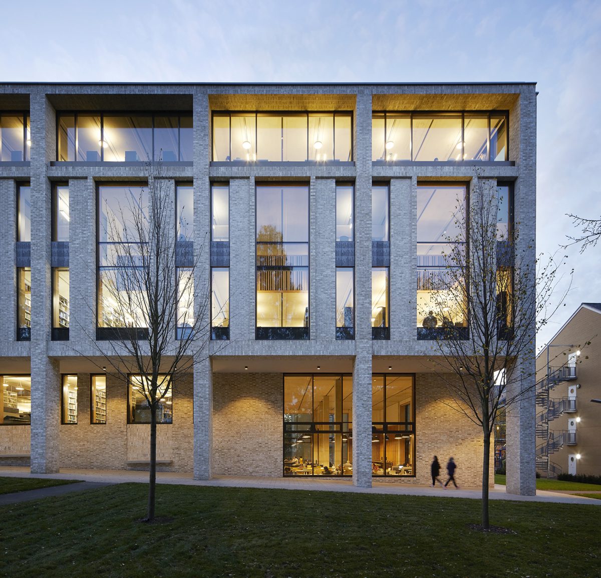
Modern libraries tend to be square and deep, but FCBS inherited a long, narrow footprint more akin to the early archetypes such as Trinity College in Cambridge or the Laurentian Library in Florence. This elevates pragmatic decisions about space use because there is no room for manoeuvre. The starting point was the 7.2-metre grid – ideal for setting out book stacks and teaching rooms and, ultimately, the brickwork and the wall linings. The legibility of the grid is the central theme running through the design.

Perhaps unconsciously, a historical dimension is also evident in the elevation, a de-facto classical composition of colonnade, piano nobile, attic and roof as entablature, that carefully sidesteps pastiche. The main columns run full-height, with a ground-level colonnade tracing the sloped site to the lake and a full-span attic storey. The first and second floors are subdivided by double-height windows and narrow side windows in a B-C-B syncopation. These two floors become a horizontal block layered behind the main columns.
One can quibble about certain classical refinements – the too shallow attic or the sense that the narrow windows are pre-determined modules. But the elevation does have sufficient sculptural strength to make a clear statement of intent to the traffic rushing past the gates.

Both the residential block and the library squeeze in hard against the neighbours to create interesting urban spaces where none previously existed. Their overlap sets up a new ‘main street’ stretching into the campus, perfectly aligned with the colonnade.
Like all well-mannered classical buildings the library is symmetrically planned around a central space – in this case the atrium. The link between the two-storey entrance hall, in the south end, and the atrium is carefully stage managed as one moves across the librarians’ area and round the stair that teasingly blocks a view through. Turning the corner, the effect is curiously calming. The light from six large skylights is softened and filtered as it reflects off slatted timber linings on every surface. Felt strips between the slats are in a random two-tone grey, with the mix becoming lighter further up the building – a device I don’t usually enjoy, but it works here. Occasional flashes of orange and turquoise cunningly reference the classic Penguin book spines.

A great deal of care went into the setting out of the timber slats to ensure perfect alignment vertically and horizontally across the void floor-to-floor, half-landing to half-landing, culminating in the sloped sides of the skylights. The lining is, of course, a prosaic sound-proofing detail but it becomes almost luxurious when applied so regularly and assiduously. It transforms the half-landings so that they appear gravity-defying, their bulk seeming to float in the gap between floors.

Balancing out the entrance hall is the cafe at the north end, a full storey down. There, a large window frames the trees and the ornamental lake. The timber slat motif is repeated but not full-height, stopping to align with the balustrade wall at ground level to create a notional separation between cafe and main library.
The felt inserts here are exclusively grey which, with the muted colour scheme, lend an earnestness reminiscent of Viennese cafes. Starbucks this ain’t. The additional height of the cafe reveals the best view of the modulation of precast ceilings, structure, and internal linings. Again huge care has ensured that the language of construction joints separates out each entity. There are no cover strips or scribing pieces anywhere.

On each floor the main circulation space extends the length of the building in front of the enclosed teaching rooms and service areas along the western plan edge, with book stacks in the central bay. What differentiates each floor is largely what happens between the atrium and the east wall.
The double-height spaces behind the central windows drop pools of light onto the first-floor study areas, each aligned with a window and a view of the green. These do not extend the full length of the plan but stop in line with the entrance hall. On the floor above, the enfilade of side-lit rooms that fills the gaps between the double volumes is one of the signatures of the building, enlivening the spaces beyond the atrium. Stopping the double volumes three bays short is an understandable decision in plan, but the effect is lost in three dimensions.

The third floor was originally intended to be set back from the elevation and girded with terraces, but this was deemed unnecessary on a campus with plenty of open spaces. Their infill created more valuable accommodation at little or no additional expense, but explains the less pronounced attic storey.

The long, narrow plan of the library invites comparison with a promenade around a ship, where a central companionway links all the floors. There are bound to be some points along the route that are less good than others – the two silent study rooms being a case in point. Here, at the prow and stern of the third floor, extensive glazing precludes the sensitive sense of enclosure that helps achieve a collegiate feel elsewhere. But these are just two parts in a building that contains many fine moments, so things balance out.
Overall, the success of the library arises from the impressive concentration of thought that has marshalled all the details in keeping alive the main organising power of the grid. Appropriately, this emerges most forcefully in the atrium, the central void at the heart of all good classical buildings.
Additional Images


Download Drawings
Credits
Architect
Feilden Clegg Bradley Studios
Main contractor
Geoffrey Osborne
Costs, project manager
Gardiner & Theobald
Structural, acoustic, services, lighting engineer, BREEAM
BDP
Fire engineer
Jeremy Gardner Assocs
Access consultant
David Bonnett Assocs
Landscape architect
Gross Max
Planning consultant
Boyer Planning
Ecology consultant
Skilled Ecology
Specialist cladding
Montresor Partnership
Curtain wall, windows
Smart Systems, Avdon
Revolving doors
Dorma Kaba
Loose furniture
Senator
Glazed screens, doors
Planet Partitions
Roofing systems
Bauder
Rooflights
Lamilux (formerly DVS)
Bricks
Wienerberger Marzialle
Flooring
Cobra Granite, Altro, Paragon Workspace
Insulation
Xtratherm
Lighting
Concorde, Optelma, Artimide, Fagerhult, Thorlux, Aktiva (desk)
Sanitaryware
Armitage Shanks, Duravit
Acoustic linings
Topakustik
Acoustic baffles
Heradesign