Brendan Woods on Christ & Gantenbein’s addition to Basel Kunstmuseum


The sequence of three buildings along St Alban-Graben that constitutes the Basel Kunstmuseum, which includes the new extension by Christ & Gantenbein, describes an architectural trajectory from Renaissance palazzo to primitivist warehouse-bunker.
The middle, main museum building, designed in the 1930s by Paul Bonatz and Rudolf Christ (great-uncle of Emanuel Christ), has a stripped classical presence which, on closer inspection, reveals a fascination with the grotesque in the carving of the capitals to the entrance arcade, a mixture of late-nineteenth century sculptural license and the grim fairy tales of the Germanic world.

The building is now faced, across a busy street, by a strange striated wall with few openings – the new extension doesn’t offer a ‘front door’ on a par with the welcoming arcade of its parent. Having found the way in, past the yawning hole in the side elevation where the service entrance is, we were informed that entrance tickets had to be obtained from the main building, back across the road (beneath which the two buildings are linked). Perhaps this isn’t an architectural issue, but it left me wondering whether some kind of visual connection, such as a bridge, could have explained the subsidiary nature of the extension better.
Piranesian, it (the grand stair) recalls the Vatican’s Scala Regia and Garnier’s Paris Opera stair, but is this necessarily appropriate? “
In exploring the interiors we resisted the temptation of the grand stair and opted to take the lift to the top and make our way slowly down, a model established by Frank Lloyd Wright’s 1959 New York Guggenheim. On arrival at the uppermost level we were directed to turn right by an attendant.
Again one felt that the architecture could make this clear – a compelling architectural promenade shouldn’t require written or spoken commands.

The new galleries are relentlessly grand in scale. It is as if small artworks are no longer legitimate, as only larger pieces could sit easily in these spaces. The insistent pattern of the large-format parquet floor also argues against smaller-scale work, for example Carl Andre’s ‘Cedar Piece’ woodblock sculpture. What a pleasure to come across an early Gilbert & George video, which was beguiling in the way it shrank the space to more ‘human’ proportions. I have a growing concern that contemporary architects have lost the ability to compose sequences of space in which major and minor modalities are felt, with the pleasure of finding the intimate in careful juxtaposition to the grand.

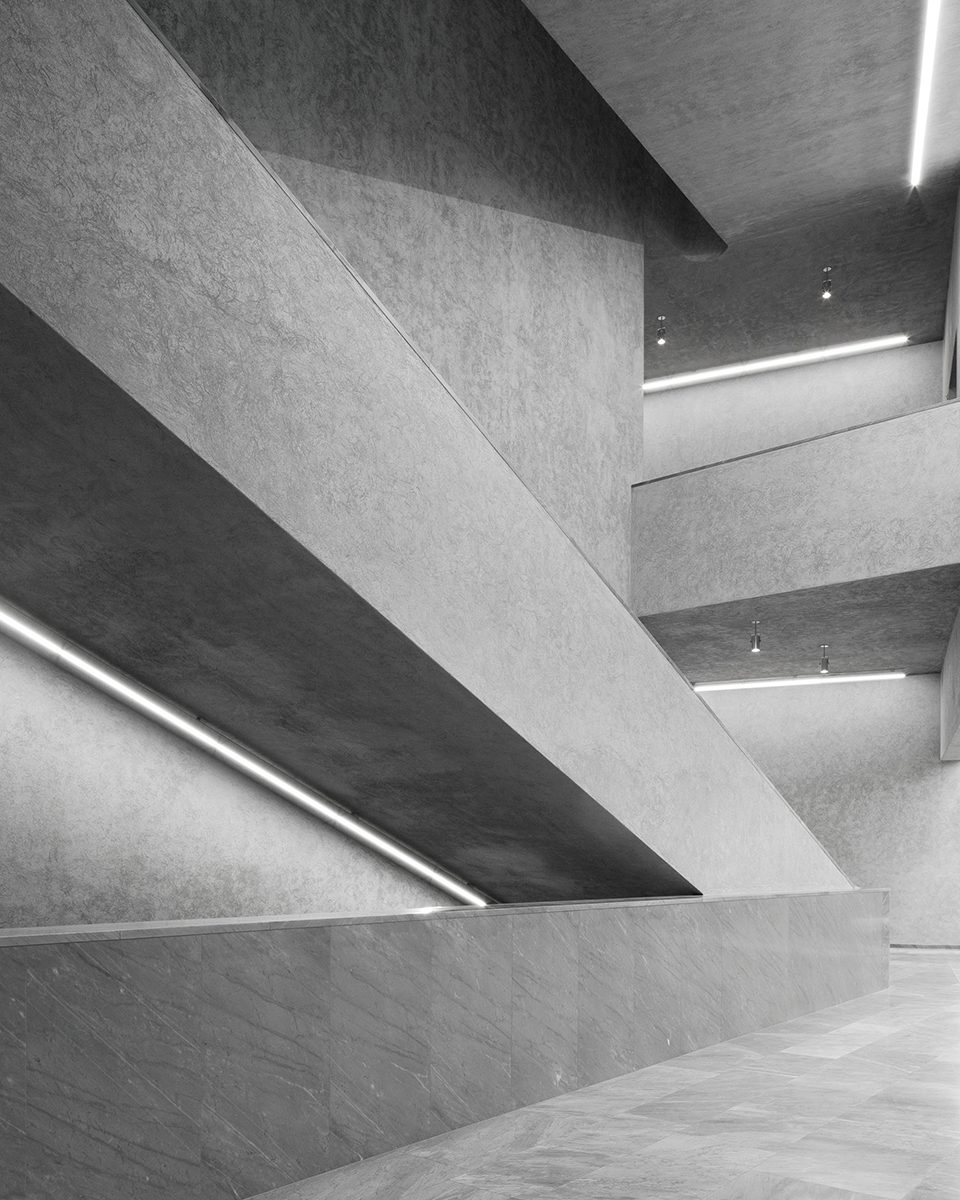
Precast concrete ceiling troughs add interest to the way the top galleries are lit, allowing a carefully controlled mix of natural and artificial light while giving the rooms a strong muscular sense; lower down the building these troughs are less dramatic, but they give a firm order to the spaces.

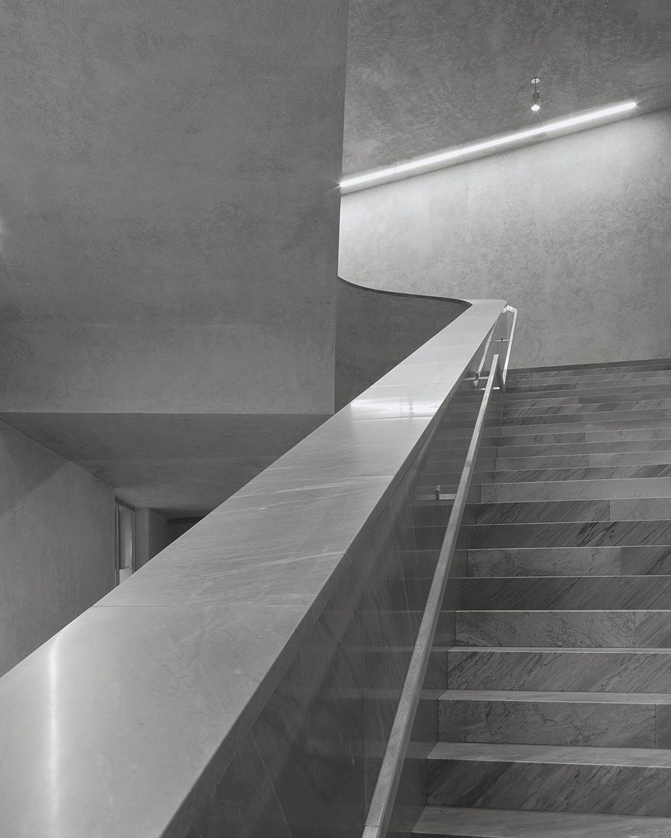
But it is the grand stair that provides the main drama of the building. In the competition scheme it was pushed deeper in the plan, where it might have participated more in the architectural promenade, but it now occupies centre stage. The stair is wonderfully baroque, expertly sculpted in grey marble with wreathed balustrades of seamless material leading from one flight to the next. Piranesian, it recalls the Vatican’s Scala Regia and Garnier’s Paris Opera stair, but is this necessarily appropriate? It appears mock heroic, a hermetic world of grand gestures where a reference to the city outside might have been more meaningful. Viewing art benefits from reference to the everyday world – art is not a religion. What became clear, however, on visiting the main building, was that this new stair is engaged in a critical conversation with its neoclassical predecessor.

Another curious feature of the interiors is the galvanised security ‘gates’ to the suites of galleries. These are based on the same design as the shutters to the service yard and main entrance, but with sliding slats that render them solid (and which tend to rattle). Galvanised steel is used extensively for the interior finishes, such as in the lift lobby, where one is not quite sure whether it is a thin decorative veneer or meant to be ‘no-nonsense’ construction. It is rather too shiny, not the dull mottled surface of industrial use, and therefore a bit chic and disconcerting. Generally the manner in which the various materials are put together is not entirely consistent with high Modernist principles; the small marble skirtings, for example, suggest ‘good manners’ rather than absolute conviction.

In the work of certain contemporary architects – Herzog & de Meuron and OMA, for example – one senses that the present is being interrogated for clues in the pursuit of a new architecture. Here at the Basel Kunstmuseum, however, there is a sense of a more bourgeois architecture. Although the ghostly presence of the LED lighting concealed in the mortar joints of the striated brick cladding also suggests a fascination with the idea of a hybrid architecture. This is a building of unsettling contradictions – unsettling as they do not appear to have been resolved by the architects.
Additional Images


Credits
Architect
Christ & Gantenbein
Structure, services
ZPF Ingenieure, Stokar & Partner
Construction manager
FS Architekten