Sergison Bates has completed its first elderly care home at Huise-Zingem, Belgium. Stephen Bates reflects on the experience.
AT Is there a conflict between the idea of home and institutional scale?
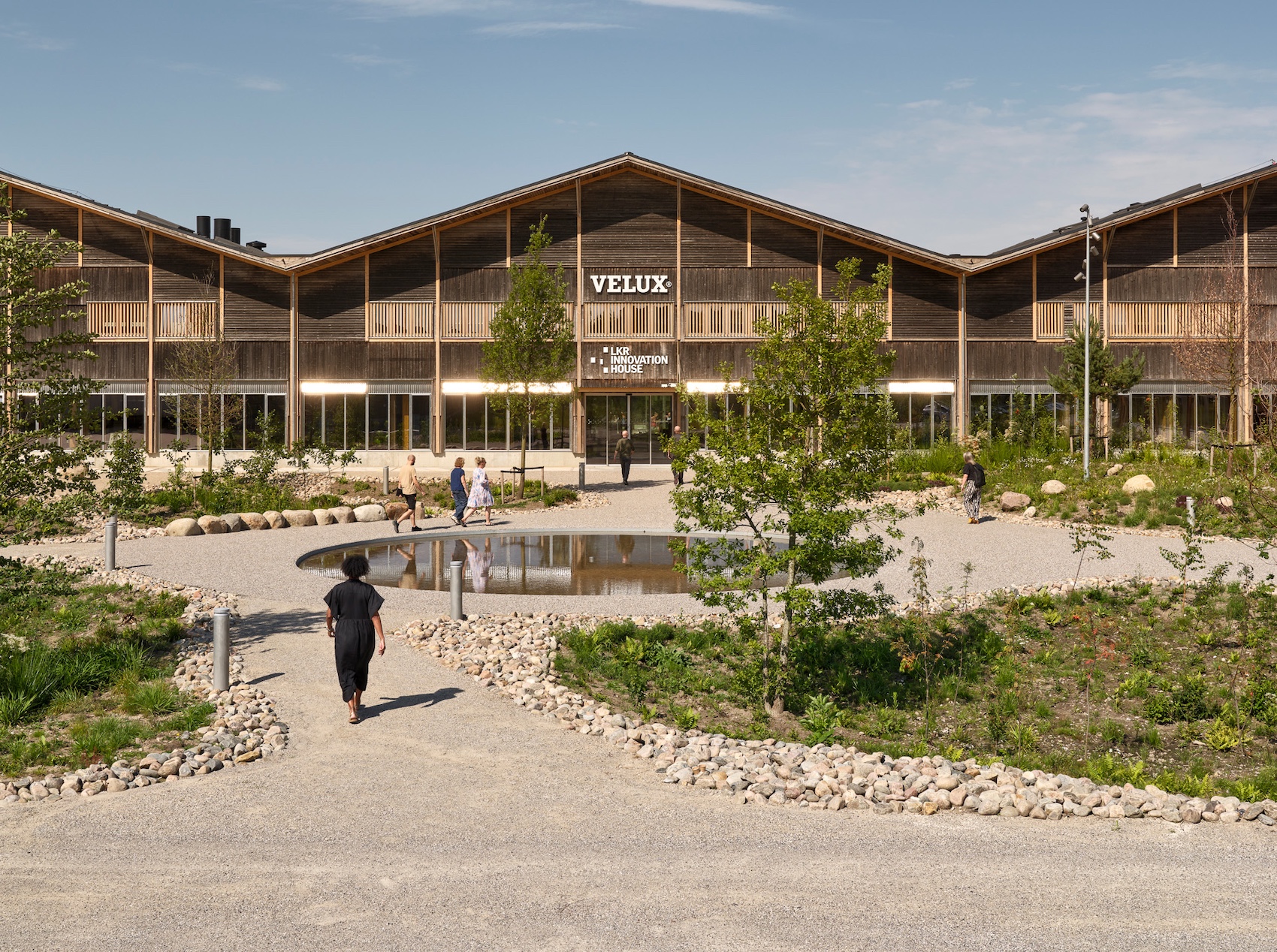
Stephen Bates One of the most positive factors of a care home as opposed to staying at home is the potential it has to address the scariest part of getting old – increasing isolation. But while it is efficient to put all of the care facilities required locally in the same place, you end up with a big building; the challenge is how to make that domestic. At 6500 square metres, the Huise-Zingem home is not a house. Instead, we talked a lot about the feeling of a household. That led us to look for a way of organising the programme by grouping a number of collectives comprising residents who require a particular type or level of care. We found an answer in the courtyard typology: the building comprises three parts which are shifted in relation to one another. Two of those have courtyards and the central one has a large living room. Around these spaces are groups of between eight and ten rooms. There’s a lot of encouragement by the industry to think like that, but the architectural challenge is how to do it well: if you have a wall with eight or ten doors it looks like an institution. In recent projects we have developed devices to reduce the number of visible doors by grouping them in recesses.
We spent a lot of time sizing the courtyards as the clients’ existing building had one that was too high and narrow, and wasn’t really working. We developed a stepped section to let in the maximum amount of light. Though it feels like a big building when you arrive – some have linked it to a country house – once you’re inside you’re constantly connected to the outside through large windows, either into a courtyard or out to landscape views. Combined with ceilings that, although generous, are low in relation to the size of the large living rooms, they give the interiors a proportion that relates to the flat landscape.
AT How do practical and regulatory requirements complicate matters?
SB The challenge is balancing the specification to meet a
modest budget and the ambition to make it feel materially like a home rather than an institution. We thought of the circulation space like a landscape connecting the smaller and larger livings rooms. To preserve long views through the space, fire doors are offset from corners so residents get the sense of space beyond. That’s what architects can do – think carefully and spatially and not just pragmatically.
There is a requirement to have fully-accessible ceilings, smooth floors that allow beds and chairs to be rolled and so on, but if I’m self-critical of Huise-Zingem, I think there are still too many ingredients that say ‘institution’. In our current elderly care projects in Belgium we are working to reduce that.
AT Were you conscious that the visual or tactile qualities of rooms might be particularly important to people who are not very mobile?
SB The staff encourage as much movement as possible, but one of the lessons we’ve learned over the last eight years is that residents do not move around the building as much as you might expect: in most cases they don’t leave their floor, and many don’t leave their corner of it – the household. They move between the bedroom and the living room and some can only manage to move between the bed and the chair within the room. We were able to achieve greater room sizes than the regulatory minimum, which is 25 square metres for a bedroom and bathroom, and they are tall spaces with large windows. We used curtains and lighting that you would associate with a domestic environment, and encouraged the client to consider the opportunities for residents to bring in their own furniture.
As a point of orientation and to give a sense of identity, our graphic designer created a glass-fronted box next to the door of each room in which personal belongings and pictures are placed. That is supplemented by a pinboard within the fixed furniture that provides a ready-made backdrop to inhabitation.
We also worked with artists Ana Araujo and Willem de Bruijn on textile design. From seventeenth-century tapestries depicting domestic scenes they developed a wallpaper pattern and curtains that change from room to room.
Elderly people are no less sophisticated than anyone else, so there’s no need to use brash colours – something that bugs me in buildings for children too. In general we were careful in thinking about colours because sight loss and dementia are major factors. If you watch elderly people stepping from a light material to a dark material, you often see them hesitate because they perceive the dark area as a void. Likewise, we learnt that orange is thought to be frightening for people with dementia, for example. Subtle details can be very important in this sort of building.
AT Does it help that many residents have a long familiarity with modern architecture?
SB Belgian society embraced modernism in ways that we didn’t in Britain, but there is also a love of old things – the brick tradition is as old as the fourteenth century and still part of the culture. As architects we are making connections with historic tradition as well acknowledging an acceptance of modernism.
If architecture is going to play a significant role in the provision of care homes the the UK, it has got to position itself correctly within the culture – you can’t force elderly people into a modernist project if they don’t want it. We have to find an architectural language which makes deep connections.
At Huise-Zingem, we based the the courtyards on one we measured in the old city of Ghent because we were interested in making inate or unconscious connections between the residents and the spaces – familiarity is not just about form, it is about atmosphere.
AT You have two further care home projects in Belgium and are looking at more in the UK. How will Huise-Zingem shape your thinking?
SB As an architect, it’s a shock to realise how entrenched your ideas are about what is right, but it was wonderful to be challenged. For example, when we were trying to locate the best position for the communal living room, as architects we naturally thought it should be a light space, with sun flooding in. It was quickly explained why that would be wrong: staff can’t give constant attention and an immobile resident left by a south-facing window or balcony might burn. So the main living rooms are on the north side and have large windows onto a sunlit garden.
Seeing the home in use is also instructive. There was a shared sense with the client that big living rooms would be a great way to bring all the residents together but in practice that happens rarely; a collection of smaller, more intimate rooms would be more effective. Likewise, while we enjoyed the big landscape views offered by the site, in practice the most popular views from this building are of the car park. Residents congregate on the first floor overlooking the entrance to see who is coming in and out. One can’t overestimate the need for stimulation. There is a school next door, and it’s a very positive situation to have the sounds of children playing and the comings and goings of people.
More generally, procurement is very important and we had a committed client trustee group who made big efforts to support and inform us. Their hands-on approach to the project was fundamental to its success. In the UK, that kind of individual passion often gets squeezed out by a management team offering guaranteed outcomes.
Doing this project allowed us to develop a high level of sensitivity towards the programme, which is necessary because it is emotionally-laden: there are residents who don’t want to be associated with people with different needs, or thought of as ill. But we’re careful not to assume we know how to do it now – it’s important to approach each project for the particular problems that it has got to solve.
Project team
Architect: Sergison Bates; design team: Jonathan Sergison, Stephen Bates, Mark Tuff, Jan Vermeulen, Jerry van Veldhuizen, Marcos Lopes de Sousa; project support: Bureau Bouwtechniek; engineer: Studiebureau De Klerck; artwork: Ana Araujo and Willem de Bruin; graphic design: JANE studio; client: Home Vijvens.


