Adam Khan admires the blend of decorum and delight at Níall McLaughlin Architects’ Whitechapel housing for Peabody


Peabody got off to a good start back in the 1860s, its architect Henry Darbishire setting out the now familiar format of mid-sized blocks enclosing a series of connected courtyards. Whilst ever-popular with residents and celebrated in the photos of Axel Hütte, they have been somewhat maligned over the years as inward-looking, defensive, even dull. But although the dark, gloomy corners are a problem, the type now appears fresh and relevant to the stressed topic of London housing.

With respectable densities, and shared courtyards that are well defined by the blocks, activated by the entrances and full of mature trees and small playgrounds, the inward focus now seems a blessing to family life, offering protection against the busy streets outside. Critically, the shared courts are open to the city, eschewing the current paranoia that would have all perimeter blocks gated. It’s a refreshing, positive and optimistic view of the city – you can wander freely across but know you’re in someone’s yard.

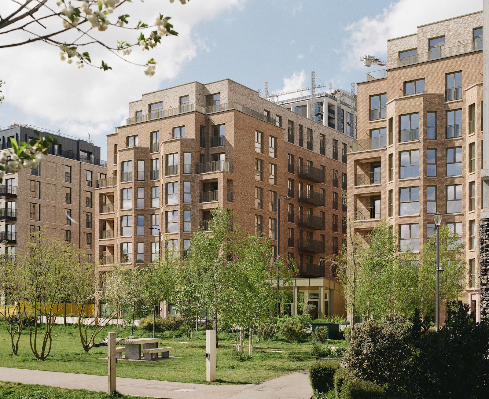
The Peabody estate at John Fisher Street in Whitechapel, east London, was centred on Darbishire’s base type and comprised six blocks, until a second world war bomb destroyed one. Used since then as a car park, the vacant site was an obvious candidate for infill development, but the choice of Níall McLaughlin as architect, and his resolution of the project are not so obvious, with the inherited format not only respected but refined and improved upon. Social housing is a tough test of the skill and care of an architect, and here it is fascinating to see an architect more accustomed to delivering exquisite masterpieces use their sense of craft and clear thinking to produce delightful homes.
A keen eye for proportion invests this simplicity with grace, and the facades exude quiet dignity. One is reminded of Kay Fisker’s Hornbaekhus in Copenhagen”
Niall McLaughlin Architects quickly defined the key battles to win, developing robust strategies that could withstand the most brutal Design & Build procurement process. That pragmatic approach should be a good fit with an urban design intention to regard housing as a calm backdrop of the city, but it is refreshing to see that this can include verve and a keen awareness of what really matters in housing.
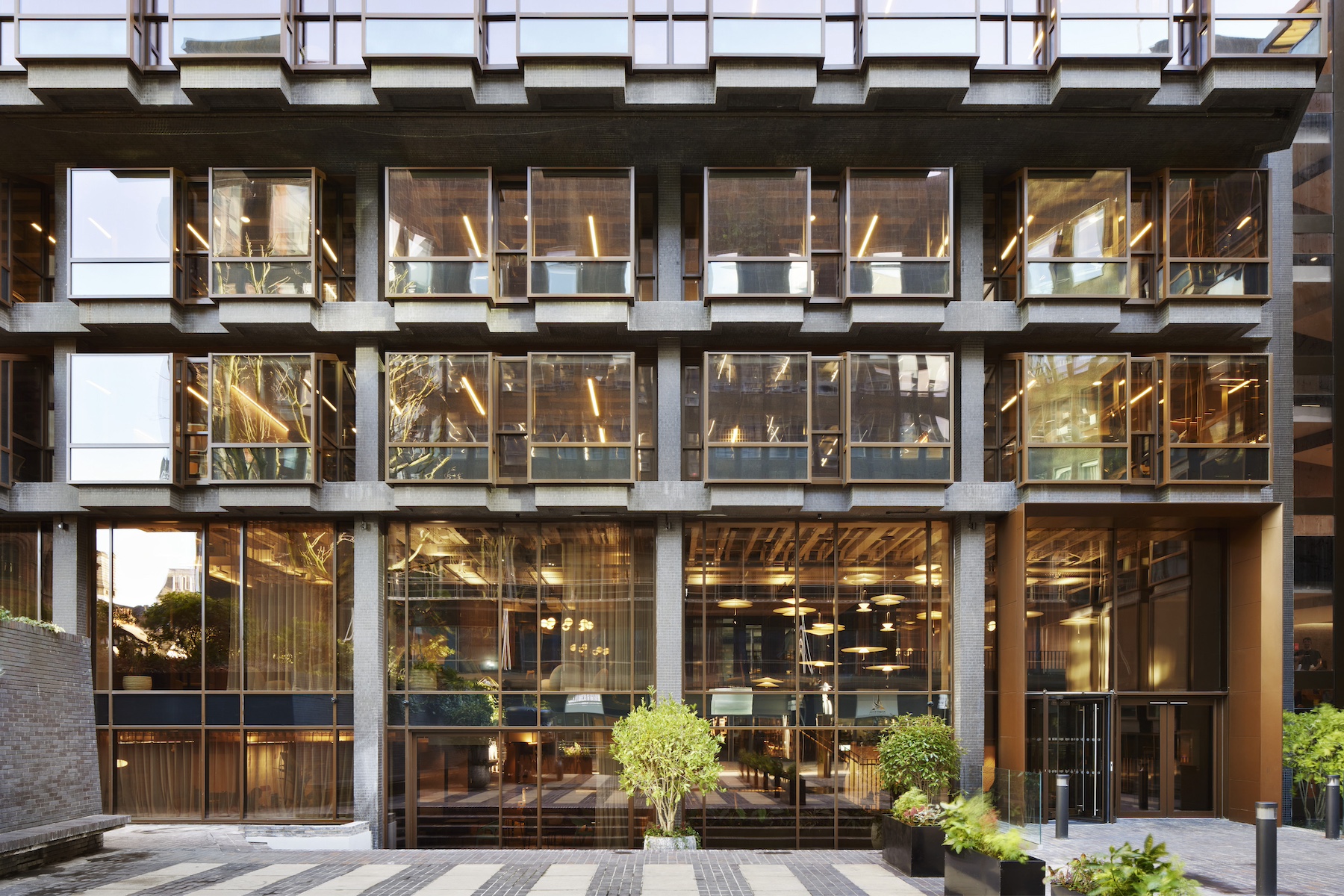
So the architects fought hard to retain the large windows, but let go of their preferred, more finely profiled product. They establish a very clear hierarchy, with the public entrance treated to a sumptuous flared entry portal while the service doors are utterly mute.

The elevations enjoy a simple repetition. While economical, this level of repetition is often deemed stark or unfriendly. But here, a keen eye for proportion invests this simplicity with grace, and the facades exude quiet dignity. One is reminded of Kay Fisker’s Hornbaekhus in Copenhagen.
The inherent site problems of viability and those dark corners are neatly solved by paring back the building at the overlap with the neighbouring block. Extending the tradition of open corners, this creates usable new courtyard spaces and a nice permeability to the adjoining courtyards, and is an invitation to the vacant site nearby to continue the game. The building develops the open corners at its own scale with wide, deep loggia balconies.

There is refinement here based on fine construction craft. The precast concrete reveals take a practical and familiar mid-century detail but give a masterclass in the subtle modulation of facade depth. The deep window reveals are flared – like a Georgian window lining – diffusing glare, celebrating the opening, and seeming to reach outwards. But they taper to a Superleggera thinness at the elevation, and then project a little more. A small shadow from projection and a deep shadow in the reveal give depth and richness to the facade at almost no cost. The beautifully fragile corner fins are a bold move, but seem natural as a development of the language already established, effortlessly sidestepping the Miesian corner issue. They too taper to a delicious thinness, accentuated by the evident mass they are supporting, and seem to make the balcony broadcast out to the square. Is it a mouth or an ear? Either way, it is a nicely sensory anthropomorphism. The architects were bemused that the subcontractor didn’t feel able to make the reveals in one piece, but the handling of the break actually lends an additional vulnerability and gentleness.

The fins work so well perhaps due to the open generosity of the balcony rooms – deeper and larger than the housing design guide suggests, double or triple aspect, and with a low parapet that combines privacy with openness – just like a nice Parisian apartment. The balustrade is set within the masonry parapet, giving a cill which is deep and not usable. Counter to an obsession with nett-lettable area, this moment of emptiness establishes a decorum – as if the building has a deep skin which belongs to the city. The inhabitation is something different, a private realm sheltered within. This is particularly effective here with the building so hard-up to the pavement.

The architects have clearly enjoyed the task of ruthless prioritisation of the things that matter for the experience of a resident. Evident care and effort was spent making an entrance hall with the salient qualities of a nice Arts & Crafts house. The lowest flight departs to wind down and present itself, a first-floor landing can be glimpsed and the open winder stairwell is full of daylight.

While spatially and technically highly practical, this creates a delightful sociability. The stair hall becomes a place, and residents really do talk here. The winding stair flights are single piece precast units with stepped soffits, carefully set free from the wall.
One can only imagine the architects’ dismay when the gap between stair and floor was masticked in (to aid cleaning), but the important things survive this hiccup – the Escher-like soffit, the views through, the clear sense of crafted materiality and the little moment of theatre of arriving home, reminiscent of Jacques Tati’s ‘Mon Oncle’.

Circulation becomes ‘place’ within the flats too, where a slight widening of the corridor and glazed doors effectively create an extra room, a place where children could play. These tiny moves are hard won at this budget, but make an immense difference to the residents.

This small block does so many things right, one wonders why more housing can’t be like this. But while it shows impeccable manners, Níall McLaughlin’s addition to John Fisher Street goes beyond anything that could be codified or stamped out; evidence that there is no substitute for a fine architect really engaging with a specific site, thoroughly understanding the context and then actually improving it. A sure vindication of Peabody’s policy of commissioning high-quality architects.
Additional Images


Download Drawings
Credits
Architect
Niall McLaughlin Architects
Structural engineer
Ellis & Moore
Environmental engineer
Nifes
Quantity surveyor
Pellings
Brick
Wienerberger Marziale
Windows
Nordan
Glass-reinforced concrete window surrounds
GRC UK
Stairs
Milbank