Bold in ambition, but compromised in delivery, Office S&M’s terrace of three family homes in a Hertfordshire village shows how commercial reality can dilute good ideas. Ellen Peirson applauds the bravery of a riposte to standard developer housing that has survived against the odds.

London has a way of stretching itself thin – pulling at the edges of its own borders until they blur into the sweeping green of the countryside. Wheathampstead is one such place – a village between the postcard charm of St Albans (and its direct trains to the city) and the broad skies of open Hertfordshire fields. It holds the line, for now, between suburbia and something more pastoral: a place shaped by the idea of home. One that eschews the supposed anonymity of city apartments and embeds it in the ideal of the individual dwelling: a distinct house, its own patch of lawn, and a front door you can see from the street. The village spreads in neat bands – large country piles tucked behind neat hedgerows, a medieval high street, scattered Tudor remnants, clusters of semi-detached post-war houses and newer masses of housebuilder homes that are eager to emulate a kind of traditionalism in miniature. It’s a landscape where clay tiles and red brick dominate, and tree-lined B-roads open up onto rolling fields. As its identity is slowly redrawn by London’s creeping edge, developers increasingly turn to these in-between places to fuel housing demand in the capital.

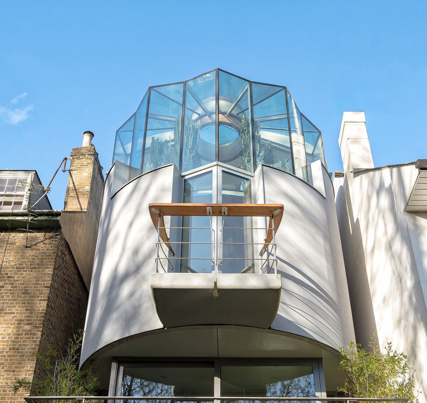
The stack-bonded, glazed red brick base creates a cartoon-like quality that is playful rather than quaint.
There are quiet and legible codes in Wheathampstead, in an environment that resists change even as it finds itself pulled ever closer into London’s orbit. Into this fabric comes Red Cow Terrace, a project of three family homes on a backland plot in the village that attempts to do something both respectful and different. The row of three- storey homes sits on a sloping site, allowing the relatively large properties to sink into the predominantly two-storey village. Arriving down the sloped driveway, the development starts to quietly announce itself as different.
Their silhouettes take cues from the surrounding village: overhanging eaves, solid masonry plinths, and the expected gable end pitched roofs that mark much of Wheathampstead’s domestic architecture. But these familiar elements are tweaked. The red brick base, for example, is glazed to a glossy sheen and stack-bonded into a tight grid, giving the buildings a cartoon-like clarity – playful rather than quaint. Above, the charred timber cladding and its barn- like form forms a kind of dark, textured crown, a contemporary echo of the tarred weatherboarding seen on older agricultural and medieval buildings in the village.

Overhanging eaves, solid masonry plinths and gable end pitched roofs are a ‘tweaked’ version of the village’s domestic architecture. The winding downpipes give the façades a graphic, almost drawn-on, quality.
“We were really interested in some of the black buildings in the area that had this almost layered construction: a tarred upper level and a red brick plinth,” explains Hugh McEwen from Office S&M. “That became something we wanted to reference and we translated those materials into something a bit more modern, but also a bit more… almost feral. Something with more texture. So it was playing off that contrast: riffing on local materials, but giving them a different rhythm.”
In a similar vein, the downpipes wind orthogonally down the elevations, giving the façades a kind of graphic, almost drawn- on quality. Their bold, deliberate paths recall the quirky exuberance of ad hoc suburban rainwater goods: oddly oversized hoppers, eccentrically-placed brackets, and jutting spouts that often punctuate village buildings with an unintended flourish. “So we wanted to play up to that and turn it into something functional with this huge box gutter,” Hugh explains. “To see how that could be used to give a bit more detail to the façade. I think it’s this thing of trying to articulate it as a whole art object, but then also give each house its own articulation, and it became a way of having a line that could then start to differentiate between the homes.”


Standard interior finishes contrast with the idiosyncratic exterior.
The Red Cow Terrace site came with baggage. A previous proposal in 1997 for four homes, arranged over three full storeys, plus a basement for car parking, and accessed by a new road carved off the adjacent main road, was refused and then dismissed at appeal for overdevelopment, access issues and harm to the conservation area. The landlocked site was effectively undevelopable and was held speculatively by the landowner for decades. The breakthrough came when No. 105, a house at the end of the row, came up for sale and would enable a new access route, making the current scheme possible. The site and house were both bought by Linea Homes, a company known for taking on notoriously awkward or previously rejected plots – sites others have deemed unworkable. They often purchase land that’s seen refusals or been stalled by logistical and planning complications, and work to unlock its potential. While they typically sell on with the uplift in value granted by planning permission, their role is crucial in taking on extraordinarily risky plots of land and working to transform them into real opportunities. They work with architects to produce schemes that respond to their tricky contexts, resulting in mid-market homes that are of high quality, but still shaped by the economics of resale value and development risk. Office S&M’s scheme reads as a response to the failed application over two decades earlier: three homes instead of four, no basement, no new access road, and a softer approach to the landscape, with retained trees and private gardens filling in the site’s northern edge. The scale has been dialled down, the massing rebalanced.


Charred timber cladding gives the building a barn-like, textured crown; an echo of the tarred weatherboarding seen on Wheathampstead’s older agricultural and medieval buildings.
Built within a designated conservation area and on a plot shaped by local policies dating back to the 1990s, the project was hemmed in by a set of very familiar constraints: traditional character references, a car-dominant layout, and a sense that any new architecture should politely fade into the background. This could easily have led to pastiche – mock-vernacular detailing, faux heritage finishes – but Office S&M took a more agile route. The homes nod to their surroundings but maintain their own personality: materials are familiar but reworked; forms are recognisable but re-proportioned.
Inside, things get messier. After securing planning, Linea Homes sold the site to family-run developer BSK Construction. This is where the homes begin to lose their charm and clarity, revealing many of the deeper dysfunctions endemic to contemporary British housebuilding. The homes suffer from some of the standard compromises of small-scale development: developer-grade materials and plastic finishes that undercut the clarity of the exterior design. There’s vinyl flooring and vertical venetian blinds, and the staircases come with ornate faux Victorian spindles and bulky newel posts that feel at odds with the rest of the architecture. The outdoor detailing falters too, when timber fences awkwardly traverse the steep decline of rear gardens and leave unsafe ledges. At the end of the site, the retaining wall that makes the sunken development possible is wrapped in fake grass – presumably to help it blend in, but actually letting it shout louder than anything else in the landscaping.
Developer Harish Kerai of BSK Contractors refers to it affectionately, if a little wearily, as “the big red house.” After purchasing the site with planning already secured, BSK retained the design but took it through technical development and delivery with their own executive architect, Gavin Jones Architecture. That baton-passing is visible in the final product. The architectural ambition survives, just about, but feels thinned out by budgetary constraints and developer pragmatism. Kerai notes the challenge in selling the homes: they went on the market in November and, as of yet, none have sold. “A lot of people do come to look at them,” he says, “but it’s the red that puts them off.”

A retaining wall creates a ‘sunken’ ground floor, allowing the three-storey properties to sit comfortably in a village of mainly two-storey homes.
Red Cow Terrace is far from flawless, but it is undeniably more ambitious than the typical developer home. It’s a rare attempt to do something contextual, characterful, and contemporary in a planning environment that often punishes deviation. But its delivery exposes the uncomfortable gap between architectural intent and commercial reality. The shift from Office S&M’s original vision
to developer execution is telling – a reflection of a wider malaise in British housebuilding. The result is a watered-down version of what could have been.
Still, there’s something admirable about how the project turned its constraints into opportunities. The conservation area, the sloping site, the decades-long planning stalemate: these could have shut down ambition. But instead, they shaped it. “I think it’s kind of interesting,” says Hugh McEwen. “It’s interesting how it’s very much a product of its location that is working in spite of, or because of it being a conservation area and a tricky topography and all these other bits and pieces, which are obviously potential blockers, but can also then be used to generate something that’s a bit different.”
The result is a study in compromise: design ambition meeting a brick wall of commercial reality, and a reminder of how easily something brave can be diluted – not by opposition, but by process. The strong, shiny red of the glazed brick, rubbing up against the sharp black of charred timber remains, but the interiors are thinned out by developer-grade finishes, the detailing blunted, the landscape unresolved. Red Cow Terrace is far from a failure – its massing is deft, the materials are inventive, and the concept is rooted in place – but it is a warning. Of how good ideas, even well intentioned, can be quietly worn down by the grind of delivery. And yet, its presence – stubborn, red, and reaching – is proof that it’s still worth trying.
Credits
Client to planning
Linea Homes
Client to completion
BSK Construction
Architect
Office S&M Architects
Executive architect
Gavin Jones Architecture
Landscape architect
Guarda Landscape
Planning and consultant
Grade Planning
Transport consultant
Ardent Consulting Engineers
Ecology consultant
Cherryfield Ecology
Arboriculturalist
David Clarke Landscape
Heritage consultant
Heritage Information