Martin Knight from Knight Architects explains how Stratford Town Centre Link – winner of the Infrastructure & Public Realm Award at the Test of Time Awards 2025 – was designed as a connection and catalyst for an emerging neighbourhood but has since evolved into an enduring and enjoyable civic space.
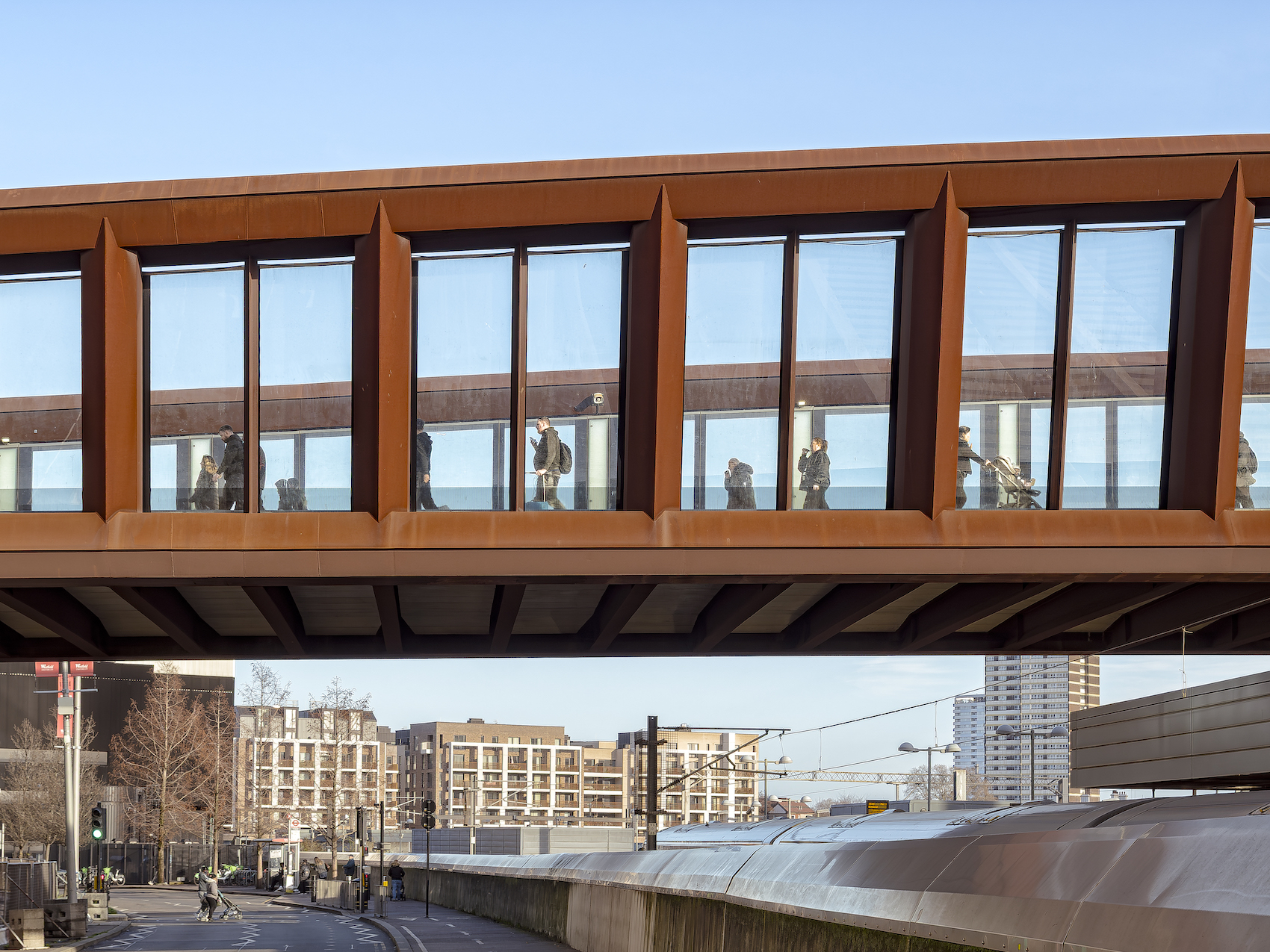
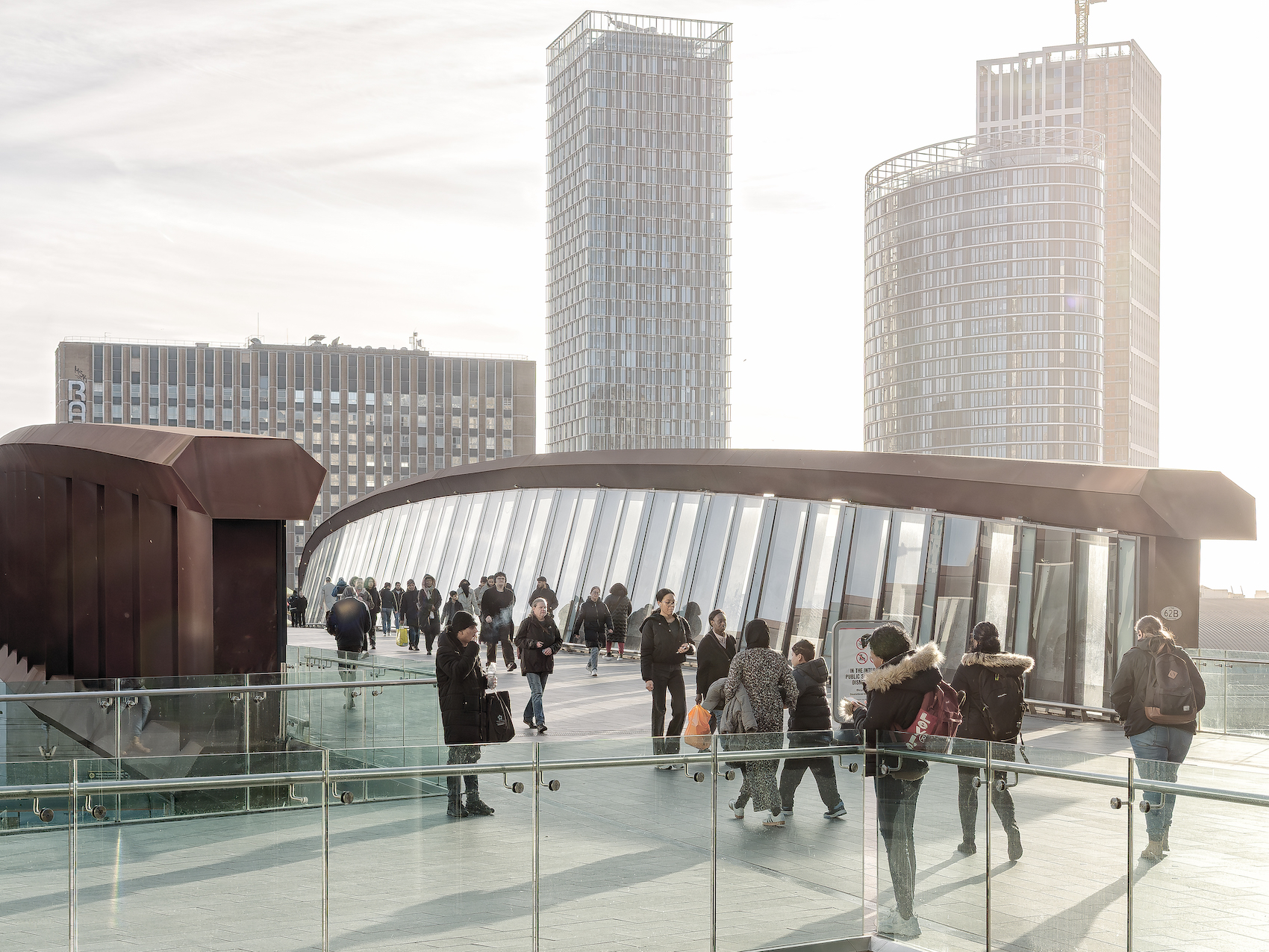
Completed in time for the 2012 London Olympic and Paralympic Games, the Stratford Town Centre Link is a 130-metre pedestrian bridge spanning one of London’s busiest railway corridors. The fixed completion deadline tied to the Olympic Games and the complexity of working over 11 electrified rail lines necessitated precise planning. To avoid disruption to rail services and station activity, the bridge was launched into position incrementally, with the final stage completed above a live station concourse – a UK first.
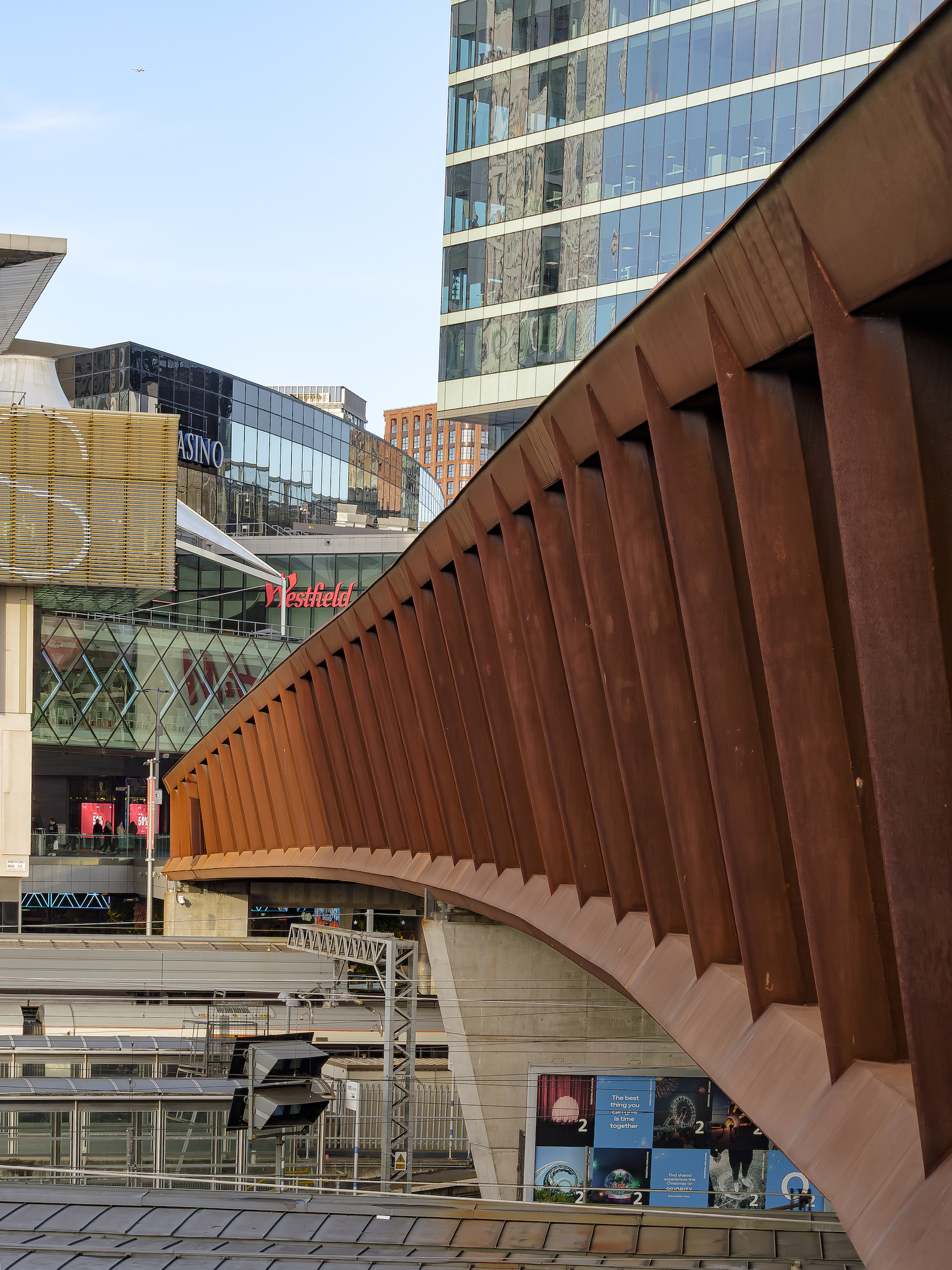
The bridge, composed of a six-metre- tall Vierendeel truss with a 12-metre-wide deck and fully glazed sides, curves gently in plan and varies in height to frame expansive views. With a 120-year design life, the detailing and material selection prioritise resilience, combining high-quality glass and stone finishes with weathering steel. This gives the structure a robust yet refined appearance, while also simplifying long-term maintenance.
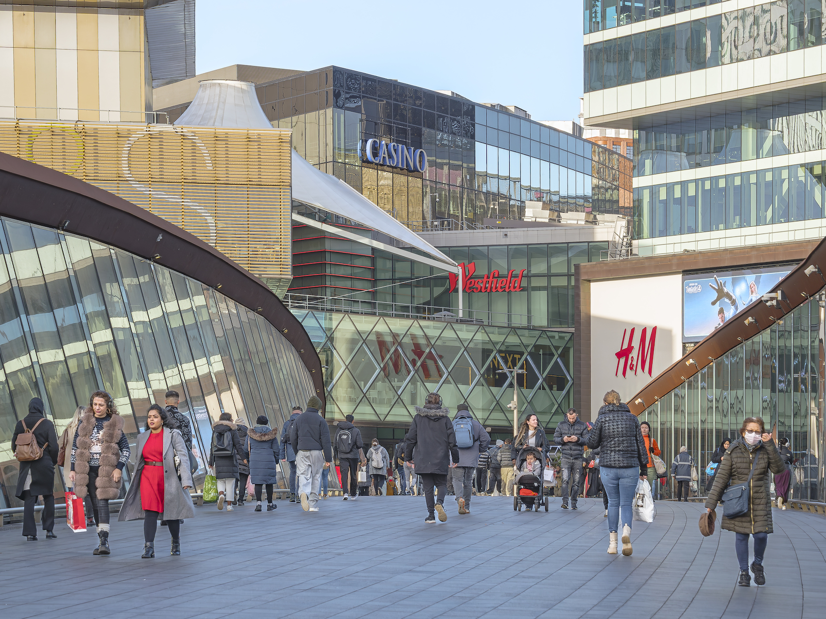
Designed to accommodate high volumes of foot traffic between Stratford Regional Station, Westfield Stratford City, and Queen Elizabeth Olympic Park – with peak crowds of up to 16,000 people – the bridge continues to serve as a well-used linear civic space, accommodating commuters, shoppers, football crowds, and occasional pop-up events.
The bridge’s 12-metre clear width was set in response to projected peak-event pedestrian volumes at nearby Stratford Regional Station.
Martin Knight At the time when the project was conceived, this part of east London was optimistically awaiting redevelopment. The site, a vast post- industrial area bordered by loads of railway lines and the rivers of the Lee Valley, was set apart from the neighbouring city, and almost impossible to access. It’s difficult to imagine, now that the area is populated with all the legacy uses: retail, commercial, sports, education, culture, and housing. But it all began with infrastructure. The Town Centre link was critical in terms of providing a pedestrian connection to the regional station and across the railway tracks. It served as a lifeline to the Westfield Shopping Centre during the period leading up to the Olympic Games, and was the catalyst for the wide range of uses that came afterwards.
The bridge crosses one of the busiest sections of railway line in London. There were 11 rail lines and a local road to be cleared. Chief amongst numerous really complex challenges was the question of how to install the structure economically and safely – all while maintaining rail movement and station activity beneath it. This led to the structural form for the bridge, which was developed with Buro Happold and addressed the major challenge of spanning 65 metres to a single central support. This was built using an innovative cluster of micro piles in the footprint of a redundant signal box, and it was the only place we could access in the middle of the bridge.
Gently curved in plan, the 130-metre-long structure spans one of London’s busiest railway corridors.
A Vierendeel truss was selected ahead of other alternatives, specifically to avoid the inclined or angled members of a normal truss, and to allow us to celebrate the elevated position and provide views to the Olympic Park and the surrounding city. The highly constrained assembly site was only around one-third the length of the bridge itself, so a phased installation sequence was used with the first part of the truss structure erected on a trestle. A temporary launch nose was added to extend the span to a temporary support on the railway boundary. All of this was then launched across the first railway span to reach the centre support. The second section of bridge was added and the launch repeated, and then the final section of bridge was added, and the third launch took the bridge across the whole span to its final position. This final launch took place over live rail lines and live platforms, which was a UK first and a considerable achievement for the contractor team.
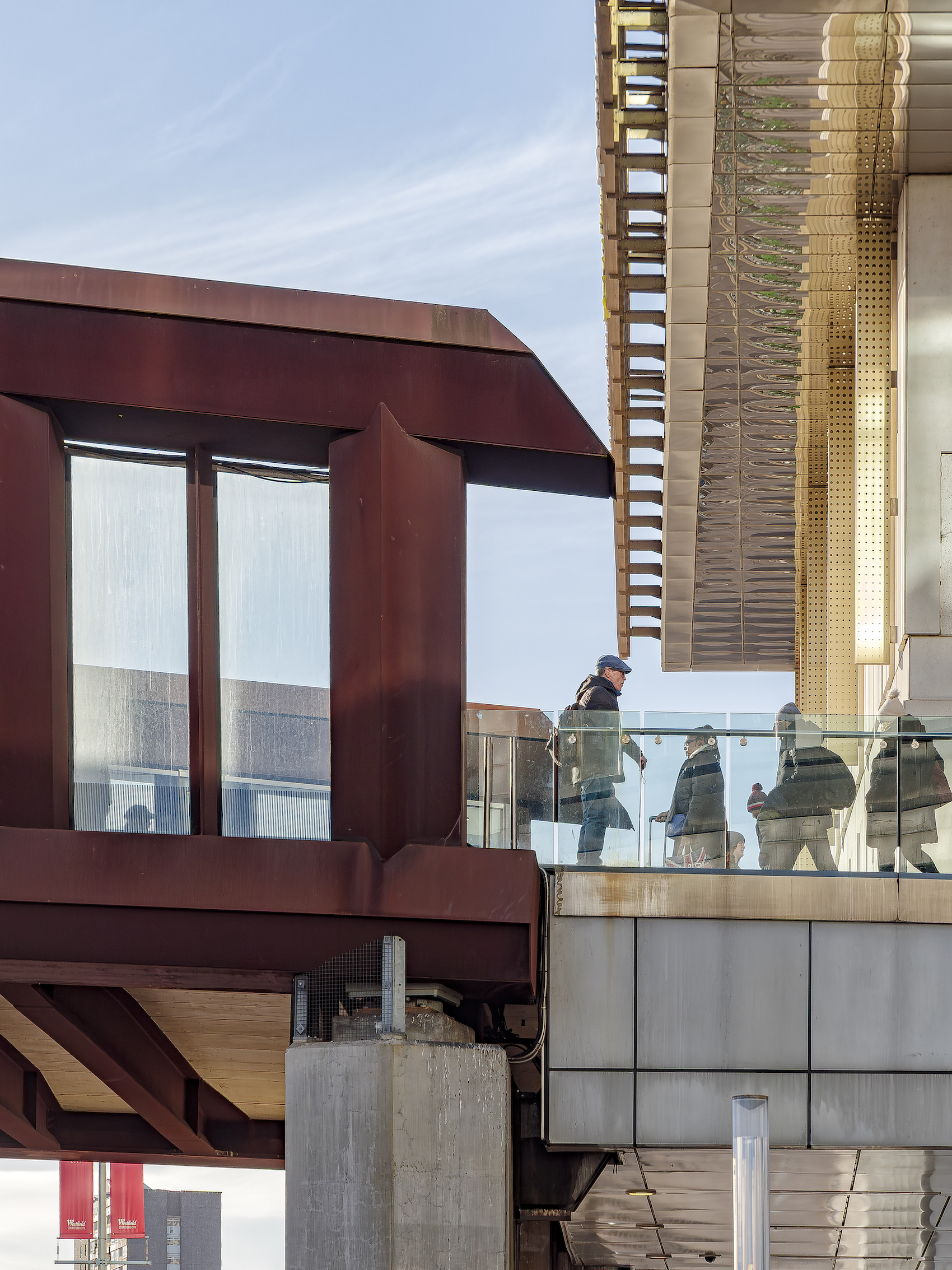
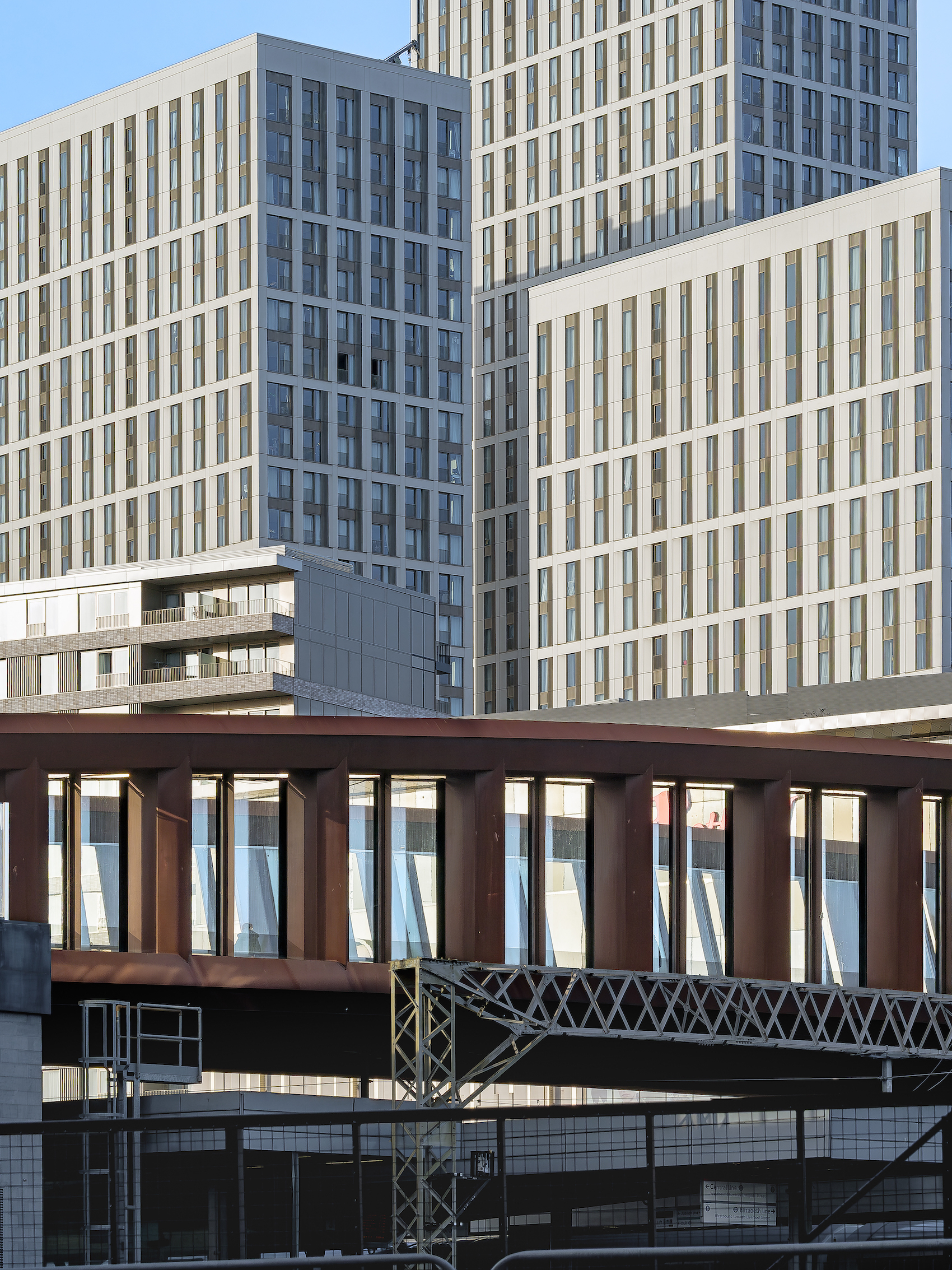
The decision to fully glaze the structure to a height of six metres at mid-span and end-to-end gives shelter from the elements and protection to and from the railway. It also extends the architectural language of the retail destination beyond. We were aware that, even when glazed, the length of the bridge – 130 metres – combined with these very tall sides, could have made the crossing feel oppressive to pedestrians. The distinct qualities of the two inner sides of the bridge – one vertical and the other curving and twisting; one in light and the other in shadow – seem to both express and encourage movement. The bridge has no designated lanes with only the stone coursing for the ground surface laid to follow the curve of the plan and to encourage flow.
The clarity of the design and materials palette complements, rather than competes with, adjacent structures.
The benign interior of the bridge achieves a sense of calm clarity, while the exterior is sufficiently powerful not to be dominated by the diverse architecture of the new Westfield Shopping Centre. For the super structure we selected weathering steel, which weathers naturally, initially to a golden red patina before darkening over time. This avoids the need to repaint the structure above the electrified railway lines, so it really simplifies maintenance, inspection and ownership. Although weathering steel and glass were chosen to minimise maintenance, Network Rail took some persuasion. They were also keen that the specification for the glass was able to withstand a ballistic test and hurricane force winds.
The appearance can be seen as either heroic and sophisticated or brutally industrial – and more than once, we wondered what we’d set in motion. On the inside of the bridge the steel is protected by the glazing, as a visual counterpoint between the brutality of the weathering steel and the fine architectural finishes of glass, stainless steel and stone. These combine to great effect providing the bridge’s users with a smooth, high-quality interior – a stark contrast to the heavily modelled texture of the muscular exterior, which is friendly or beastly, depending on your point of view.
high-quality materials give the bridge a tough yet refined aesthetic, while minimising maintenance needs.
The clarity of the Vierendeel truss structural form, which is very square set, dark and heavy, works well against the cacophony of the multiple gantries of the railway line below. The bridge’s 12-metre clear width was determined by the expected size of the crowds using Stratford Regional Station at peak events – specifically the opening and closing ceremonies and the final weekend athletics – with the glazed sides providing generous views of the Olympic Park. This was a significant factor in securing planning permission. The glazing provides wonderful views to the south and east in particular, allowing orientation and navigation. However, it was quite a surprise when Westfield secured a sponsorship deal with Coca-Cola that fully covered the glass on both sides of the bridge, top to bottom and end to end for the duration of the London Olympic Games.
Lighting was an important feature of the bridge, designed in from the outset, with the truss structure housing a series of vertical lights with programmable accent lighting that moderates between the bright lights of the Westfield Shopping Centre and the activity at the station end of the building. The nighttime environment overall is safe, calm, and understated. Legibility, natural wayfinding and accessibility were central to the design. Primary routes are highlighted and the Westfield identity is brought over the tracks onto the lift tower of Stratford Central Station.
A Vierendeel truss solution was favoured to eliminate inclined members and preserve clear views from the bridge to the Olympic Park and surrounding city.
Steps – which came to be known as Meridian Steps – mediate the nine-metre difference between ground level, the new mezzanine entrance to the regional station, and the bridge itself. The steps work well as a social space and for circulation. They’re a place where people linger and meet. The railway environment is visually busy and chaotic, but the bridge sails above this with a clarity and a purpose. It doesn’t feel heavy in spite of its scale, materiality and colour. In long views, the structure almost achieves a lightness or a slenderness, with pedestrians appearing as tiny compared to the vast scale of the 130-metre-long bridge.
In common with almost all of our projects, the bridge has been in permanent and continuous public use 24 hours a day since its opening. By connecting directly to Stratford Regional Station, the bridge provides convenient low-carbon access for thousands of people to Westfield, Stratford City, the Queen Elizabeth II Park, and its amenities, including the London Stadium, London Aquatic Centre, UCL East, Sadlers Wells East, and numerous other destinations. It’s often curated, not just by Coca-Cola, but for seasonal commercial activities and community events.
The bridge now is as popular and well used as ever, with the only obvious adaptation being secondary lighting added to the structure. Thinking about it, if only 10 per cent of the designed-for capacity of 160,000 people per day have used the bridge, that’s almost 82 million crossings over 14 years, or 10.6 million pedestrian kilometres. Most importantly, it’s not so much a bridge as a street. It’s a safe and enjoyable piece of public realm that achieves the feat of bringing Stratford and Stratford City together naturally, easily, and without too much song and dance.
It’s deliberately not iconic. This was in deference to the wishes of Viv Ramsey and the Olympic Delivery Authority Planning Committee, who rightly feared a cacophony of too many strong voiced architectural statements. The desire for something ordinary evolved into this curiously ugly/beautiful aesthetic. There were times when we were anxious that the bridge was too bold; and others when we worried it was too understated. But looking back on it, it feels just right. This is testament to a really strong team: the client, the design team, and the contractor team who, together, delivered something that has really stood the test of time.
Other finalists in this category:
Crystal Palace Park Cafe by Chris Dyson Architects