Curator Piers Gough adds a dash of colour to the architecture room at this year’s Royal Academy summer show

 hotoDavid Parry/RA
‘2018 Summer Exhibition’
to 18th August, Royal Academy of Arts, London
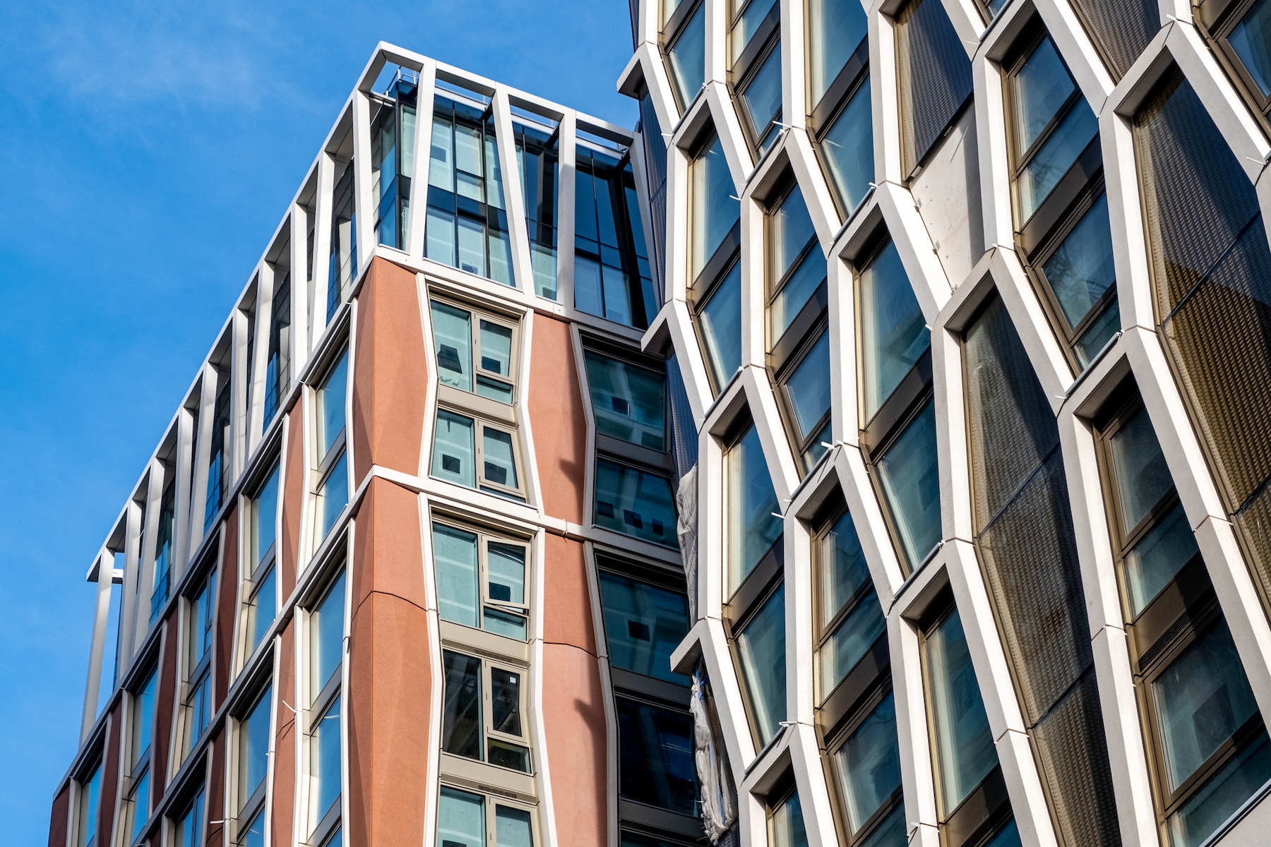
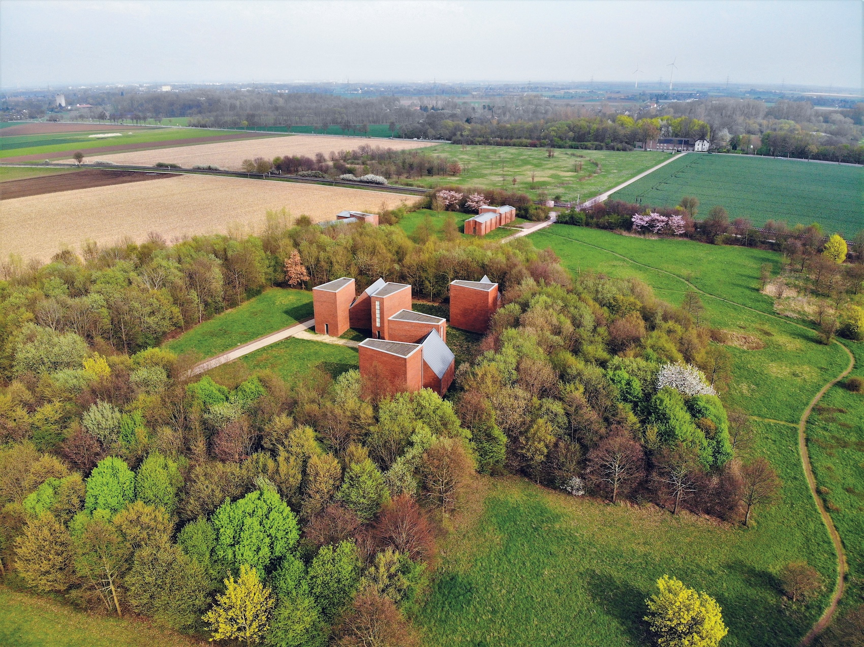
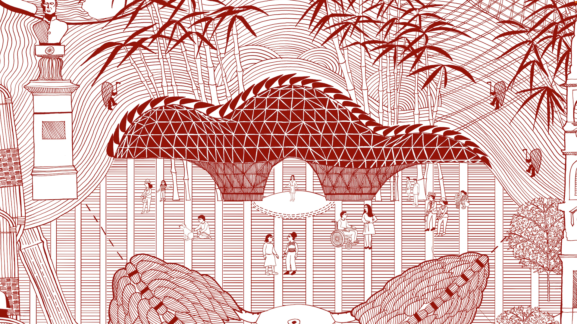
Grayson Perry asked me to curate the architecture room at this year’s Summer Exibition at the Royal Academy of Arts, which marks the institution’s 250th anniversary. I tried to emulate his popularist approach by inviting a send-in of public-pleasing models – the idea being to juxtapose the myriad of differing architectural preoccupations cheek-by-jowl into a city-like experience. The send-in was indeed a great mix of types and sizes, from whole town-planning schemes to exquisite facade studies, with happily some elegant towers to anchor the room.


Room 6 is one of the RA’s smaller galleries but it has the advantage of being directly ahead through the octagon on arrival and half-way around the normal circuit of main galleries on the first floor. It therefore has three entry arches and a three-way basic circulation. I decided to emphasise the towers by putting them in a row on a long higher plinth at right angles to the circuit flow of galleries and on axis with the octagon (with a mini-arch cut through it).
The next move – learnt from hanging the show many years ago with Ted Cullinan – was to put a shelf around the walls for models with small bases and ones that can be single-aspect. Above them, there were happily a good number of plan-form models which could be wall-hung to a bottom line. The other wall-based drawings and paintings are hung low or high, depending on their level of detail and impact.

Finally, freestanding plinths in each quadrant of the room can show the models best seen in the round. These are not completely symmetrical because a very large model of the Google offices (by Heatherwick Studio and BIG) is placed on the long axis of the room and juxtaposed with a weird, distorted model of the Albert Memorial (by DSDHA).
The other deliberate disruption was in homage to the late Will Alsop, with two paintings hung slightly below the line either side of a characteristically powerful model of a house on its own projecting plinth.
In the request for models it was mentioned that they would be displayed at eye-level but of course eye-level from a wheelchair and for a tall person are rather different, and I have erred on the side of the former with one-metre-high plinths and shelves. As an architectural conceit the plinths have other arches cut into them to acknowledge the existing cast-iron floor grilles in the room.
The arrangement of the models is not random. To make them coexist better and be more legible, they are grouped on plinths and shelves roughly according to their scales. All the walls and plinths are painted the same metallic blue which has a slightly streaky finish. The daylight reflection high up appears like an overcast sky while lower down it gives a more solid background to the works.
In fact the logistics of getting the large number of works in (about twice the normal number), then assessing and designing the room to suit, and then constructing and painting the shelves and plinths, meant that we were arranging work right up to the last minute. So although most of the nice juxtapositions are deliberate, some are frankly accidental, and I take this opportunity to apologise to their architects for one or two less than perfect locations and missed opportunities, and for the few models that unfortunately couldn’t be fitted in.