The new Cancer Centre at Guy’s Hospital, by RSH&P and Stantec, is a beacon for medical architecture says Barbara Weiss


Only a few steps away from the chaotic hustle and bustle of London Bridge Station and the Shard, and in clear view of the Walkie-Talkie across the river, the approach to Guy’s Hospital’s new Cancer Centre is matter-of-fact and un-ceremonial, much like the building itself. If however you know what to look for, there are plenty of architectural clues leading you to the doorstep of Guy’s new ‘star’ building.
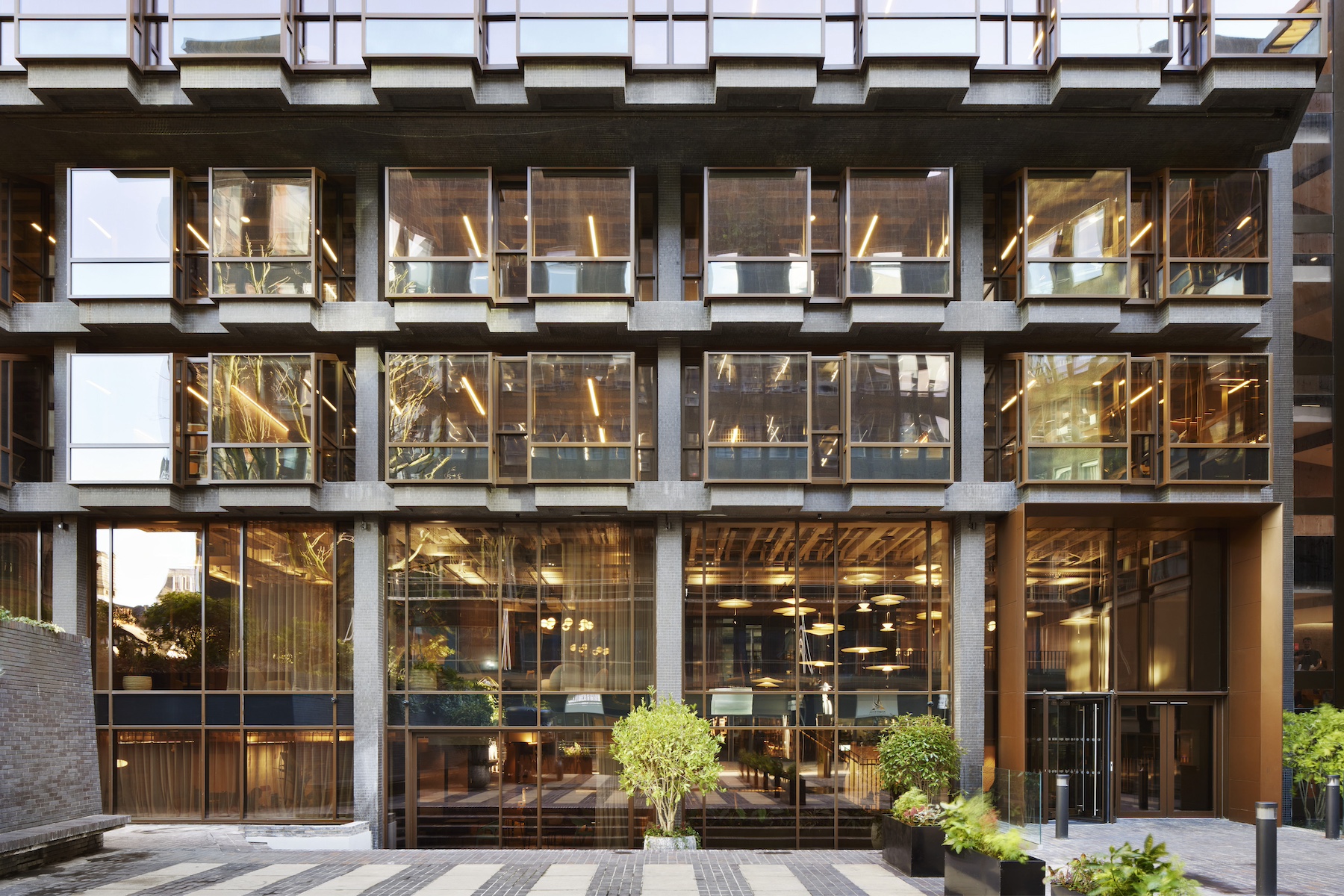
Self-confidently occupying a restricted triangular corner site, on a sensitive edge of this vast hospital campus – where medical precincts merge with low-rise residential hinterland – this 14-storey structure goes to great lengths to address the street, its own ground-floor transparency encouraging views in and out. Higher up, cantilevered multi-coloured balconies seem to be literally trying to embrace the Centre’s varied, if unremarkable, urban surroundings. It is, no doubt, a facility that reaches out to the community it serves.

Conceived in response to the client’s and architect Rogers Stirk Harbour & Partners’ deeply held belief that normality, practicality and good design all have major roles to play in minimising the stress and fear that accompany all illnesses – and cancer in particular – this is definitely a hospital building with a difference.
My guide, RSH&P associate partner Steve Martin, was keen to tell me about the many anecdotal experiences that shaped the architectural form of the building, and contribute to the Centre’s palpably user-friendly and serene atmosphere. In particular he delighted in explaining that it was an interminable, confusing array of lift buttons in an adjoining tall medical building that sparked the very core – and novel – idea of subdividing the building’s volume into a series of manageable, three-to-four-storey, vertical ‘villages’.
Stacked above each other, each houses a specific type of treatment or group of patients. This clever move brought instant clarity to the section, ensuring great legibility for patients, staff and visitors.

It is noticeable, and welcome, that RSH&P has drawn on its successful experience with the Maggie’s West London Centre at Charing Cross Hospital (2008), recreating, where appropriate, what worked well there; at Guy’s, a large and irregular central ‘kitchen’ table acts as a reception desk, but may also be used by all and sundry in a multitude of ways, and is a clear quotation from the much-loved domestic hub of the practice’s earlier healthcare building.

Above all, the building aims to be patient-focused, exuding attention for the needs of the individual, asserting the dignity and humanity of patients, while not precluding choice or descending into emotion or self-pity. A tell-tale sign of this pragmatic attitude is given by the prime position allocated to the ‘Fitting’ department on the ground floor, where, in full public display, an assistant will be on hand to provide new patients with all manner of essential cancer accoutrements – wigs and prosthetics.
On every floor, throughout the building, there is a strong geometric divide between front- and back-of-house spaces, with the more public activities occupying the bulk of the triangle at the front, and technical areas to the rear. This is the case also on the ground floor, where most of the space is treated as a continuation of the public realm, an introverted street that, while bringing you to your destination, dilutes the contrast between inside and outside.


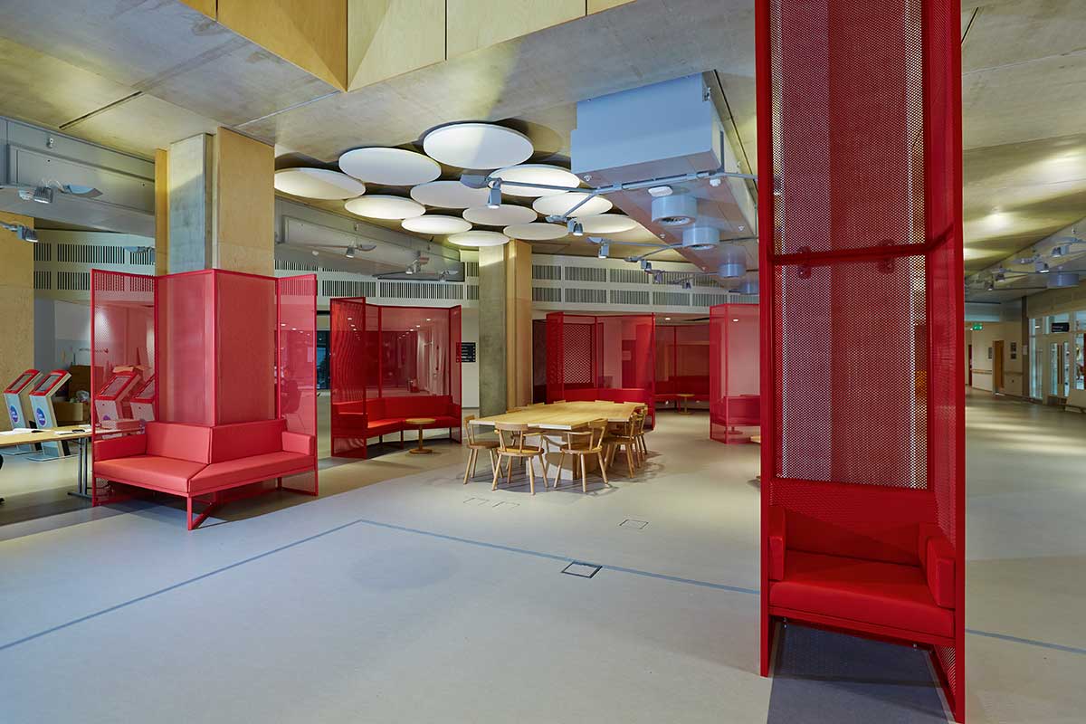
Much goes on in this lofty and rambling reception space: people sit, are directed to their appointments, meet, and wait. The volume is correspondingly generous and varied, with a slightly over-excited combination of staircases, mezzanines and double-heights sailing by overhead, above an array of coloured furniture intended for many different occupants and occasions, interspersed with the many – somewhat predictable and very much ‘de rigueur’ – examples of contemporary art.

My own favourite part of the building is, however, to be found on the upper floors, where the excitement dies down, the concept of the Villages comes into its own, and the clarity of the plan and section becomes stronger. With the late-afternoon sun pouring into the unusually generous lift landings and reception lobbies, it was hard to instantly recognise the building typology I was experiencing: not a hotel, not a public building, definitely not a hospital… the uncertainty was tantalising.

It therefore came as a surprise that the chemotherapy suite happened to be the single space to touch me most; configured as a rather ordinary open-plan room, it is subtly subdivided into two large bays by a low wall; each sports a line of very retro, and fun, highly padded purple armchairs, grouped so to allow patients the possibility of chatting together during the course of their treatment. There was something very comforting about this ordered, unfussy and yet quite elegant space; it is thoughtful, calm and reassuring.
By contrast, the Radiotherapy Village is all about engineering, and the immense architectural feat (and considerable cost to the client!) involved in bringing to the middle floors of the building the bulky and heavy Linac machines that must be shielded by two-metre-thick concrete walls. The easy and conventional option is to locate them in a basement, but RSH&P used the presence of Roman archaeology to add weight to its argument that anxious patients arriving for treatment could be directed upward, rather than down into subterranean bunkers.

While the radiotherapy treatment rooms are equally blind to the outside as a basement, out of technical necessity, it is RSH&P’s approach that counts – that constant turning of all received wisdom on its head to offer patients a ‘lighter’ way of dealing with their condition.

My tour covered a large array of different spaces, all of which are impeccably detailed and consistently user-friendly. I envied the brilliant design of the compact consultation rooms, and the impeccable changing rooms. I remain somewhat less convinced by some of the building’s ‘busy-ness’, particularly in the more public areas, and in relation to the exterior elevation.
Here an excessive use of colours, types of fenestration and different materials goes hand-in-hand with a few almost gimmicky solutions such as the over-sized balconies. Presumably the architects’ aim was to make the building look less tall and daunting. In playing with scale, and ‘decorating’ every inch of the exterior, however, I felt that some of the powerful sense of interior calm and elegance was undermined.

Guy’s Cancer Centre is brave, and clever, and beyond doubt a beacon for the desired direction of travel for medical architecture. It is also touching and inspiring, with its extremely skilled and careful design portraying so well a dedication on the part of RSH&P to patients’ well-being that must equal that of the medical staff itself. In a centre such as this, it is hard to imagine that only 50 years ago, the word ‘cancer’, the great taboo, could only be mentioned in hushed tones.
Additional Images


Credits
Architect
Rogers Stirk Harbour + Partners
Healthcare architect
Stantec
Contractor
Laing O’Rouke
Structure, services
Arup
Quantity surveyor
AECOM
Landscape architect
Gillespies
Client
Guy’s and St Thomas’ NHS Foundation Trust