Sandy Rendel has designed an intergenerational family home in the leafy village of Cuckfield, West Sussex. John Pardey locates the project within a history of one-off houses that are meaningful, modest, and very much of their time.
In history, the one-off house has always been the test bed for new ideas, new materials and new ways of living. From Palladio’s 16th century Villa La Rotonda that codified classical design principles and was to influence architects across the following centuries, to Le Corbusier’s Villa Savoye of 1929 that carved out a new way of living in the modern era, the house project remains the most potent vehicle to move architecture forward and reflect the culture of its day.
In Julian Barnes’ latest – and he says last – novel, Departure(s) he relates that in later life, Verdi “learned how to write less music.” Mies van der Rohe of course liked to say “Less is More” but looking around the architectural scene today, too many architects it seems, lean towards more design, rather than less. So how wonderful it was to visit a modest house in the leafy village of Cuckfield in the South Downs, that is easy to walk past without really noticing. It sits back, quiet and well-mannered in its setting. No shouting.
Its architect, Sandy Rendel, has quietly acquired a reputation for building houses that speak softly, yet sit beautifully in their place. Following the completion of his 2015 Corten-clad house on the banks of the River Ouse in Lewes, Sussex, Rendel subsequently secured a series of commissions in the South Downs that have all gone on to win RIBA awards. Deservedly so, for he has found his voice and his buildings are gentle, but insistent, modest yet assertive.
Today, in the UK, we are polarised between those architects that continue their allegiance to the moribund styles from the past and insist that this is a dignified and proven approach to build today – and those of us that seek a relevant, meaningful and informed way of building in today’s culture. There is no doubt that a Georgian terrace house is a thing of great beauty and grace, yet with the skills that produced it reliant on the penury of masons and craftsmen that laboured to build these structures, today we must strive, as all cultures across time have, to find a relevant and meaningful way of building.
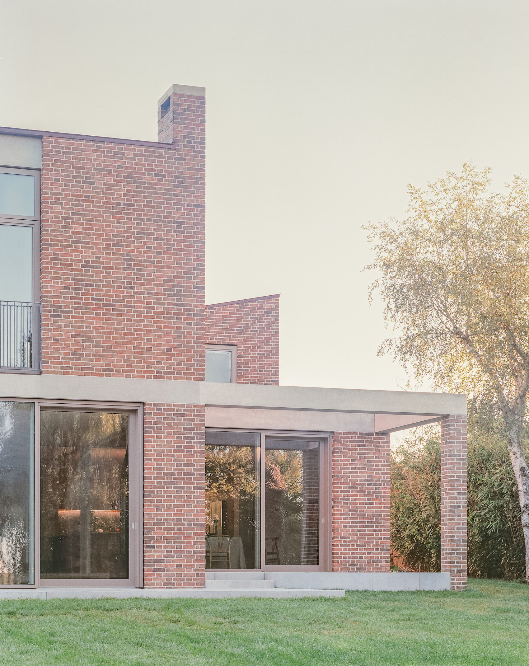
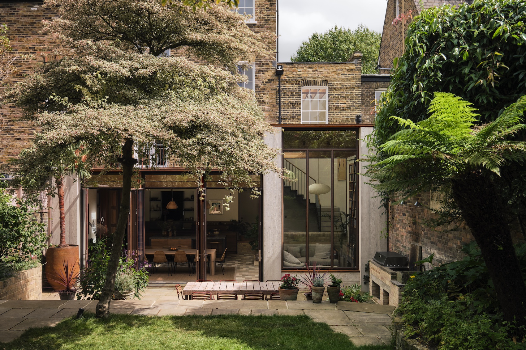
Left: The living room and master bedroom viewed from the garden, together with the recessed dining area. A precast concrete band at first-floor level unites the different volumes of the house.
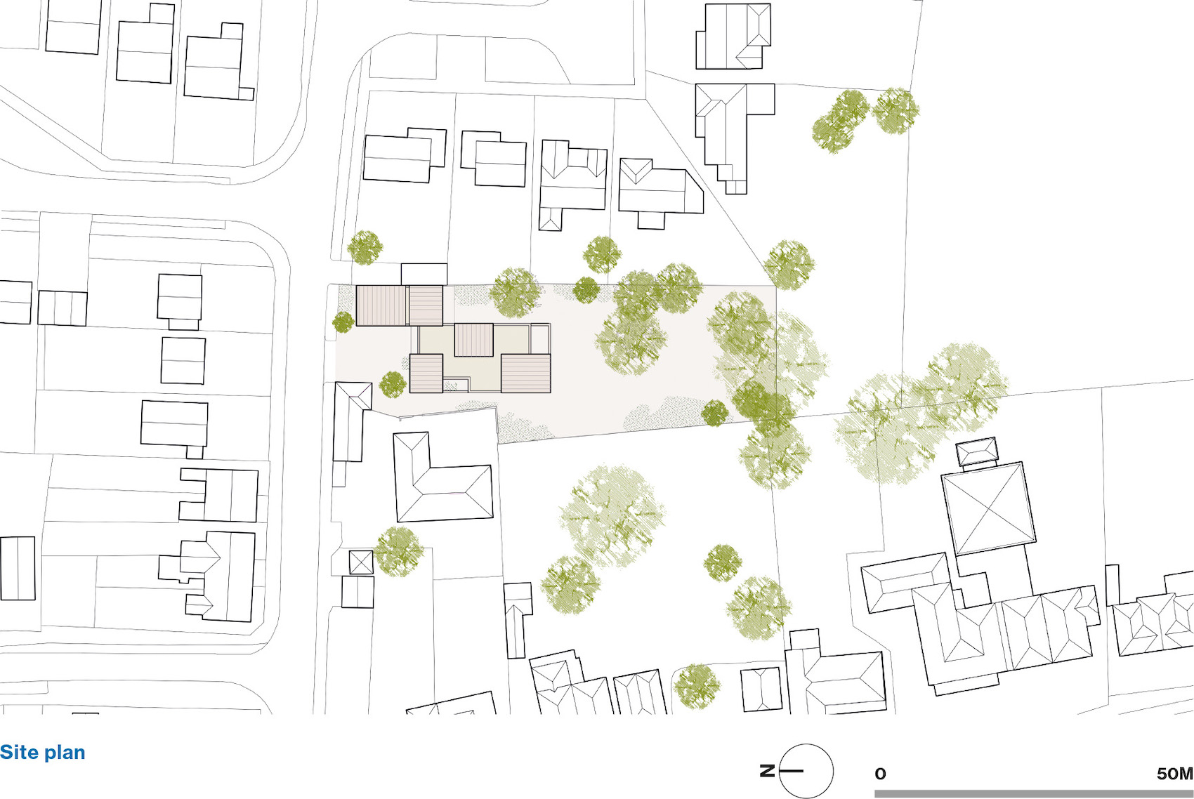
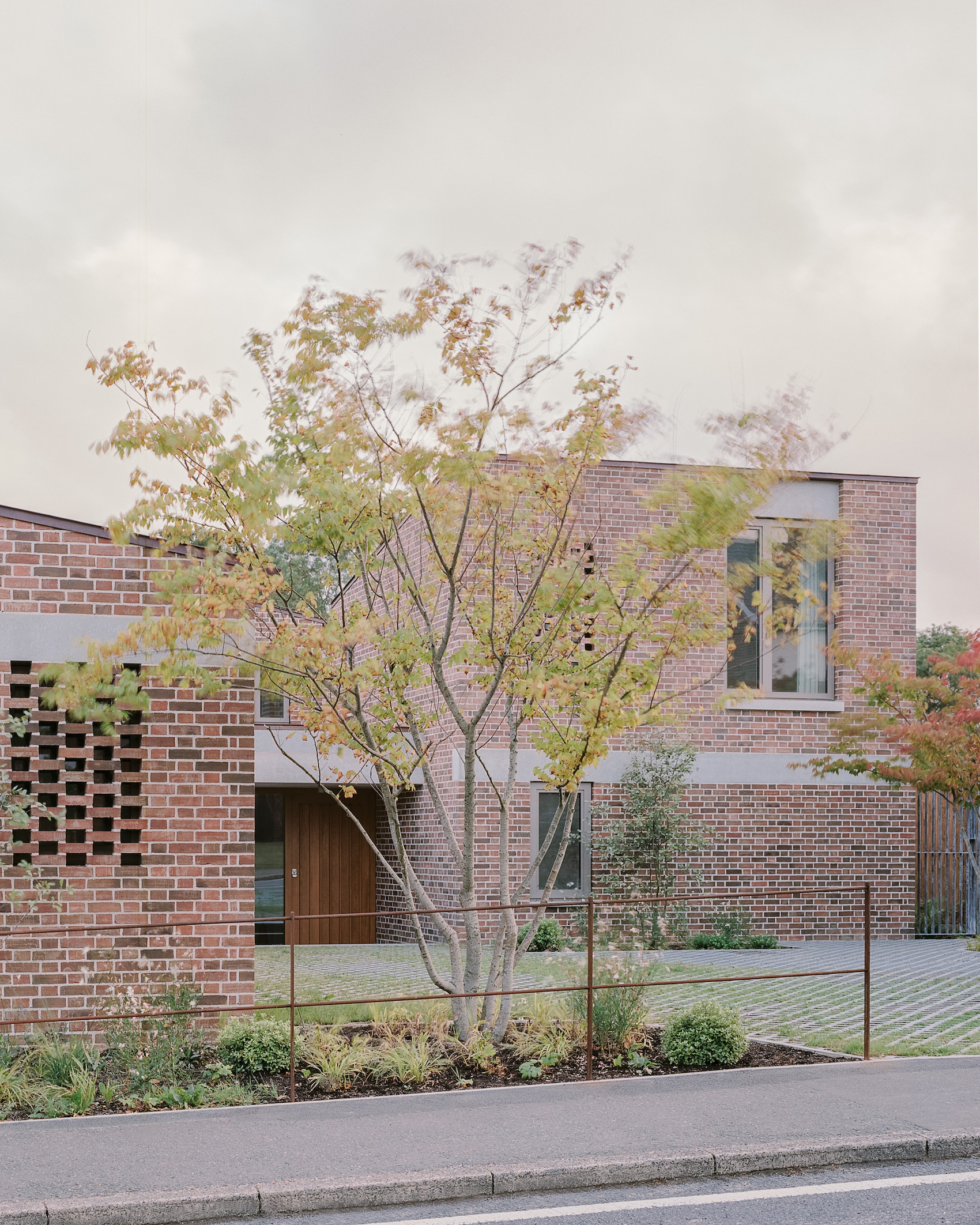
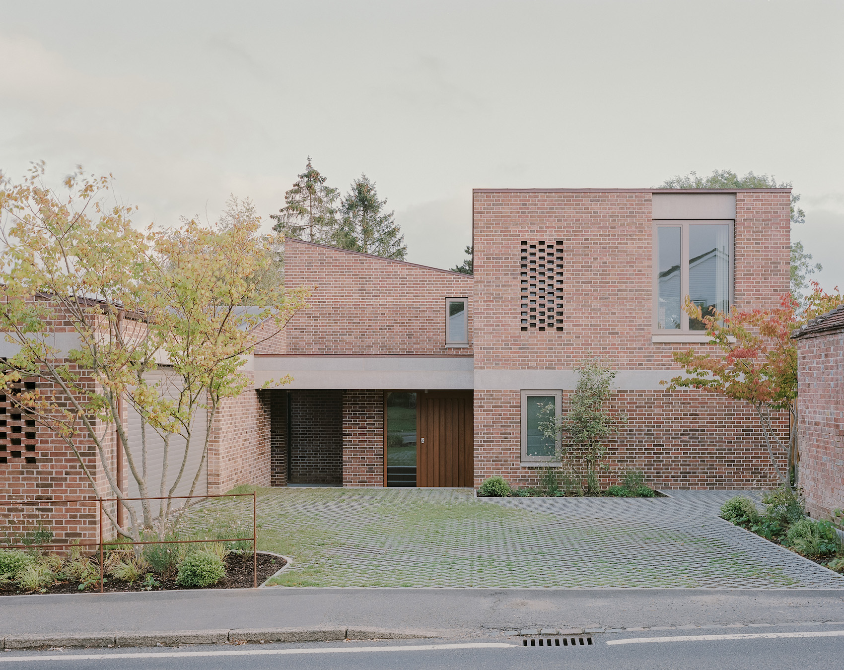
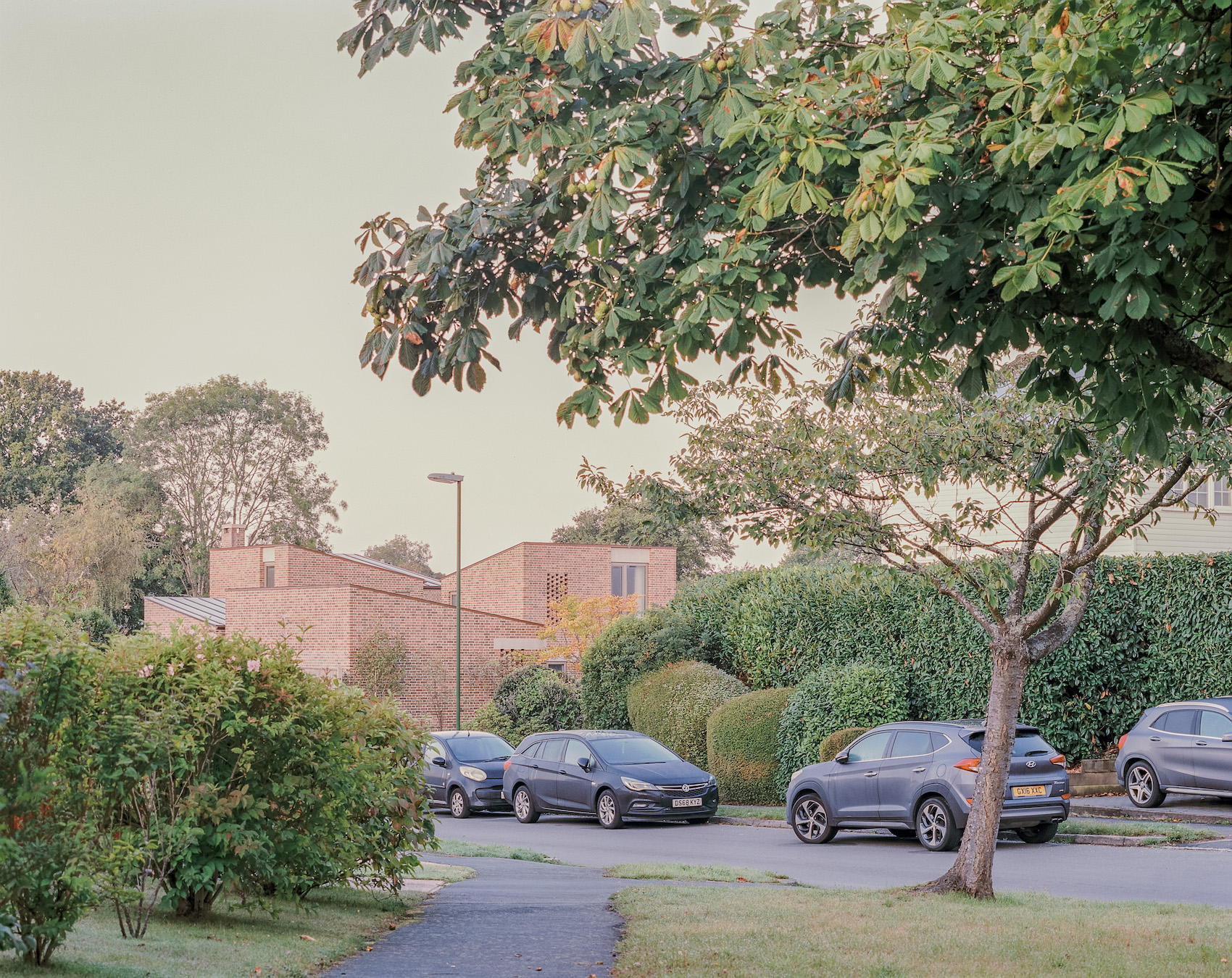
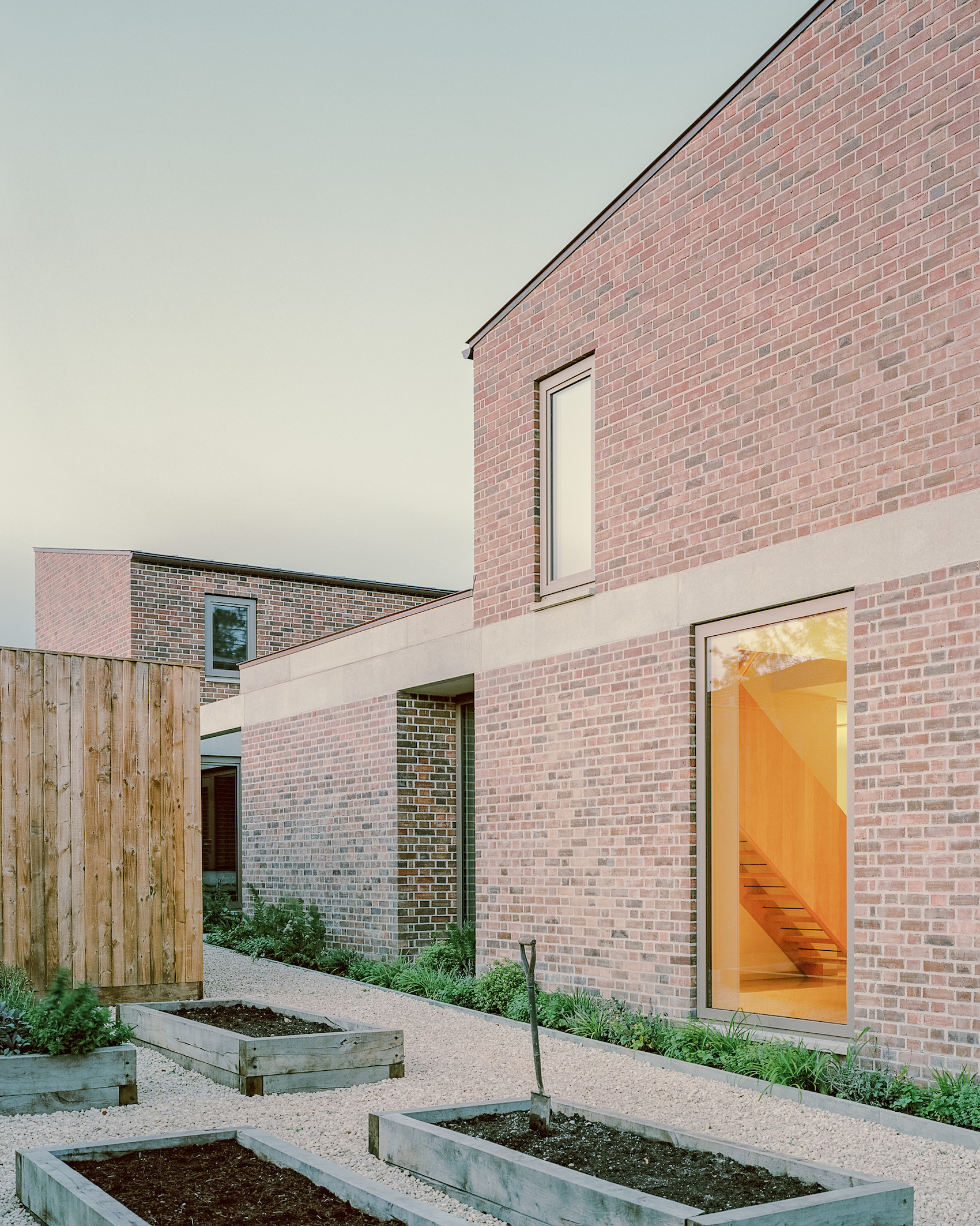
The site for Rendel’s latest house in Sussex sits within a typical English residential setting – a conflation of older brick buildings alongside 1970s jaunty, white shiplap-clad, pvc-windowed developer houses sitting back with open lawn frontages – with nothing much to cling to contextually. So it was the awkward relationships to the neighbouring properties that provided the driver for the design. It also has a long, south-facing slope of some four metres from the road to the bottom of the garden.
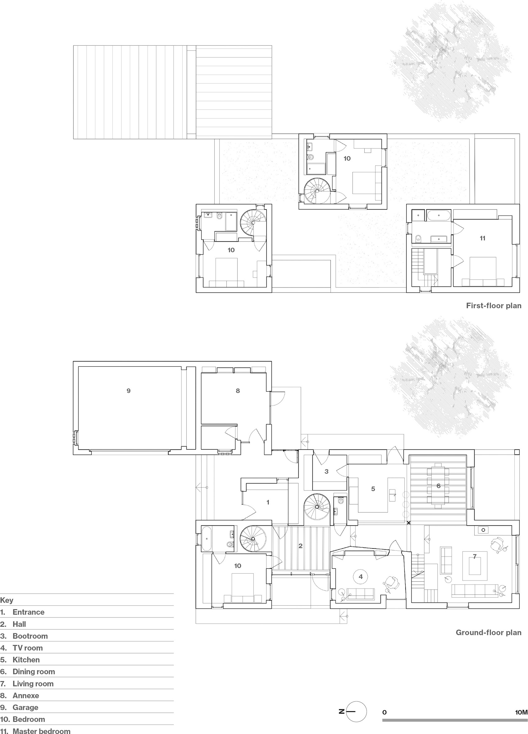
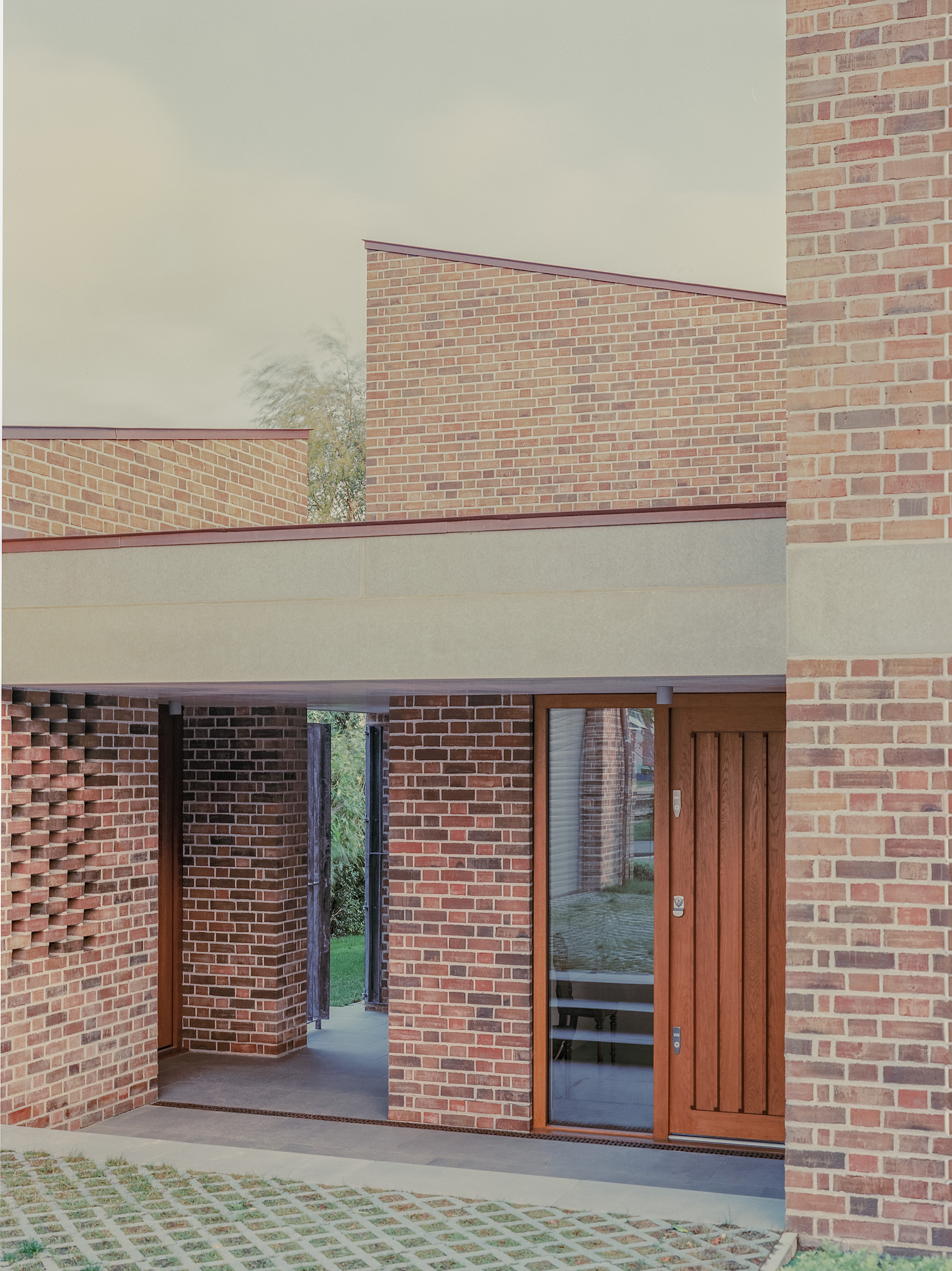
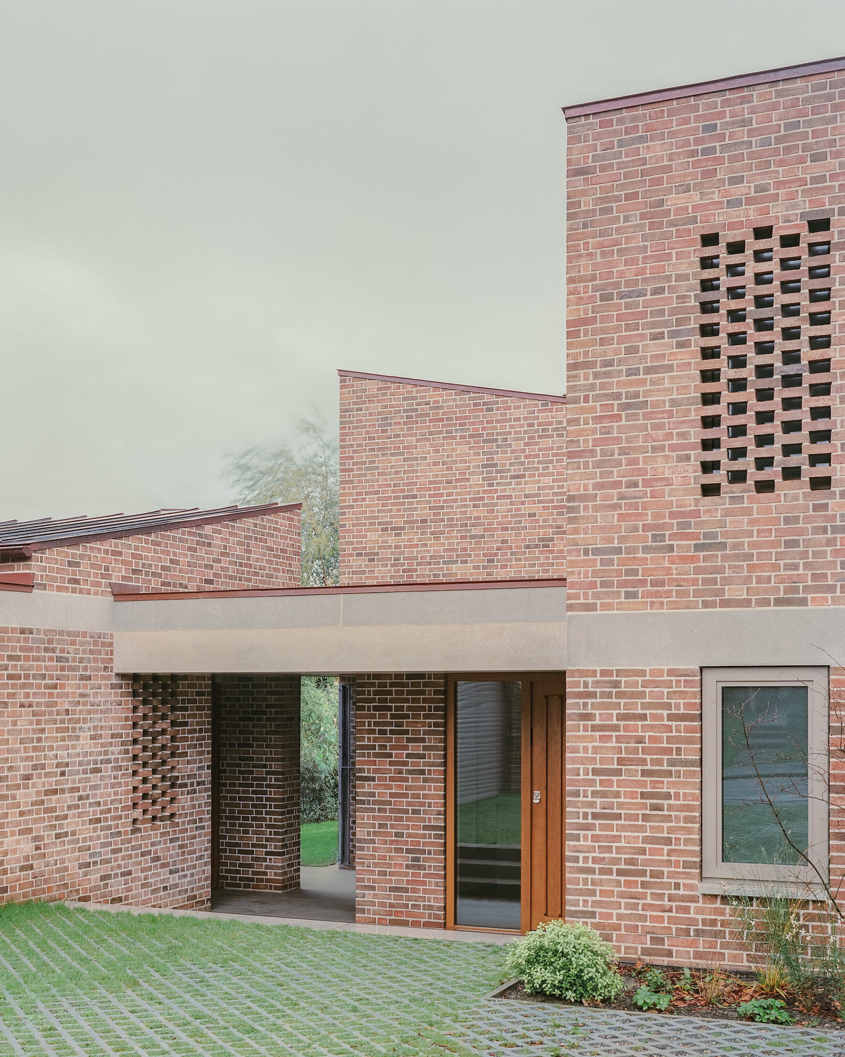
The house is founded on a rectangular plan that is split lengthways into two halves, with each half divided into three distinct zones like a chess board. It sits end-on to the street, some nine-metres wide, and stretches back into the site some 21 metres. To the east, a smaller rectangular garage block pushes forward to the street, creating an entrance court surfaced in grasscrete.
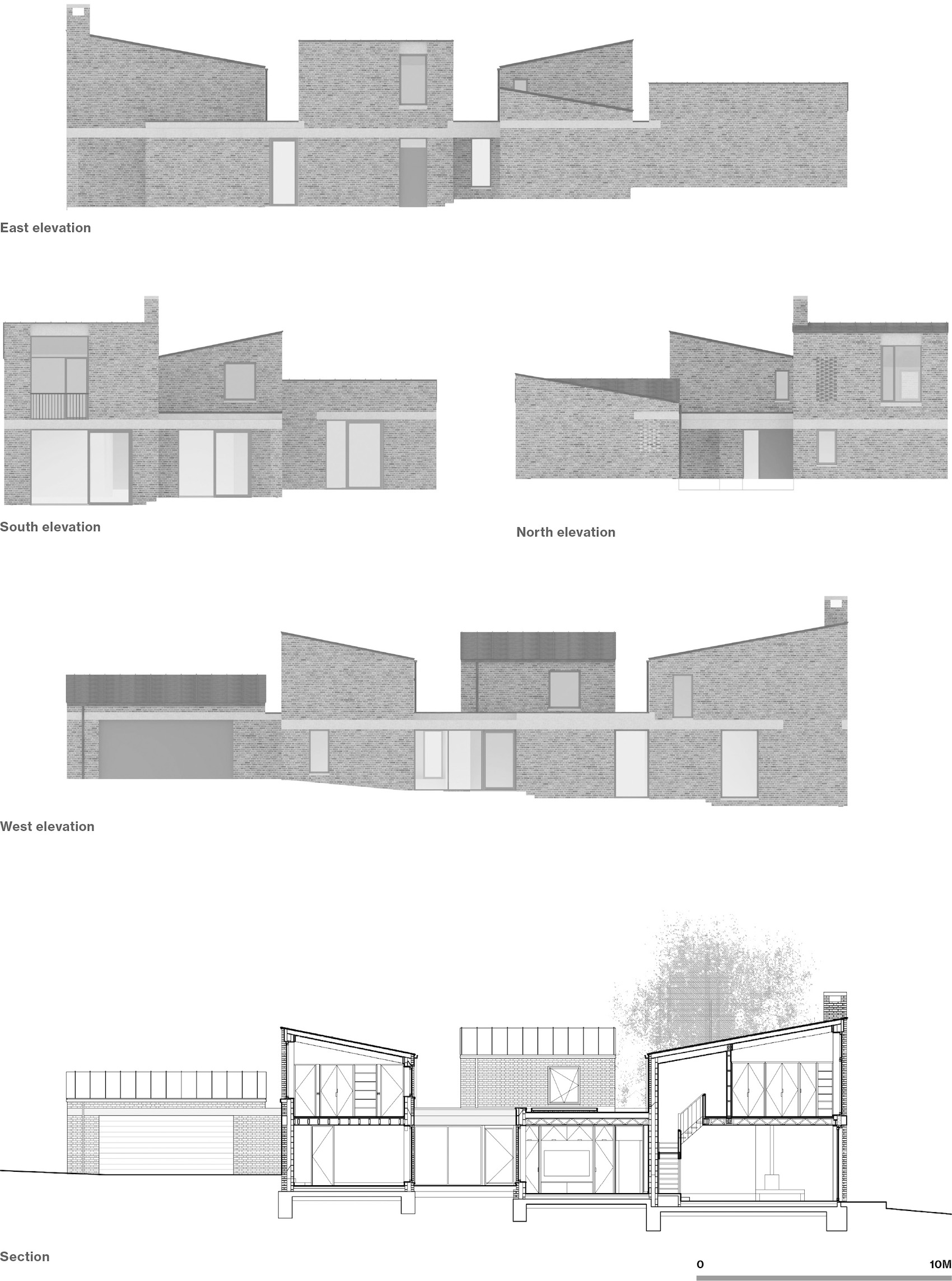
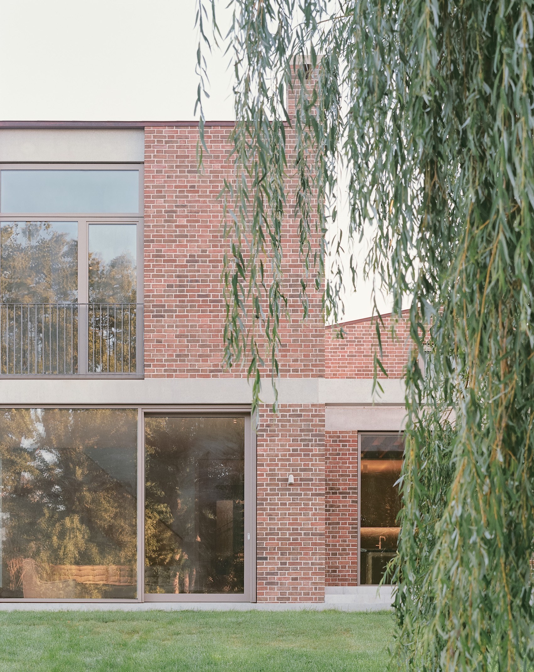
Built in a dusty terracotta-coloured brick with flush lime-mortar joints, the house reads as a single-storey base with a pre-cast concrete beam at first floor level, and three separate, angular brick volumes above. Rendel, however, prefers to describe the house volumetrically, as three small towers sitting within a single-storey base. Both readings are valid but the unique thing about this house is that the three volumes at first floor provide distinct private eyries, each accessed by their own staircase. This came about as the clients have two grown-up daughters (one has now already left for university), so the idea of three distinct bedroom suites fitted the brief. It becomes an intergenerational house, like the large country house built by Rural Office and James Wright in 2017, which won many accolades and wonderfully accommodated many generations of a family in its capacious form – based on numerous reworkings of a traditional Kentish oast house. Yet here, a steady authoritative plan offers a more achievable template for family living.
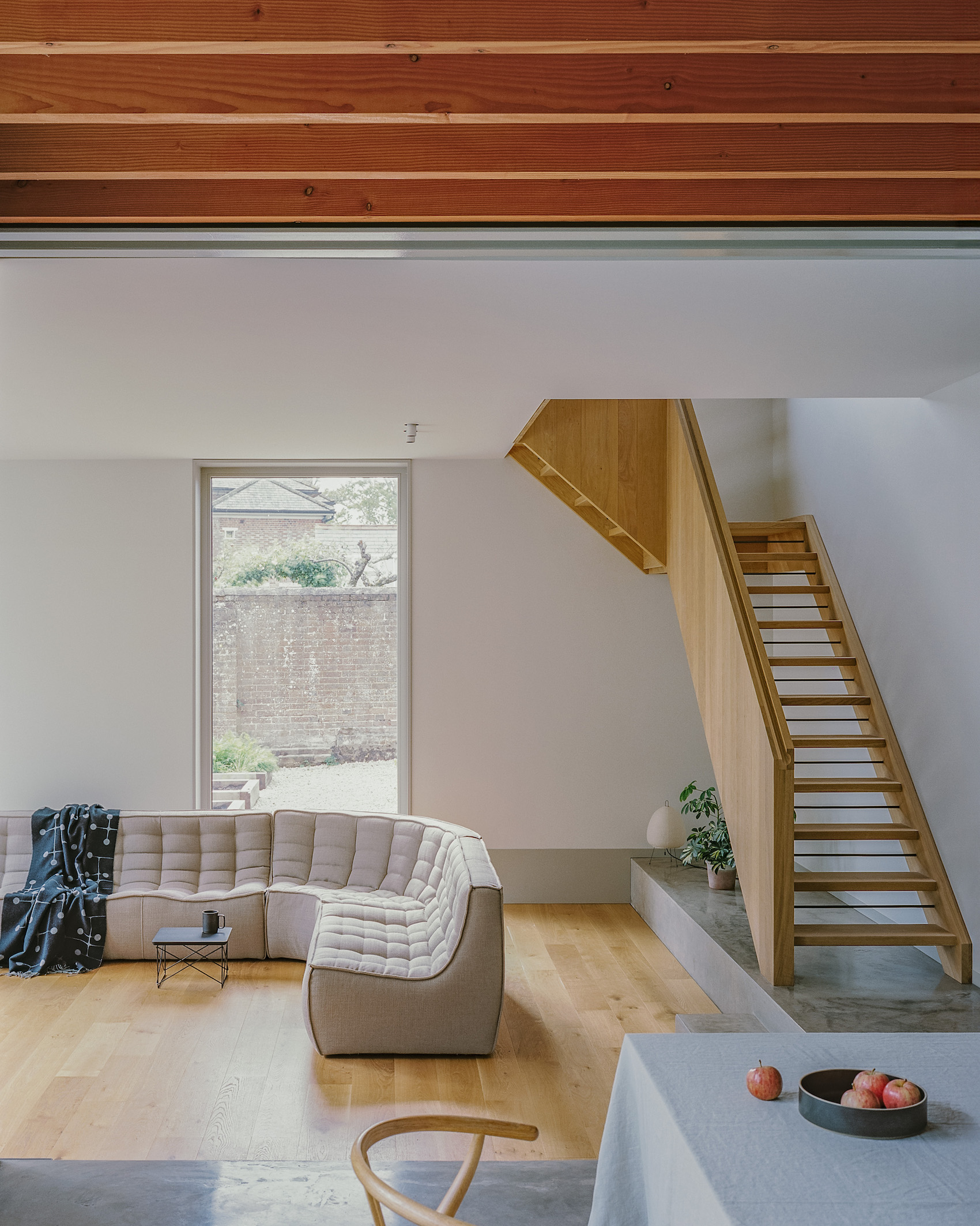
Left: A straight-flight timber staircase leads from the main living space to the master bedroom suite.
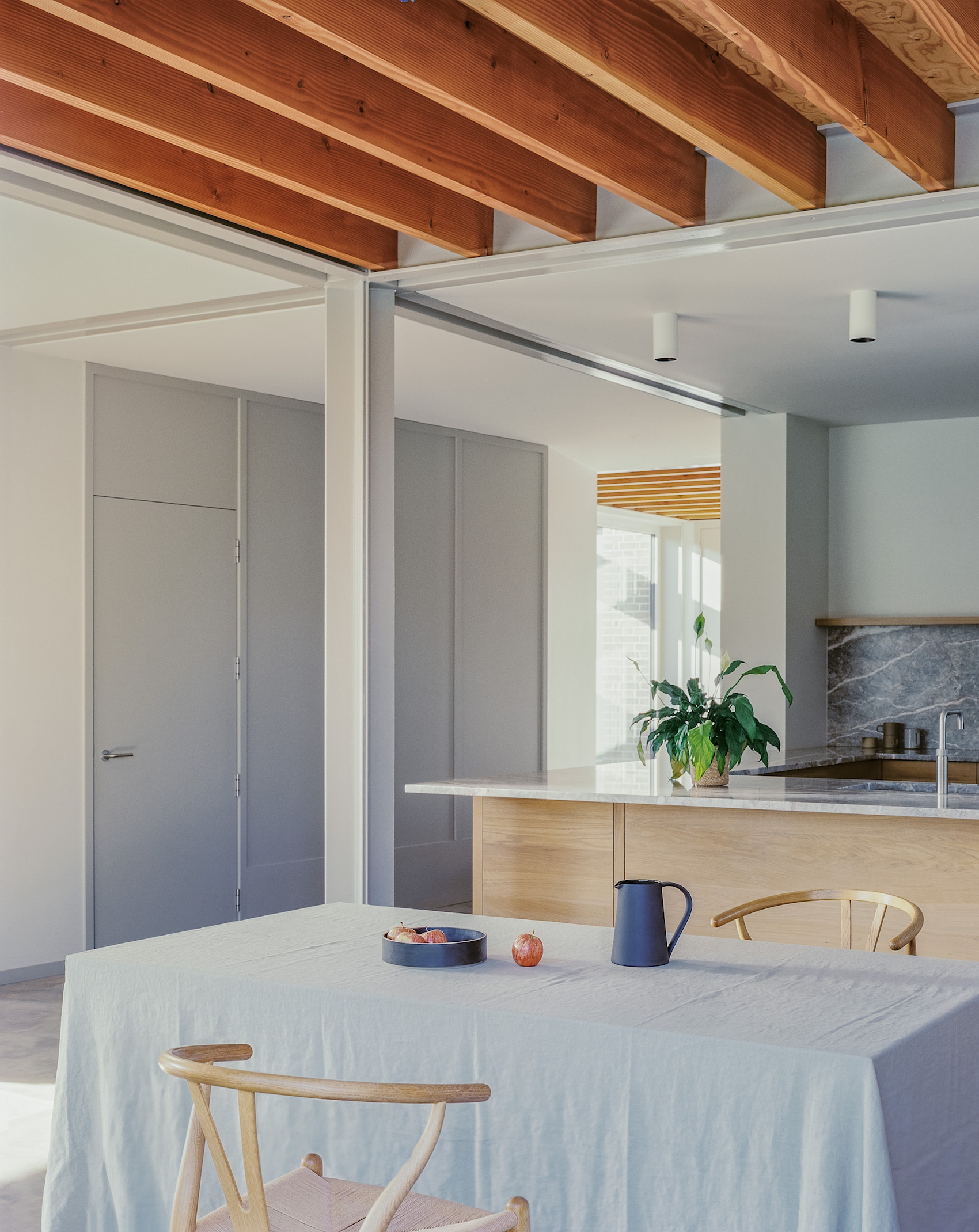
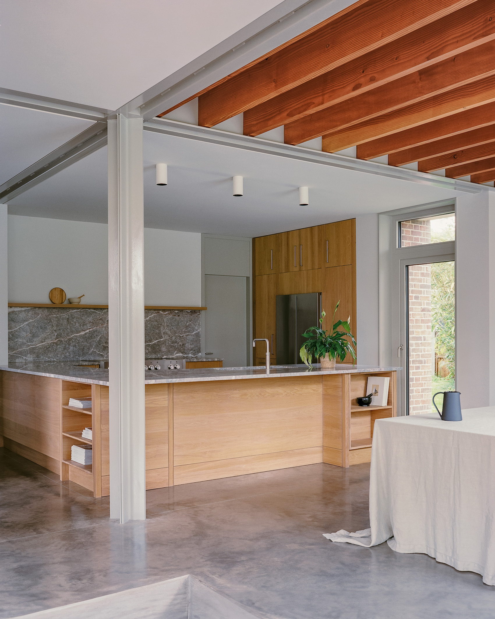
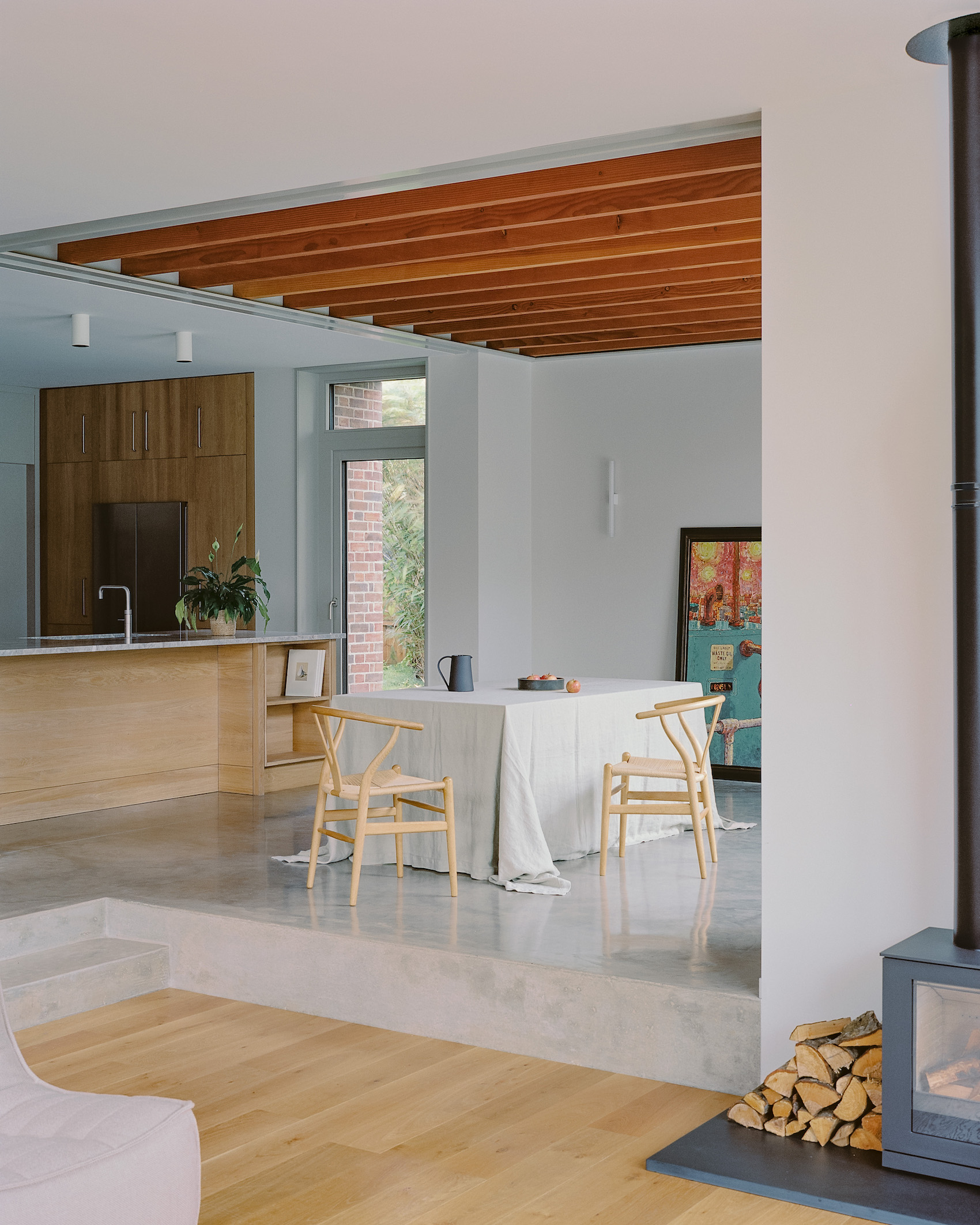
Right: The kitchen opens on to a dining area that includes exposed ceiling joists. Two steps lead to the timber-floored living space.
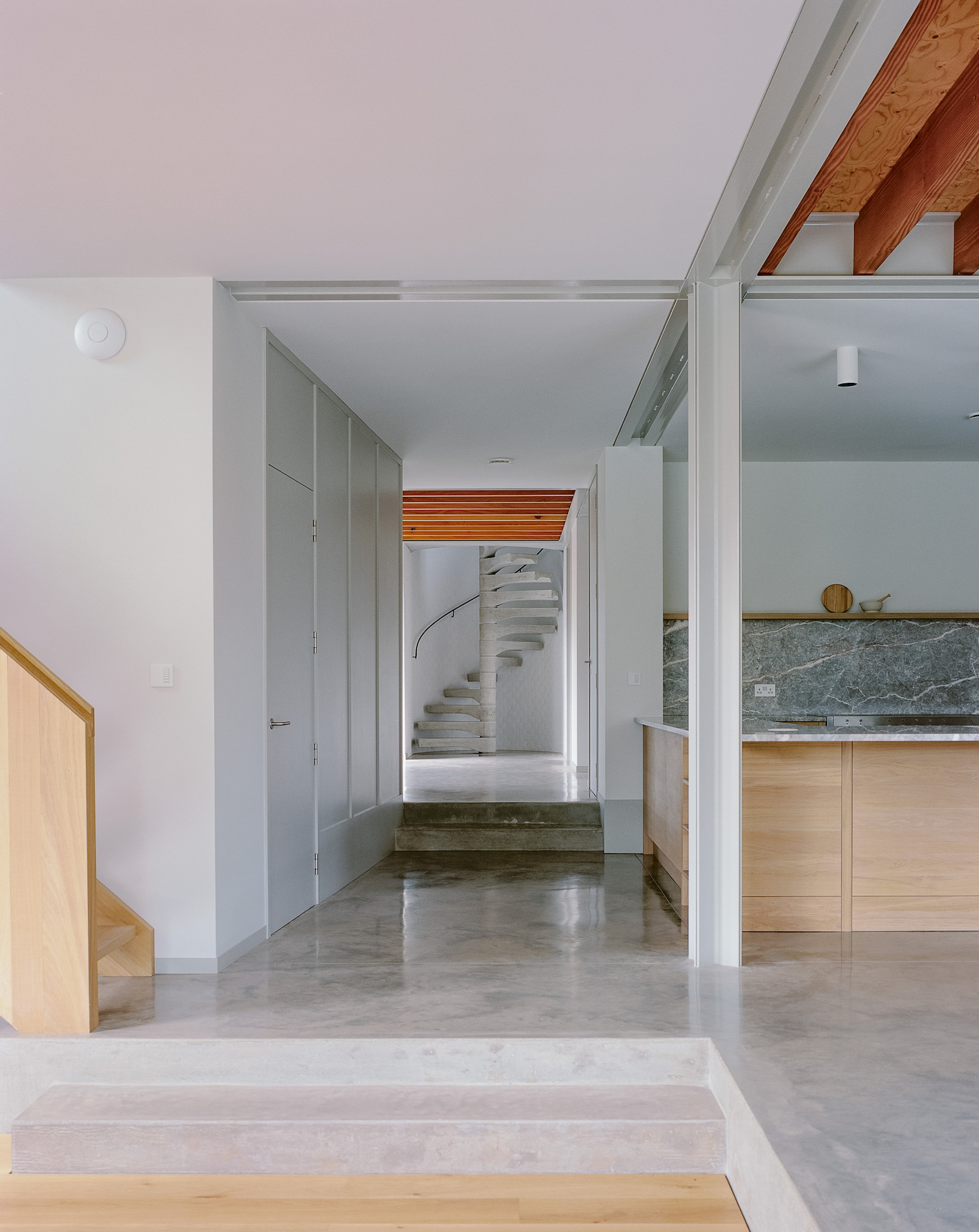
The journey through the house begins by stepping down two broad concrete steps to the front door, sheltered by the flat roof above. To one side a small passageway leads to an entrance into the garage and a side garden gate, while the front door opens into a small lobby that provides a place for coats and shoes. Turning into a hallway, the west side is fully glazed onto the garden, and with an exposed joist ceiling (indicating that it sits beneath a flat roof), there is an immediate sense of intimacy. At the same time, a view along the centre of the house unfolds.
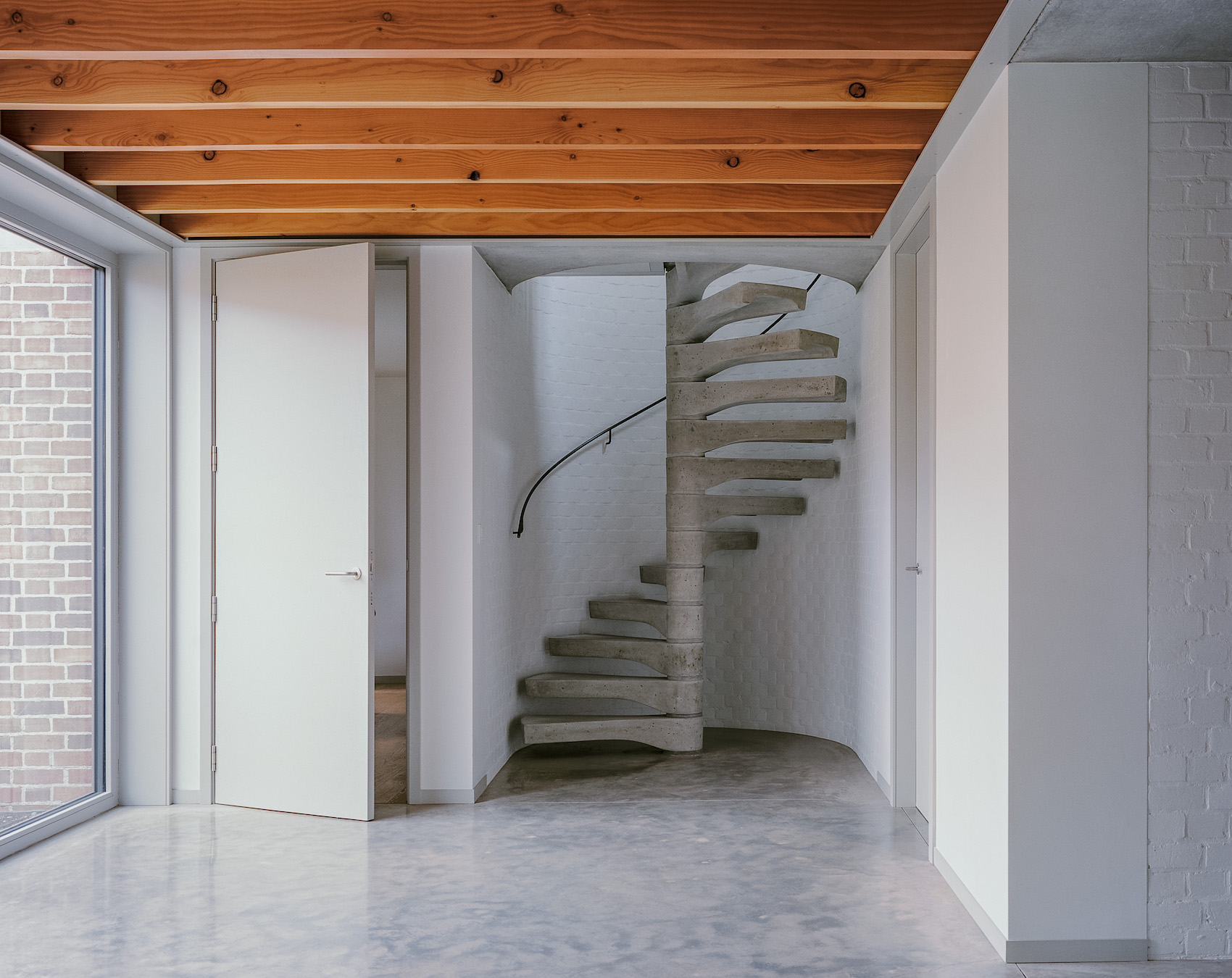
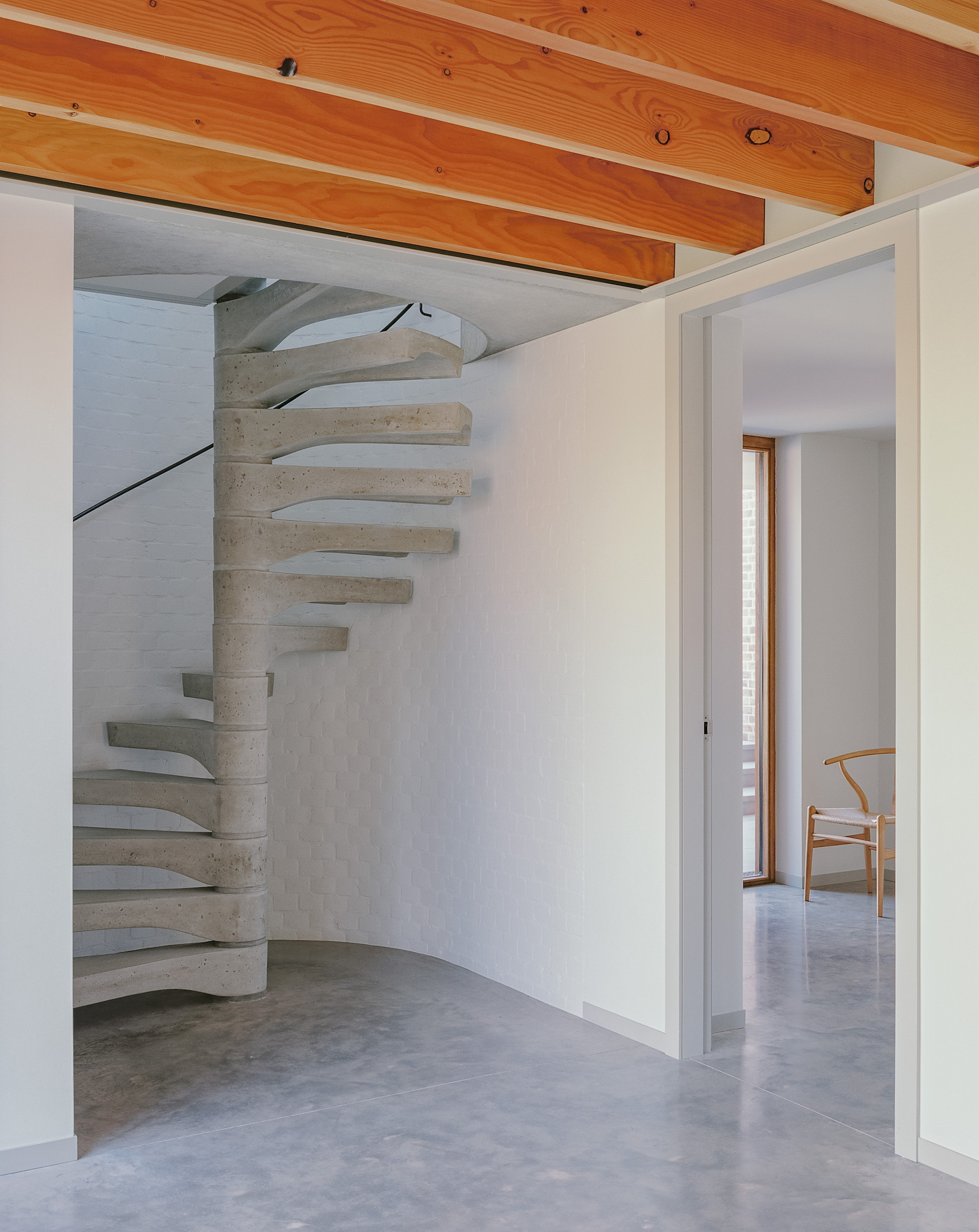
Off the hallway, set at right-angles to each other, are white-painted, curved brick alcoves with sturdy, precast concrete spiral staircases that lead up to the daughters’ separate bedroom suites. These stair alcoves have the feel of an old church tower, with a skinny 16mm diameter steel handrail set on simple rod brackets that winds its way up the wall leading up to the light above.
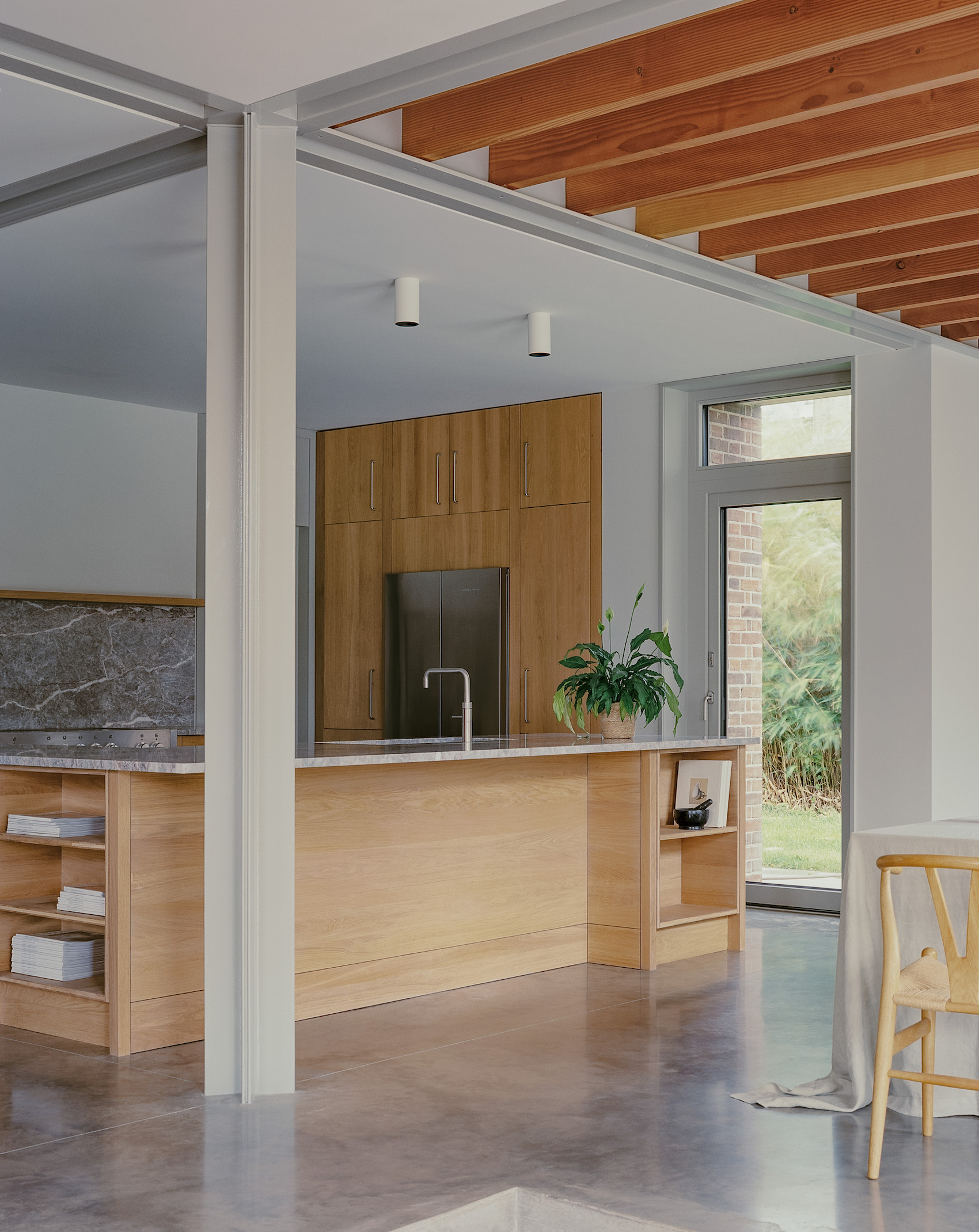
Moving through the house, two more steps drop down alongside a slightly angled wall concealing a snug and, to the other side, a U-shaped stone worktop defines the kitchen space. This in turn opens onto a dining area, again with an exposed joist ceiling. Two steps further down is the main living space, culminating with tall sliding doors onto the garden. To the rear of this space, a straight-flight timber staircase rises to the master bedroom eyrie – the third and largest volume, which enjoys distant views across the village to the South Downs.
At the nexus of the kitchen-dining-living space is a cruciform steel column formed by four back-to-back angles – a nod to Mies van der Rohe’s Barcelona Pavilion and Villa Tugendhat, but here painted grey rather than chromium plated. This is rotated 45 degrees to neatly align with the steel beam structure above and express a certain freedom from the orthogonal plan.
This journey through the house reveals a series of linked but discrete spaces off a main circulation route that steps down to offer greater ceiling heights as it progresses, culminating at three metres in the main living space. No space is too large, but all are interlinked. This brings to mind Peter Aldington’s Turn End from 1967, a debt Rendel is happy to acknowledge, where the house is magically revealed, step by step.
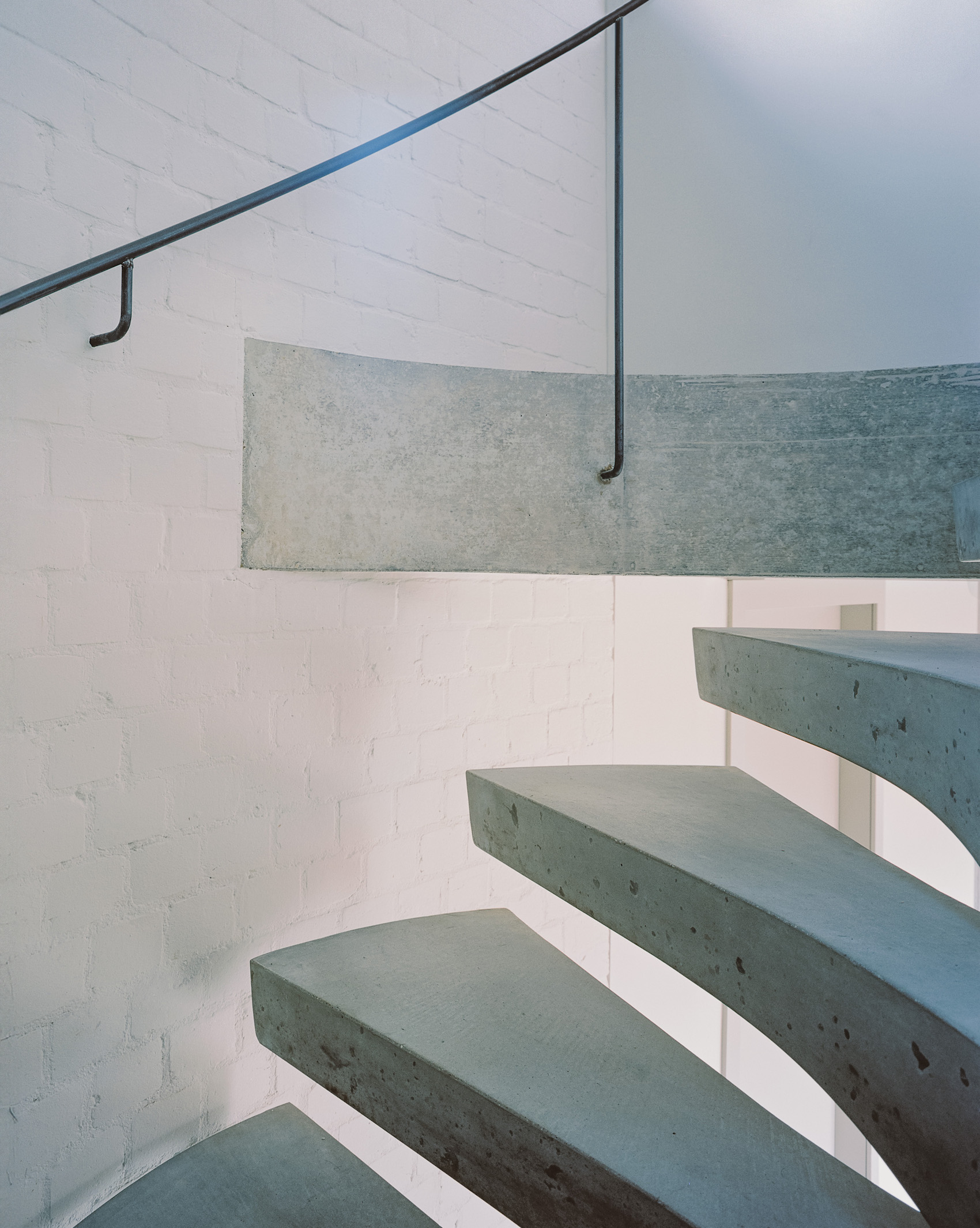
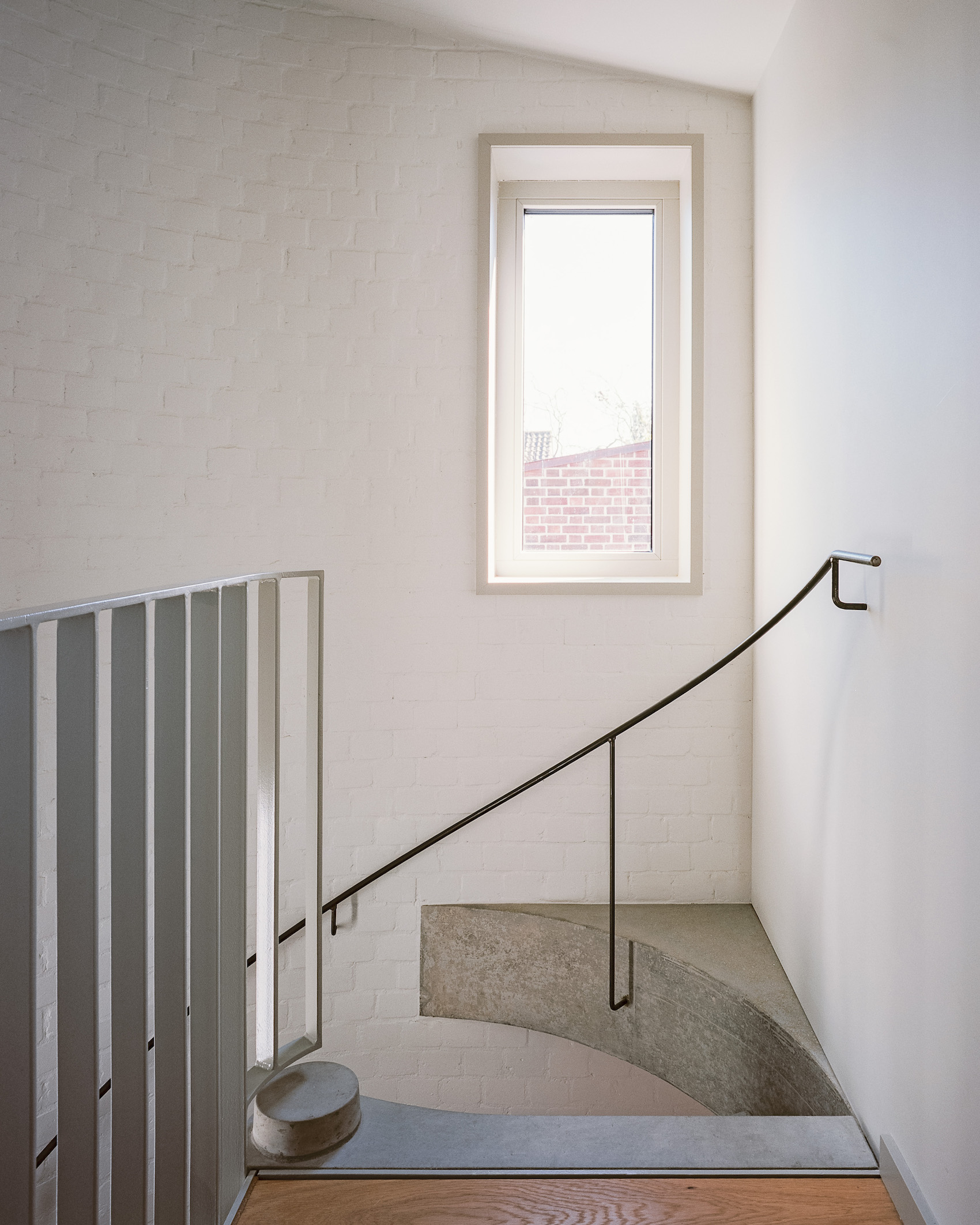
White-painted curved brick alcoves contain spiral, precast concrete staircases to the daughters’ separate bedroom suites.
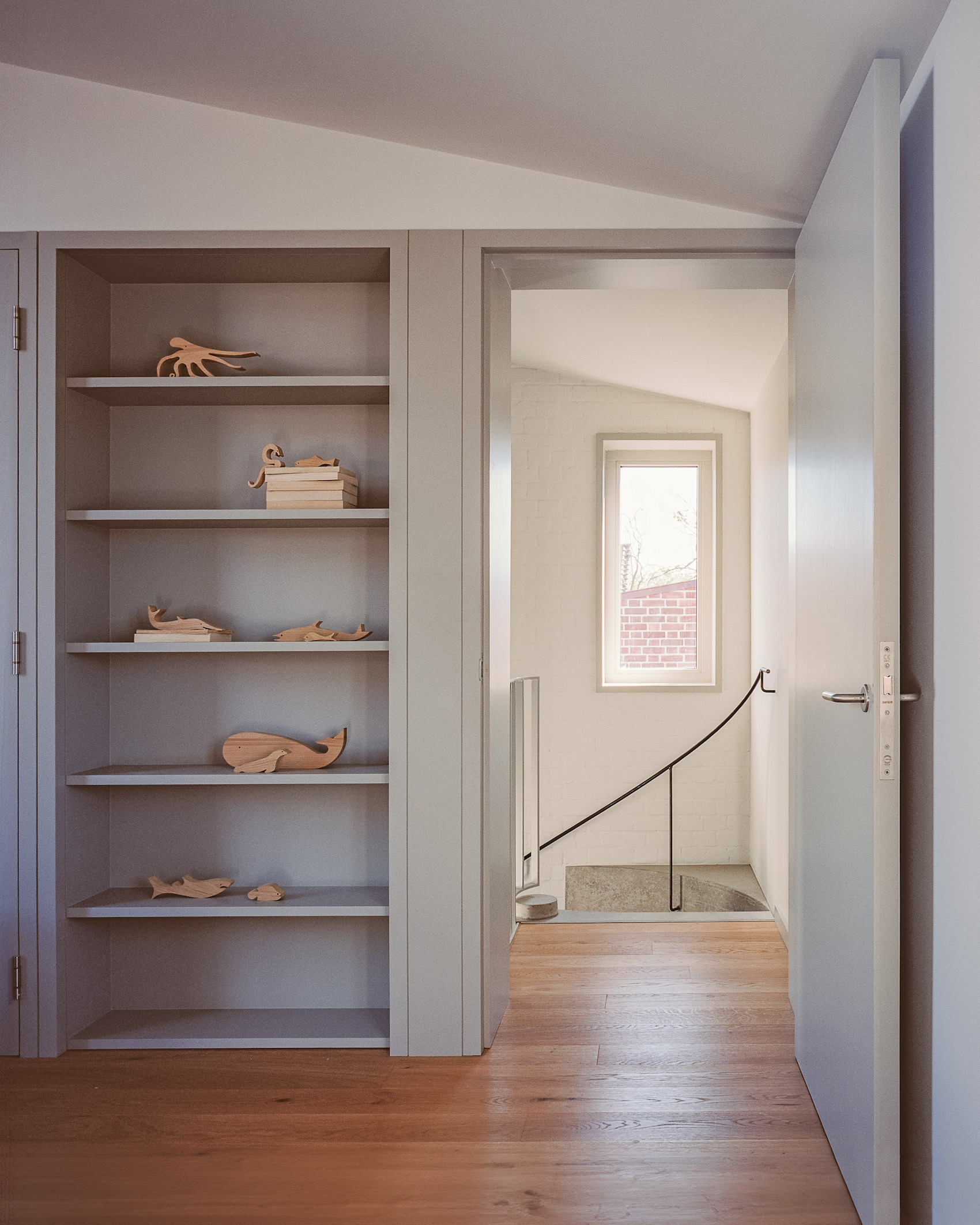
The house avoids the vanity detailing of recessed skirtings and so on, perhaps through budget constraints, but the result is deeply satisfying and matter of fact. Doors, architraves and storage units are gathered into walls of joinery, finished in a greenish-grey satin paint like the windows – all one piece – to read as an overlay onto the white walls. This pragmatic approach also forms the kitchen, where simple carcasses are lent dignity by being faced with three-layer engineered oak boarding front panels with a 4mm outer veneer lending solidity and durability. This boarding also forms the balustrading to the staircase serving the master suite, with a neat oak capping rail that has a curved routed groove for the hand – deftly turning the ordinary into something tactile and precious. Perhaps the one finish that felt a little out of place was the polished concrete flooring on much of the ground level, which just felt too urban.
With the underfloor heating from an air source heat pump and a whole house MVHR system, along with a high-performance envelope and a fabric-first approach to energy use, the house achieved an EPC B Rating at completion. A photovoltaic array with battery storage is scheduled to be installed this year, which will push the energy performance up to an A rating.
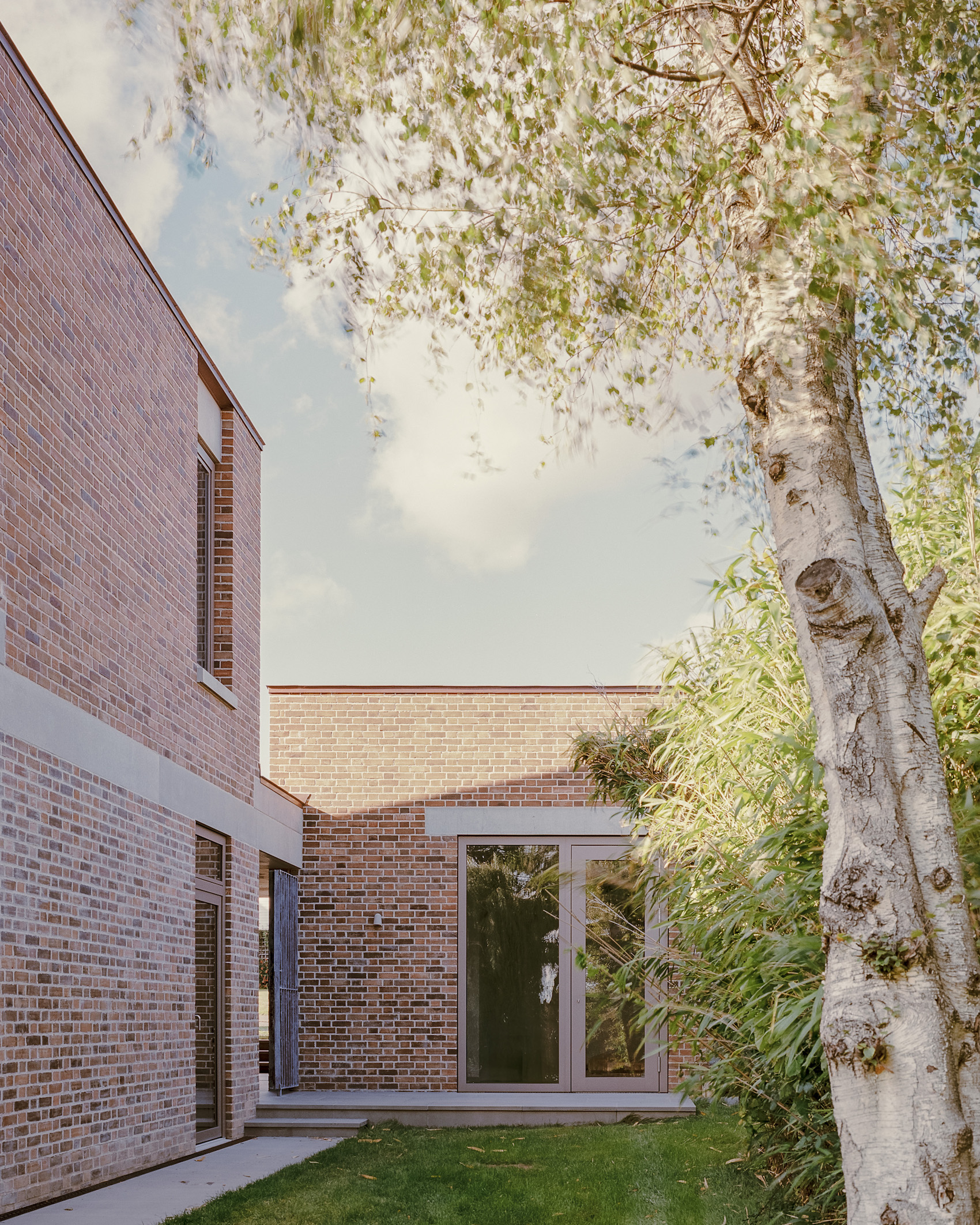
Stepping outside, the brick house is united by the precast concrete band that spans across two inset areas (to the hallway and the back of the dining space, defining a terrace), but cleverly stops short on the third volume. This facilitates an unbroken vertical brick wall, asserting the idea of a tower rather than being just a decorative banding. But this unity becomes simultaneously disjointed, reading as three taller volumes rising above a brick plinth – each with a mono-pitched roof that slopes down into the centre of the house, like a Roman atrium. The roofs present the taller sides to the outside (the garage block with its office space at the back also sits beneath a mono-pitched roof). The roofs and copings are elegantly clad in seamed copper, and with greenish-grey window frames, the overall palette is restrained and perfectly in harmony.
As a composition, the house becomes a cluster of roofs, like a tiny village. This brings to mind another seminal 1960s house by Stout and Lichfield at Shipton-under-Wychwood in the Cotswolds. Here, five lozenge-shaped, mono-pitched roofed, stone ‘rooms’ gather to form a house – immortalised in the 1971 film A Clockwork Orange by Stanley Kubrick.
Looking back at this house with its three staircases, here is a modest architecture that fits its setting beautifully, celebrates its ordinariness, yet manages to be meaningful. It may not shout, but like a gypsy song sung softly, it lingers far longer in the mind than a roaring anthem. This house endures more than the overt, slick houses that all too often make the cover of lifestyle magazines. It is a modest house built in a simple material palette that is hugely accomplished. It would be great to see Rendel take his skills into some housing projects, as he has all it takes to move the dial gently towards a meaningful architecture on a different scale.
Credits
Client
Mark and Gaynor Brooks
Architect
Sandy Rendel Architects
Structural engineer
Structure Workshop
Civil engineer
CGS Civils
Landscape designer
Studio Stour
Approved building inspector
AIS Surveyors
Main Contractor
OAC Build
Precast concrete
Cambridge Architectural Precast
Structural steelwork, gates and Juliette balcony
Futurefabs
Engineered timber joists
Pasquill
Douglas fir
Brooks Brothers Timber
Bricks
Petersen Tegl
Copper roofing
Holmes Metals
Windows and glazed doors
Gutmann
Precast concrete stairs
Spiral UK
Curved metal handrail
Cranbrook Iron
Concrete flooring
Steyson Granolithic
Kitchen tri-ply cladding
Nordcell
Marble worktop
Marmi Remuzzi Bergamo
ASHP and underfloor heating
Nu-Heat
MVHR
Vent-Axia
Additional images