Crown Paints discusses Colour Insights 2025/26, its latest research into the evolving role of colour in the built environment.
In association with![]()
Colour is often considered the final flourish of a project, the surface treatment that completes the narrative. Yet in contemporary architecture and interior design, it is increasingly recognised as a fundamental element of design intelligence. For Crown Paints, colour is not simply aesthetic, it is a driver of human experience, shaping how people inhabit, interpret and respond to the spaces around them.
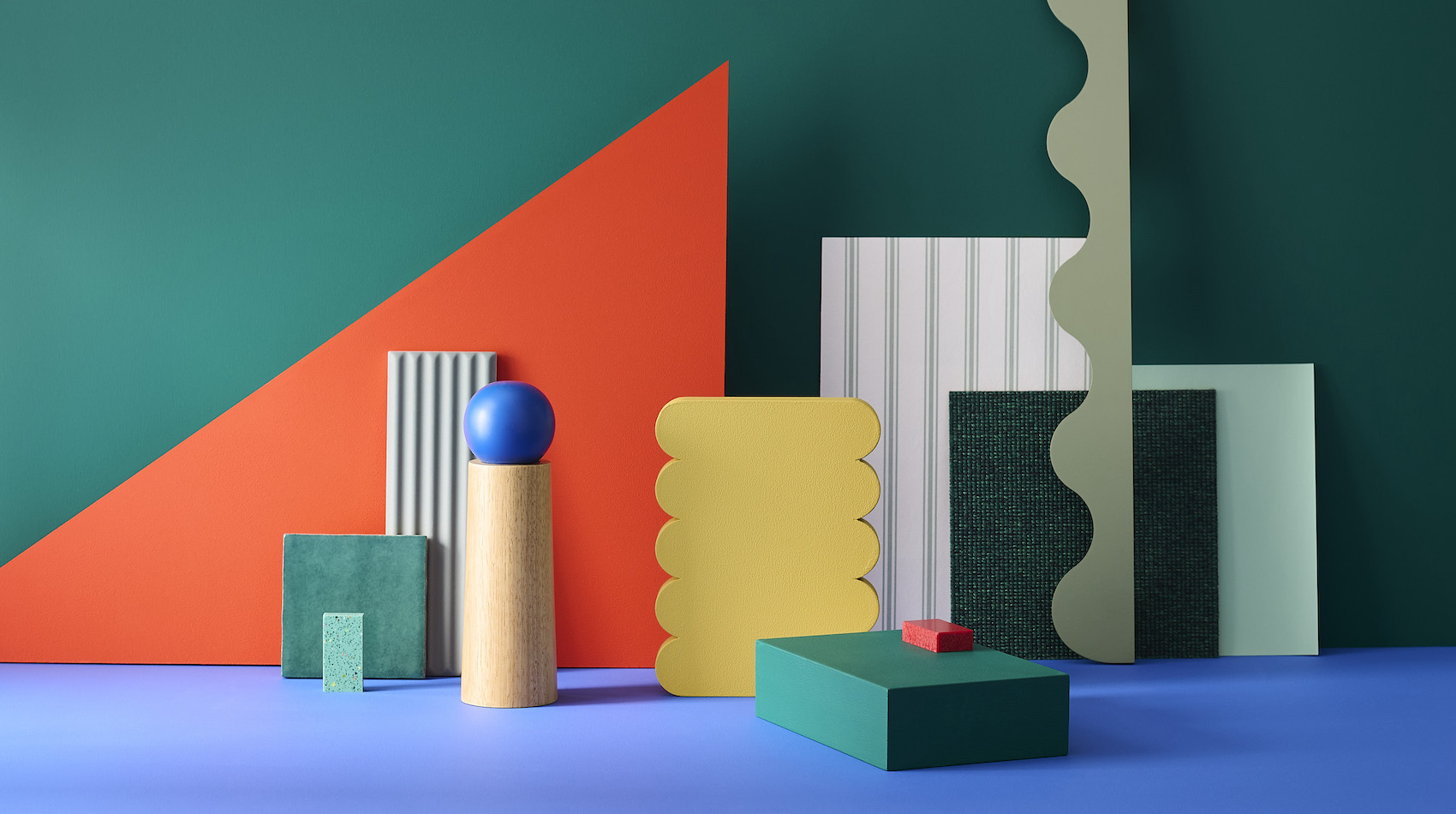
This philosophy underpins Colour Insights 2025/26, Crown’s latest research into the evolving role of colour in the built environment. Bringing together experts across design, manufacturing, technology and behavioural science, the study identifies five palettes – Co, Choreography, Disrupt, G-local and Faraway – each informed by global trends in sustainability, innovation and social change.
The collection reflects an exciting time in design, where designers are balancing performance with emotion, the local with the global, and the digital with the tactile. As Jemma Saunders, Colour Specialist at Crown Paints, explains: “Colour is so much more than a decorative tool. It shapes how we feel, work and interact within spaces. These palettes offer a framework for designing environments that respond to human need.”
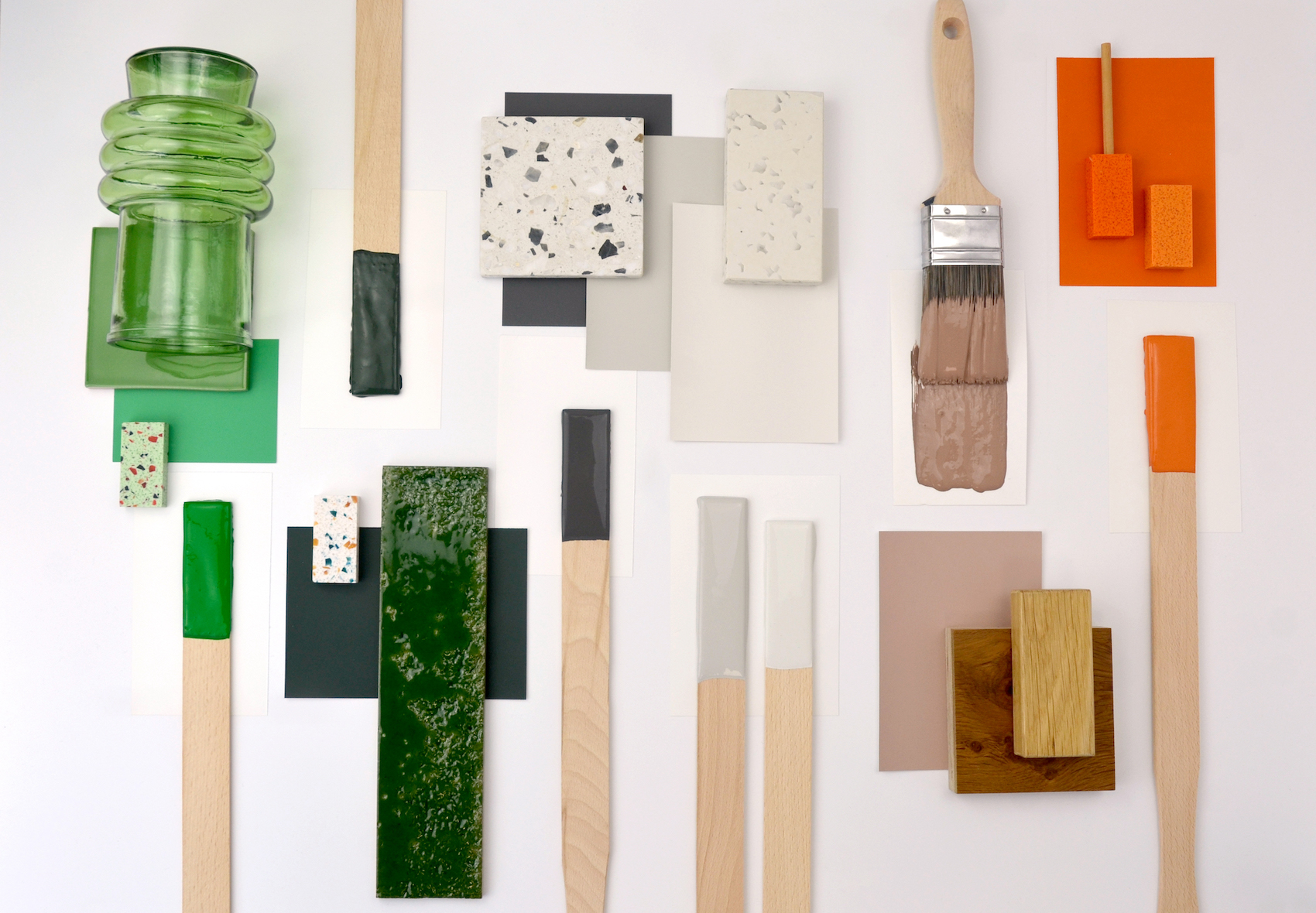
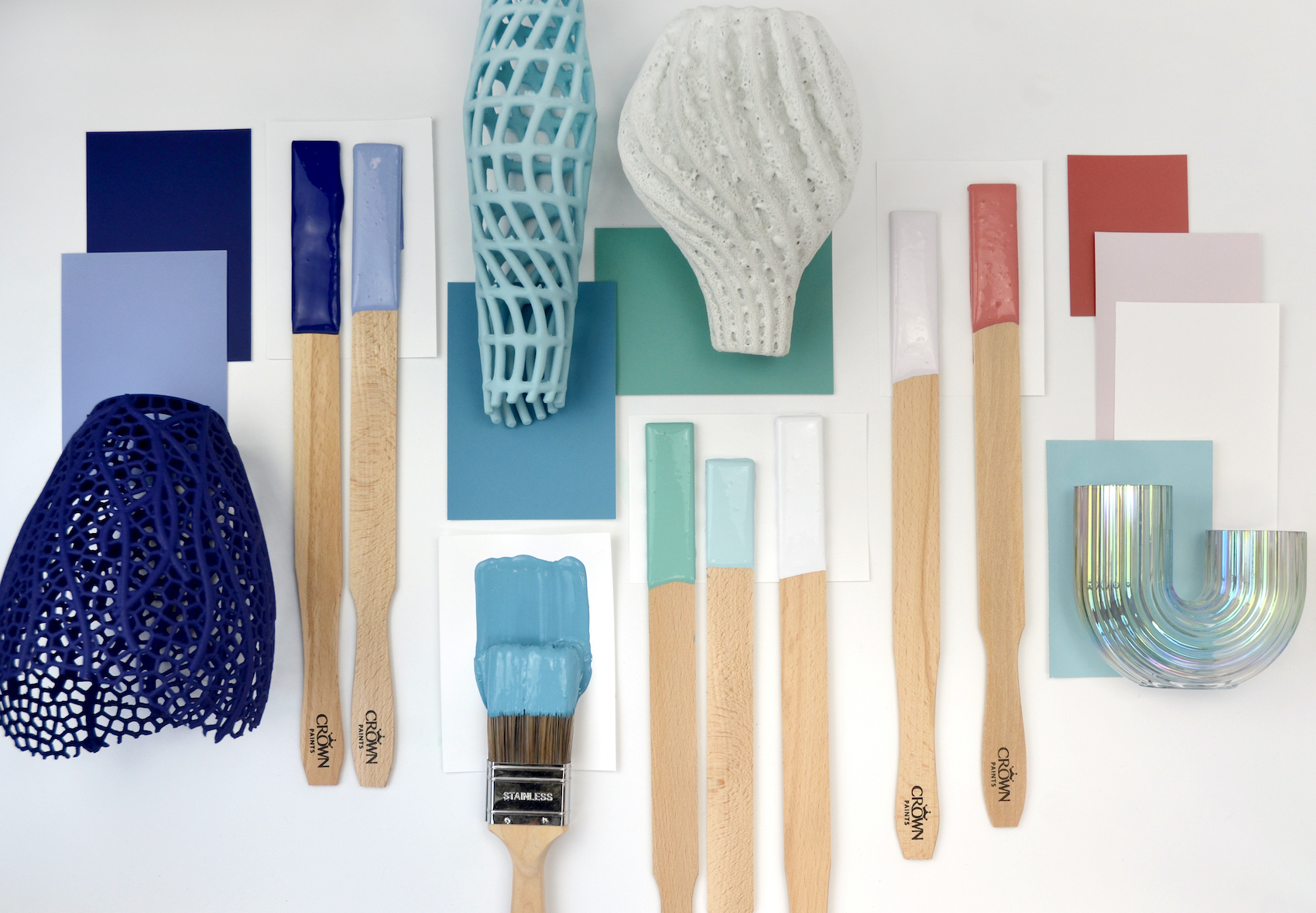
G-local mood board.
Each palette captures a distinct design mood and material direction. G-local, for instance, explores the convergence of traditional craft and contemporary innovation. Neutral greys and mineral tones are offset by saturated green and orange accents, reflecting recycled content, industrial processes and the renewed appreciation for material honesty.
According to Kathryn Lloyd, Colour Specialist at Crown Paints: “It’s about highlighting the impact of sourcing locally and responsibly. G-local celebrates the fusion of natural and synthetic materials – a true balance between the traditional and the modern.”
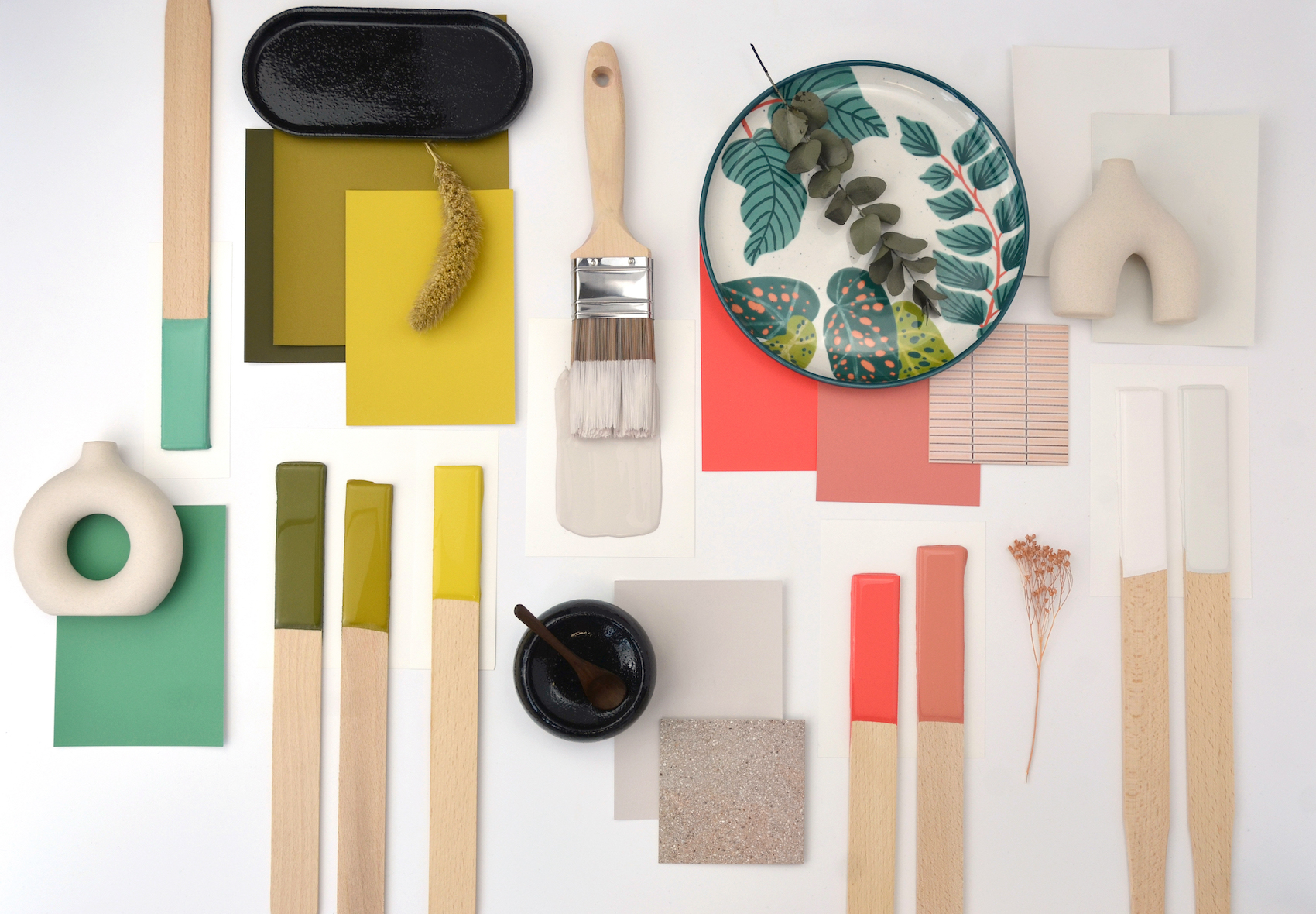
Co mood board.
In contrast, Co channels a sense of community and calm. Rooted in muted greens and soft neutrals, it encourages productivity and relaxation – a palette that feels particularly relevant to post-pandemic workspaces, where architecture must reconcile domestic comfort with professional focus.
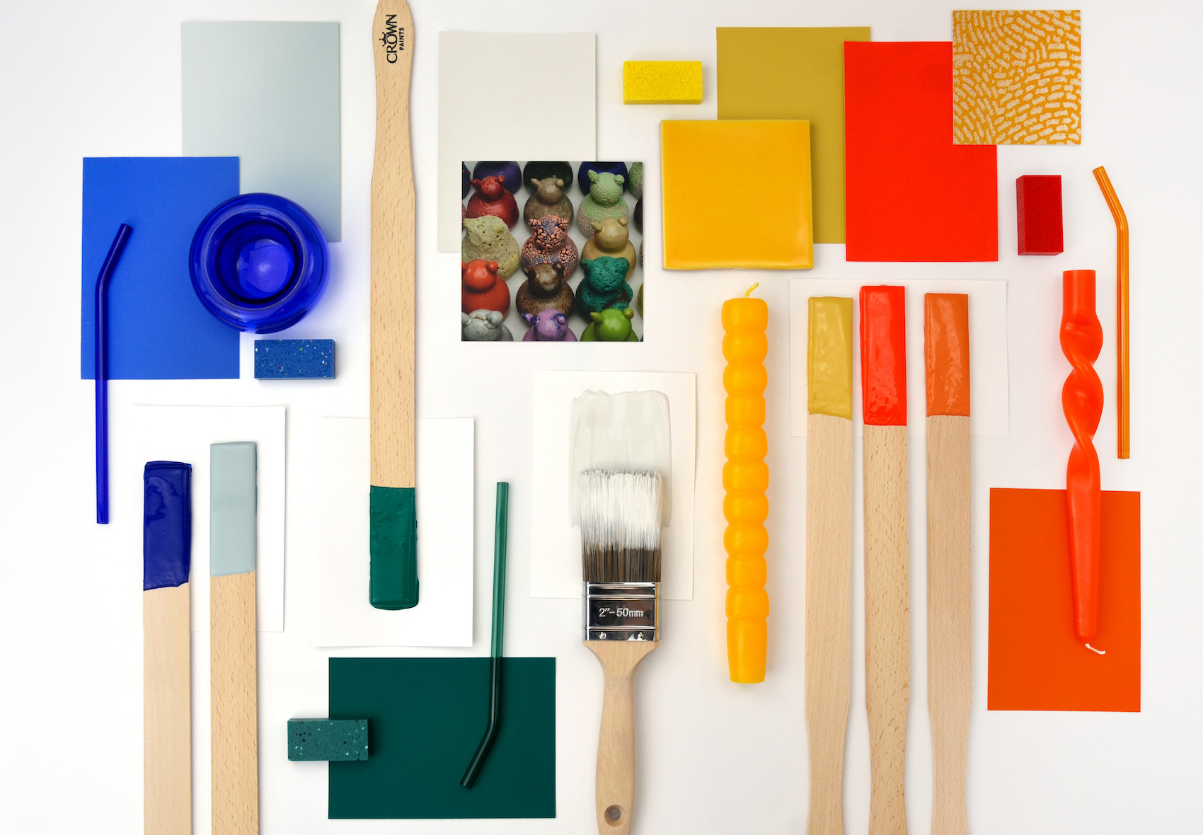
Disrupt mood board.
The more assertive palettes, Disrupt and Faraway, explore the emotional power of contrast and technology. Disrupt provokes interaction through electric blues, saturated yellows and vivid oranges balanced by grounding greys – colours that animate social or collaborative zones. Faraway blurs digital and physical design, its iridescent blues and warm purples evoking reflection and movement – a nod to digital fabrication, adaptive lighting and immersive technologies now shaping practice.
Faraway mood board.
Choreography embodies the sensory dimension of design, expressed through a rhythm of lilacs, greens and warm neutrals that invite calm and introspection. Its adaptability allows spaces to flex with users’ sensory needs.
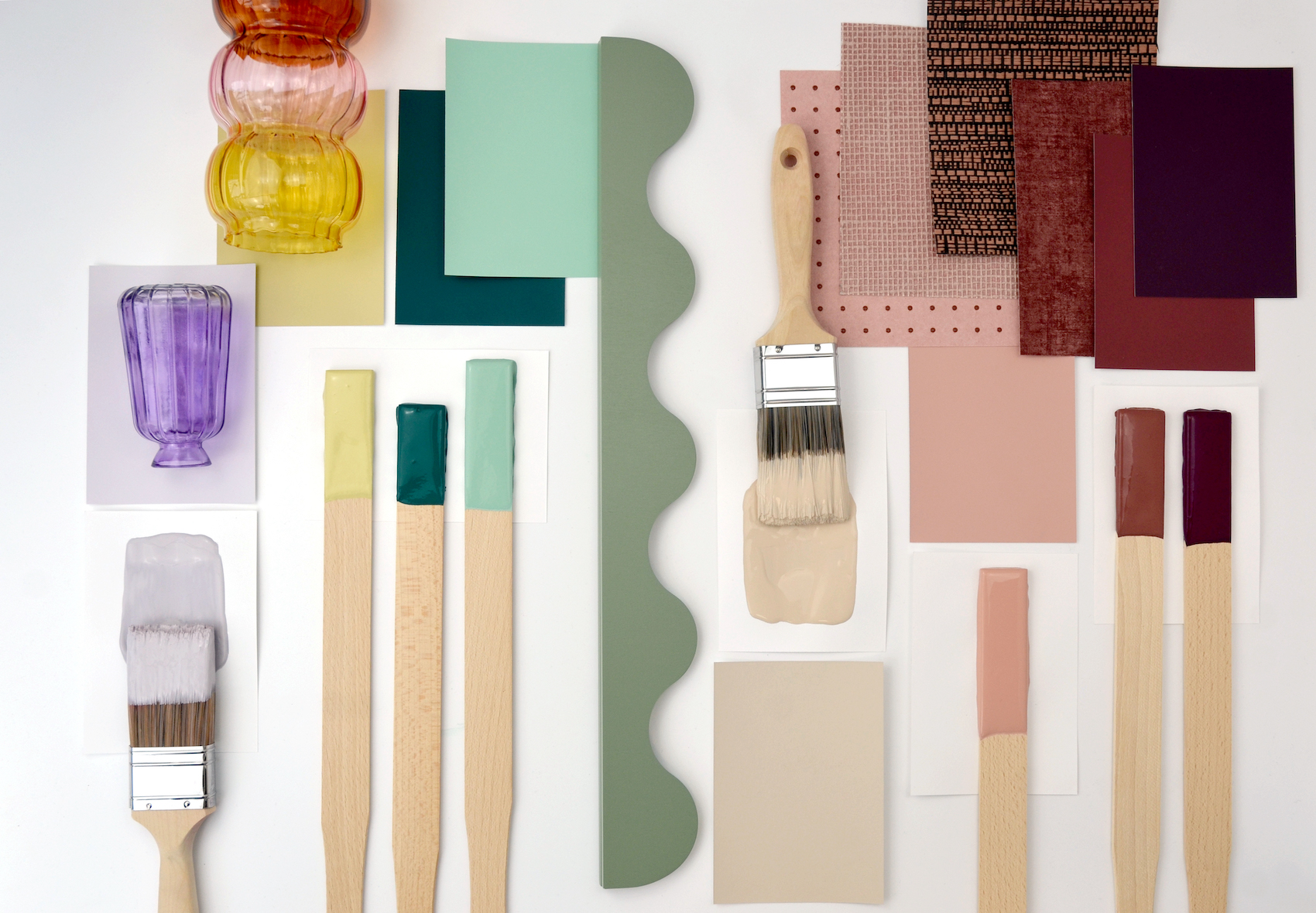
Choreography mood board.
Crown’s colour team views colour not as a fixed outcome but as spatial strategy. Each of their carefully curated palettes are mapped in three-dimensional colour space, analysing hue, saturation and lightness to understand performance under different conditions. This level of rigour gives architects a practical tool for achieving visual harmony, contrast and accessibility across projects.
It also mirrors a broader shift within construction, towards evidence-based, data-driven design that leads to human-centred results. From sustainable material choices to daylight modelling, architects routinely work with quantifiable insight. Colour Insights applies that same discipline to chromatic design, enabling confident specification while addressing the psychological and sensory impact of colour.
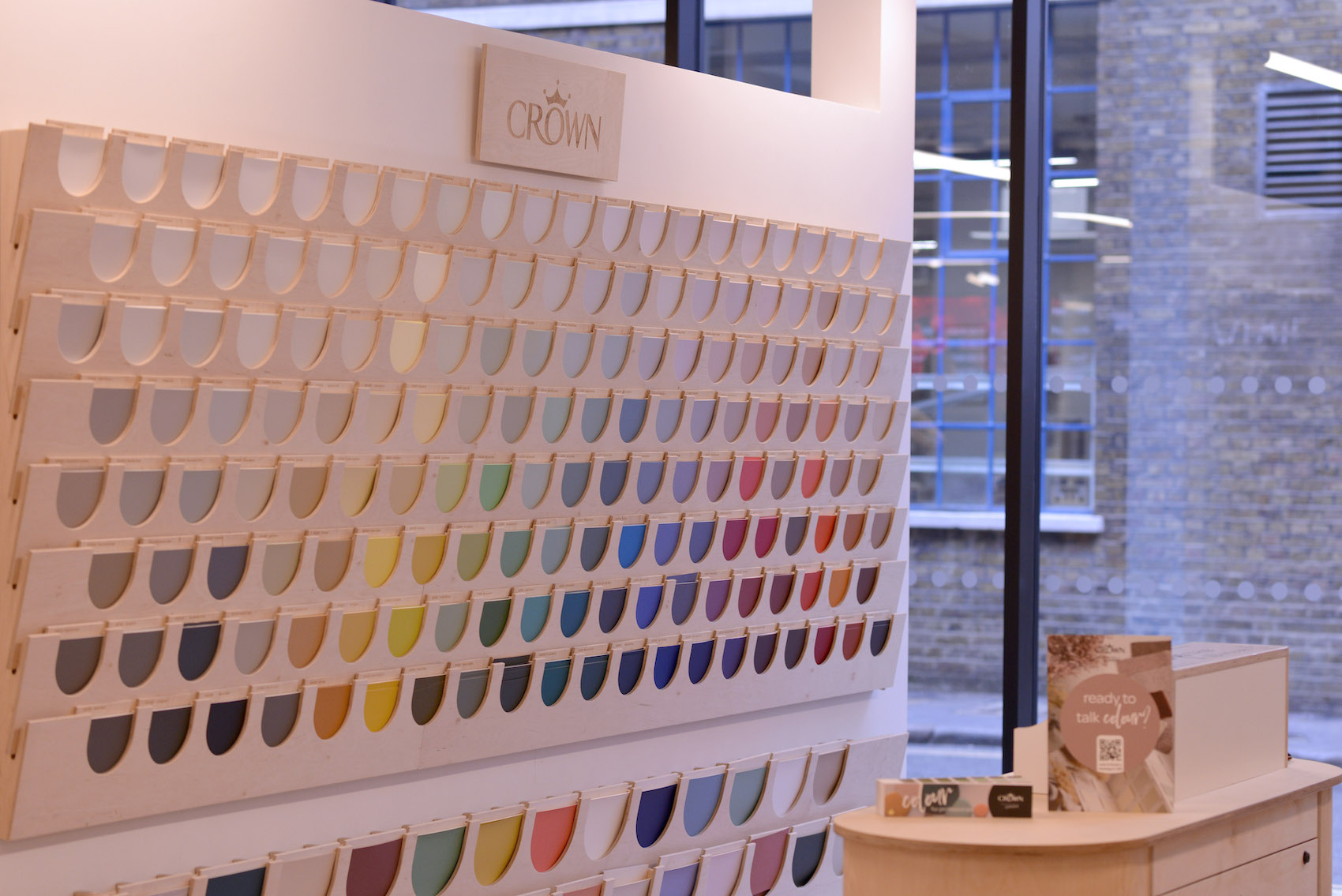
The Colour Edit at Material Source Studio London.
Making colour tangible
At Material Source Studio London, this research is made tangible. As founding paint partner, Crown has created a space where architects can physically engage with colour – not only as a pigment but as a material.
Crown’s installation in the space includes a tactile wall of The Colour Edit – a curated collection developed to support architects and designers in specifying cohesive colour schemes for commercial and residential projects, and from which all Colour Insights palettes are derived, alongside a dedicated mood-boarding area that simulates shifting light conditions.
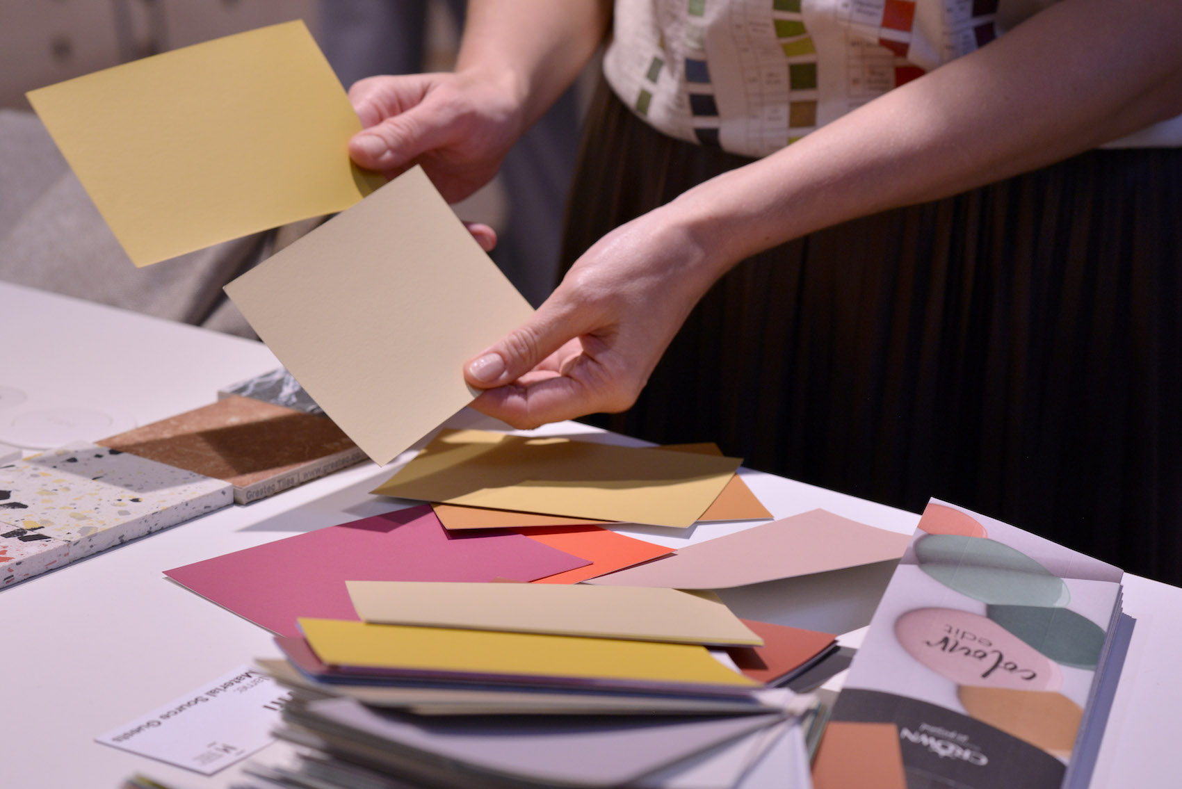
Across the three Material Source Studios – London, Manchester and Glasgow – Crown’s Architectural & Design team hosts regular CPD sessions and one-to-one consultations translating research into application. Topics such as Colour Notation and Technical Colour and Inclusive Colour for the Equality Actbridge theory and construction practice, equipping architects to make informed, evidence-based decisions at specification stage.
For today’s architects, the conversation around colour has evolved. It is no longer a matter of taste, but of performance, sustainability and human connection. Colour Insights 2025/26 demonstrates how colour can anchor a scheme conceptually, enhance user experience and deliver measurable benefits to wellbeing and inclusivity.
Architects and designers are invited to experience these insights first-hand at Material Source Studio London, Manchester and Glasgow. There, visitors can interact with real paint samples, explore the palettes in depth and join discussions on the role of colour in the future of architecture.
As Crown’s research makes clear – colour is not the end of design, it’s the beginning of it.
Contact Details
For more information please visit the Crown Paints website.