Studio MUTT strips back a 19th century factory in Stratford, rediscovering its history as a former home of the Great Eastern Railway’s printworks.

Liverpool-based practice Studio MUTT has completed the redesign of a former 1890s printworks in east London for the developer General Projects. Built in 1893, the printworks served as Great Eastern Railways’ press used for tickets, timetables, and posters. Printing took place within four stacked open floor plates, with large north light windows ribboning across the top floor. Monumental steel beams spanned the width of the building, creating an inherently flexible plan which, over time, was fragmented into cellular offices with minimal shared amenities.
General Projects commissioned Studio MUTT to provide improved workspace for existing and new tenants along with a new entrance, prominent reception, and pockets of communal space scattered through the building.

Studio MUTT’s holistic design – which included work on interiors, bespoke furniture, graphic design and wayfinding – set out to celebrate, and to build on, the building’s history. Much of the design was about peeling back and revealing the original architectural features, most of which had been covered up and/or painted over.
New elements, such as doors, a reception, tea points, washrooms and meeting rooms, have been expressed in an architectural language that is a contemporary take on the industrial aesthetic; simultaneously paying tribute to, and contrasting with, the material and detailing of the original brick and steel.

Staff and visitors enter through a large profiled-metal door that slides open to reveal the studios behind.
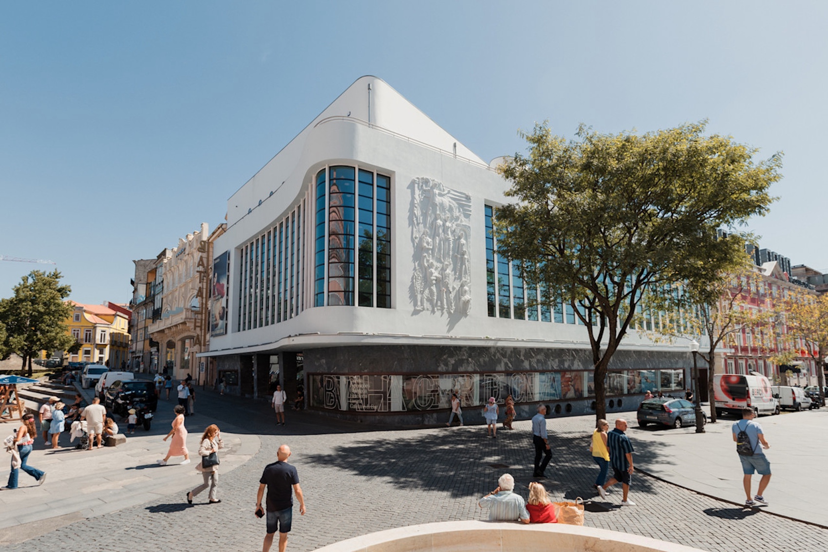
Major changes began with the ground floor, where a large profiled-metal sliding door, metal triangular canopy and signage signal the building’s new identity as Stratford Workshops. While the previous reception area was housed outside the building envelope in a cluttered construction container, visitors are now greeted by a modern reception and waiting area, which opens onto a shared meeting area dominated by a large communal table.

Custom-designed coloured MDF timber, gives a nod to the aesthetics of the industrial machinery that would have once sat in the space, but also to the minimalism of Donald Judd. A series of new elements have been designed to appear as large objects dropped into the original factory floor. A large, panelled, timber box houses two meeting rooms – one orange, one teal – as well as bathrooms, a kitchenette and mechanical servicing.
A timber hut resembling a railway signal box contains two individual booths for quiet meetings and private calls. These insertions – startling but somehow familiar – breathe new life into the building, signalling a new chapter in its evolution.

Photograph (above) and axonometric drawing (below) show how colour was used to aid circulation through the building, with bright orange and a darker teal being used throughout. The colour palette developed for new elements, including furniture, stairwells and doors, was inspired by the industrial machinery which originally occupied the space and designed to contrast with the neutral tones of the preserved structure.

Wayfinding and colour
The colour strategy, developed in parallel with the material selection and furniture design, was influenced by the bold tones of old printing machinery, as well as the strong graphic colour combination of the tickets that were printed on them. Stairwells, kitchens, bathrooms, and furniture in common parts – along with the factory’s original I-beams – now all belong to a family of burnt orange shades, signalling a clear shift between areas that are shared versus private workspaces.
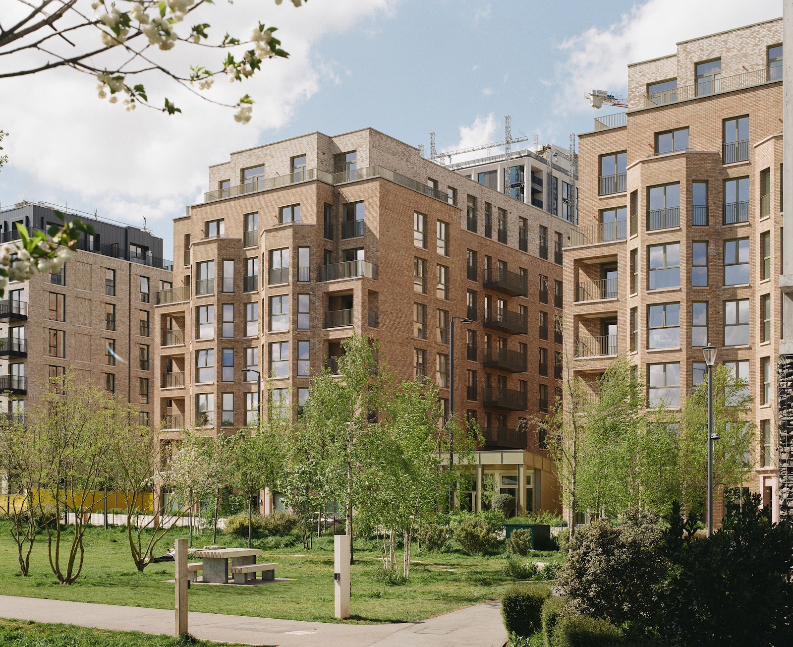
Beyond the ground floor, each office level works to a similar design. Pre-intervention, corridors on the office floors were haphazardly painted in random colours. The redesign harmonised the internal spaces by white-washing walls and adding a deep teal accent colour as a contrast. The teal indicates office entrances, breaking up the monotony of the long, narrow aisles and working as wayfinding.

Photograph (above) and axonometric drawing (below) show the ‘social pockets’ of space that have been integrated across the plan. These new communal areas, such as kitchens, shared bathrooms, meeting areas and breakout spaces, encourage interaction between tenants.

A key goal was to create zones for social interaction on every level, something the previous layout lacked. Underused spaces, such as areas for lockers, were reimagined as unconventional spaces for chance encounters between tenants. Previously, the building had male and female WCs that took up unnecessarily large amounts of space. These have been consolidated, removing the men’s toilets on each floor and converting released space into small kitchens or tea points. The remaining WC spaces have been converted into five unisex ‘super-loos’ on each floor, fitted out with a central shared wash basin and large mirrored panels. The stalls themselves have been fitted with coloured MDF in different shades of orange, creating a patchwork effect.
Heritage, identity and branding
Stratford Workshops’ new identity was inspired by the elegance of Margaret Calvert’s typeface for British Rail – which became the standard for all signage in British railways, as well as the railway tickets themselves. The geometric forms integrated throughout the building reference the punches, stamps, and perforations found on railway tickets, which included triangles, circles, and squares.

Signage and symbols draw on the building’s history of graphic excellence, as well as improving navigation and unifying the space.


Colours from mid-century palettes, such as greens and orange tones, were selected to reflect the building’s heritage, lifted directly from examples of ticket stubs and artwork. The theme of movement associated with train stations and travel was incorporated into the graphics, experimenting with dynamic layouts within painted signage guiding users through the space.
Aside from its original typography, the new Stratford Workshops identity incorporated a series of symbols that represented key architectural elements from the building, such as the north light windows, I-beams, and other structural features. These were then borrowed as motifs developed to aid with wayfinding, with symbols appearing seemingly in motion throughout the space – falling or tumbling down through the shared levels of the building.

The project celebrates original industrial features, such as large beams and windows, while creating contemporary work space.
Internal and external murals were created to announce the building’s new life as a thriving workspace and to re-address its role in the history of graphic design. The large mural in the lobby includes the shapes and symbols that appear to be cascading downwards along the circulation walls throughout the building. A mural on the external wall signals the arrival of a heritage-influenced workspace, that highlights the little-known story of British Railways’ graphic history.
Credits
Client
General Projects
Architectural design
Studio MUTT
Furniture, fixtures, and equipment
Studio MUTT
Graphics and wayfinding
Studio MUTT in collaboration with Corbin Wood
Mechanical and electrical consultant
David Webb Associates
Additional images