Healthcare
Standing the test of time: Kentish Town Health Centre
Paul Monaghan from Allford Hall Monaghan Morris reflects on the enduring success of Kentish Town Health Centre – Healthcare Award winner at the Test of Time Awards 2025 – with David Ransley, practice manager during the project’s conception and delivery.

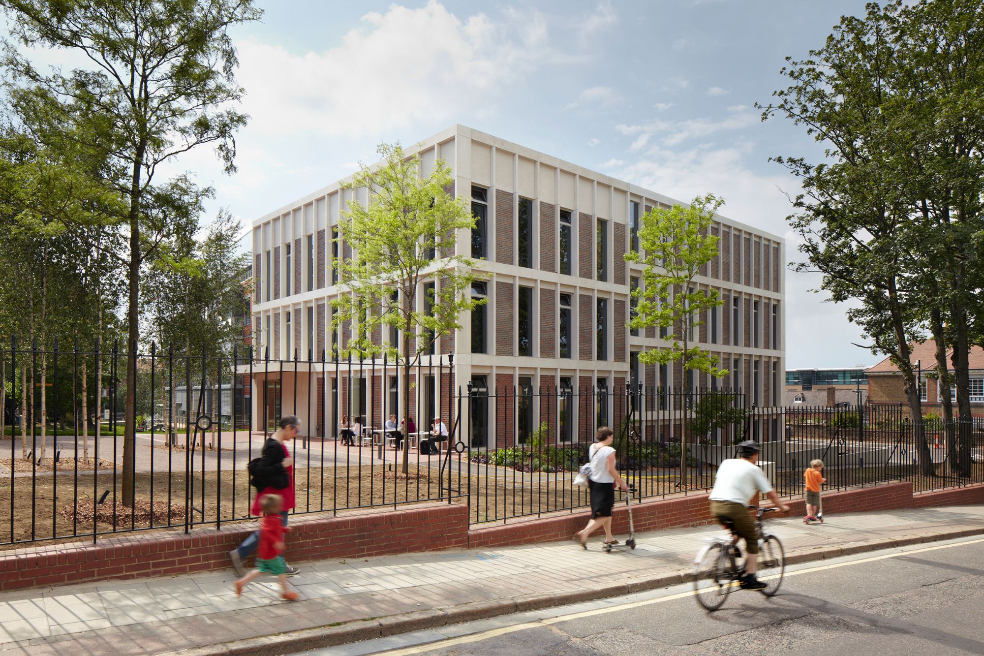
Led by Dr Roy Macgregor, Kentish Town Health Centre (KTHC) in north London was designed to house a GP practice with a wide range of health and community initiatives under one – very welcoming – roof, with a view to improving communication between different services, fostering wellbeing, and optimising the patient experience.
Sustainability was embedded from the outset through material choices, passive design, and travel planning. A mixed-mode ventilation strategy reduced mechanical cooling costs, and features such as electric vehicle charging points and folding bikes, remain in use. The building supports multiple UN Sustainable Development Goals, particularly in health, equality, and education.
Designed to feel like an arts centre or cultural institution, as opposed to a clinical/ corporate environment, the centre houses public-facing clinical spaces on the lower floors and private staff areas above, with discrete access for out-of-hours use. The layout promotes open-plan, flexible working to maximise collaboration, space efficiency, and adaptability.
Since opening in 2009, the building has undergone minor internal adjustments to accommodate an expanding range of services, including hot-desking areas, a dedicated reception for children’s services, and the co-location of multidisciplinary teams. The building has successfully accommodated significantly increased patient numbers, while maintaining its original welcoming, non-institutional feel.

A triple-height, triple-aspect ‘public room’ forms the heart of the building, and provides access to the landscaped garden.
Paul Monaghan The health centre is on a site in the middle of Kentish Town, just off the High Street. The existing building – the previous health centre – was built in the 1970s or late 1960s, but had become quite tired. The practice itself was very old, formed in 1887, and when they chose to build the health centre it was considered to be good enough to be in the Architectural Review. So it was an important building of its time.
David Ransley What we wanted was a new health centre, which patients would be happy to visit and staff would also be happy to work in. That was a really important driver. One of the things that concerned me and my colleagues was staff churn, and we felt that if we could find a building, or create a building, or have a building created which people really enjoyed working in – were loyal to – then we’d be halfway there. And in fact, that proved to be the case. It has been immensely popular with staff and patients alike.
Paul Monaghan From our point of view, what was interesting was the mix of the brief. There was a traditional GP practice, the James Wigg Practice, but also there was Camden’s mental health team, and there were breast screening rooms. It was like a sort of cottage hospital. At the time – we’re talking about 2006 when it was commissioned – there was an idea of rolling these buildings out around the country, and this was going to be a model for it. Since then, we’ve had Wes Streeting, Secretary of State for Health and Social Care, come round, and he’s interested in rolling them out again 17 years later. So I think that mix is still relevant.
A single-storey dark brick plinth supports two-storeys of crisp-white rendered overlapping volumes.
David Ransley I personally wanted there to be what you might call an equality of space and rooms. Occasionally, if you went to a hospital or a health centre and you saw a nurse, they’d be in a room with no windows; and if you had the temerity to say “Why?”, they’d say “Well, I’m just a nurse.” That wasn’t going to do for us at all. So they’re all really nice rooms, and they all have windows, and they all have natural light. Some of them have doors out to terraces. And there is an equality of sharing and occupancy.
Paul Monaghan We knew that the mix was likely to change, so we needed to come up with a building that could flex and rearrange itself as departments grew and people changed their mind. The main surgery was very fixed in its brief, but the rest of it was still quite flexible with Camden. So we came up with this metaphor of the game Jenga, where you could push things in and pull things out. Different departments could squeeze around and we could be geometrically more abstract about the way the building would hold together. But at the heart of it there was a street that people could walk through at any time of day, and the reception would be in the middle, with private areas on one side and public rooms on the other. There was also the idea that as you walked through that central street you would catch glimpses of, say, the dentist, or other areas of the building, and everyone would feel connected. Importantly, this concept of Jenga broke down the massing of what was effectively a tall three-storey building surrounded by two-storey houses. And finally, we were trying to break down the institutional nature of the building. When we first went around the building it looked more like an art gallery than a health centre – and that was very important to David and our other clients. Alan Bennett, the playwright, who was a great supporter of – and patient at – the centre, said at the opening that it was the sort of building that makes you want to be ill, which is a great compliment and typical of him.
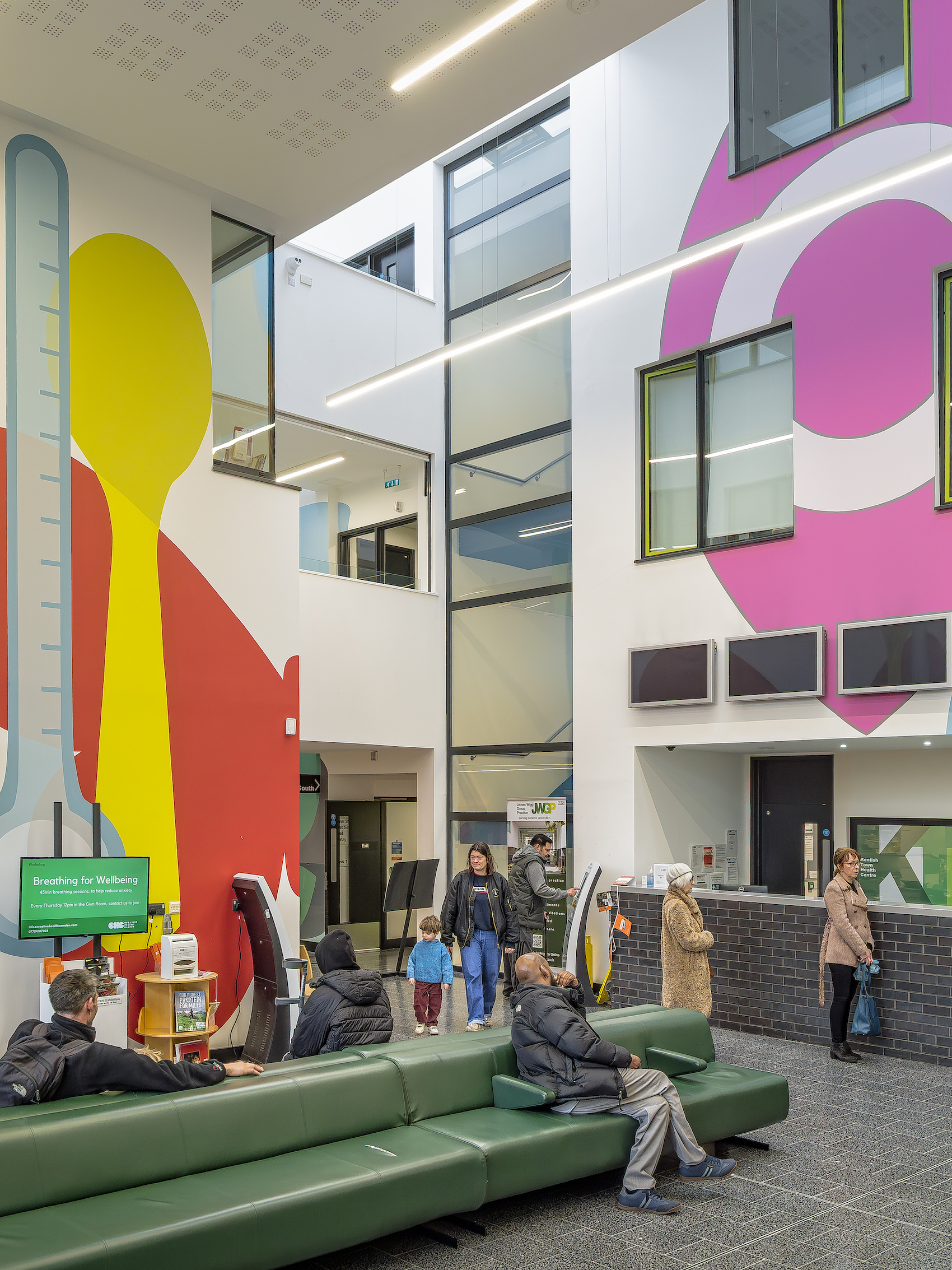
Bold graphics by artist and designer Morag Myerscough articulate the interior spaces, including the triple-height public reception area.
David Ransley As the client, we felt that this was going to be quite a difficult project to get through local planning, and certainly the articulation of the bulk and mass helped enormously. Anything that was salvageable from the old building was salvaged or recycled. The old building was ground up and forms the piling mat for the new building, and that went down very well with the local residents, who slowly came around to the idea that this could actually be rather a nice thing sitting in their midst. All credit to Paul and his team for that; it was a really brilliant idea.
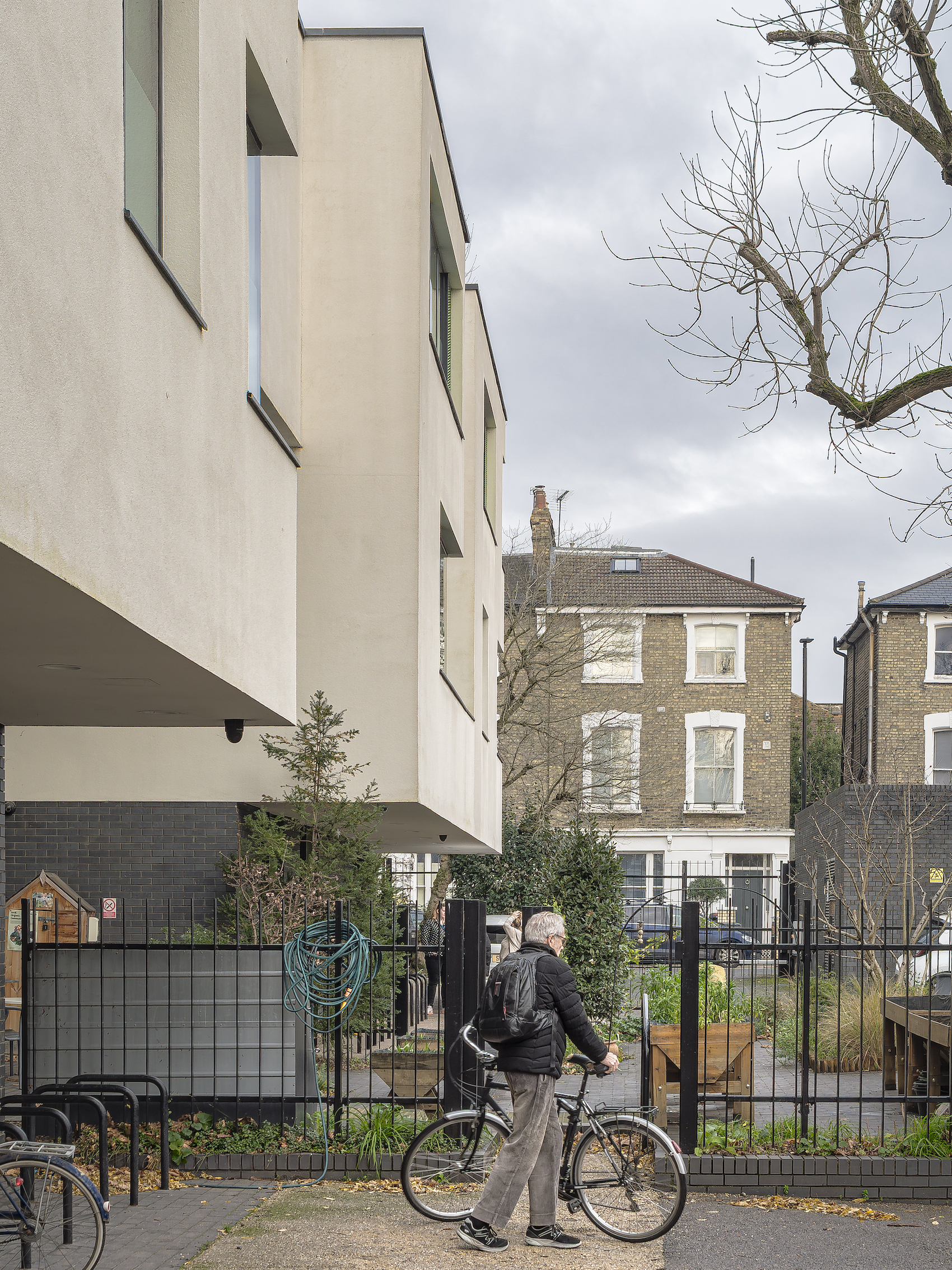
Paul Monaghan We’re talking nearly 20 years ago. Obviously things have moved on a lot, but this building was pioneering in that way. The doctors didn’t want an air-conditioned box; they wanted windows you could open. The sculptural massing provided quite a few terraces that could either be public or private, which allowed ways for people to have sanctuary in the building. Sometimes they’re off the waiting rooms. Sometimes they’re in staff areas. The massing was defined by the trees. The lower floor is set back because we didn’t want to get in the way of the tree roots, but we did need more area on the upper floors in order to deliver on the brief, so the cantilevered elements were very much informed by the trees.
David Ransley One of the things we wanted, was that the building should not just be a health centre, but also a community hub.

View from an internal bridge looking towards the central public room.
Paul Monaghan We’d worked a lot with Morag Myerscough, who is a graphic artist. We introduced her to Roy and David early on, and everyone enjoyed the work she did. She came up with the graphics for the front of the building, which became the new logo and was on all the letterheads. We then decided the graphics were too good, and perhaps we could use them inside for the ‘street’. And in a way this makes the building look very different, and it’s not how you expect a health centre to be.
David Ransley Within the public spaces on the ground floor we introduced all sorts of non-specifically clinical but health-related activities, such as art classes and language classes, the perception being that if you’re newly arrived into the country and you don’t speak the language you’re not going to get along very well until you’ve learned. So we set up ESOL classes. We did dance; music and movement for Parkinson’s sufferers – all sorts of things. A bicycle repair workshop was very close to my heart because I was very keen on the Green Travel Plan. It became a community building. It is essentially a healthcare building, and you can get your phlebotomy and all that stuff done there, but it’s also a resource for the local neighbourhood. And that’s exactly what we wanted. If you can keep the architect and the client working closely through every stage of the process – that’s the secret of the building’s success. It’s a happy building, and it was a happy relationship. We had a lot of fun doing it.
Paul Monaghan Although there was an atrium running a pathway through the building, it was really important to us that it wasn’t just a straight atrium; that there were bridges for circulation and open-plan meeting rooms off those bridges. So there was a real connection between the different spaces. We tried to make the staircases feel delightful, more art-based, and again they’re visually connected to the rest of the building. There’s a double-height reception. In the old building there was a lot of intimidation aimed at the reception staff, so their safety and wellbeing was really important. Behind the KTHC logo, there’s one-way mirror that fronts an open-plan office, so people don’t feel vulnerable, and there’s full vision of what’s happening in the reception area. There was no intimidation of staff. It changed overnight. There’s a lot of passive viewing lines and no corners, so it works well.

Opportunities to relax in the open air, and to take part in gardening, have proved hugely therapeutic for patients and staff.
David Ransley There is quite a lot of bad behaviour associated with healthcare buildings, which is very sad. But we’ve had no problems; it’s worked really well. I think it’s because people feel happy to come into the building. It feels cared for and looked after, and generally a nice place to be.
Paul Monaghan It was always explained to us that some people are very anxious when they go into waiting rooms. So there’s this garden beyond, that people can walk into. It’s well looked after and there’s little things like herbal plants.
David Ransley The garden is very good for mental health departments, and it’s proved enormously helpful and very therapeutic for people to come out and do some gardening and get their hands dirty. So many aspects of the building work really well.
Paul Monaghan All doctors could have a space, but it was hot desking – this was one of the first practices to go entirely digital, which was unheard of 15 years ago for a local health centre. So when you weren’t working, someone else could take your space over. That was important in making it a really buzzy area that works incredibly well.
David Ransley The name on the door is a metallic sign that can be removed at the end of the day. It stops rooms from being empty if doctors are working a one-day or two-day week and makes the building very, very efficient.

Determinedly unclinical in style, the architecture has the feel of a cultural or community centre.
Paul Monaghan We were asked to create this top rail system, which is incredibly flexible. It’s like a VITSO shelving system, only for doctors’ surgeries. Over time it can be adjusted or moved, depending on what’s going on in the room. That’s been one of the very simple things that has worked really well.
David Ransley The good thing about it from our part of view is that you don’t need a third party contractor. You literally just unhook it and reconfigure it as and when you like.
Paul Monaghan Roy was very interested in art. There’s a charity called Art for Hospitals who change the artwork maybe quarterly, so we created a little channel at the top of the walls that would allow you to hang paintings. There are exhibitions of well-known artists in the local area, and that’s been incredibly successful. Another very simple thing that we did was to control things getting pinned to the walls. We wanted to neaten the notes, so we bought a series of frames, painted them green, and then people can either do A4 or A3. That worked incredibly well in terms of keeping blu-tac and bits of paper off the wall. There is a bit of clutter now, and they were always very concerned about this, so I’d imagine Roy would be unhappy with some of the current signage. But I have to say they’re a client who really look after their building. Very little has changed. It was really important to us to have furniture that would last. So I’m pleased to see that the same furniture is there 16 years later, and still looking brand new.
David Ransley It is a very flexible space. We were part way through constructing and commissioning the building in 2007 at the time of the London bombings, and we had a request: “Would it be possible to use this new building as a minor hospital?” And the answer to that was “yes”. It is immensely flexible. You can put in a hospital ward. Because at the time, the Department of Health didn’t know if it was a one-off or if it was going to be a sustained campaign. So that was actually a very interesting question to be asked. Can your building adapt as much as that? And the answer was yes. It is an extraordinarily adaptive facility. The number of patients has gone up from 15,000 or 20,000 when it was built, to 30-35,000 now. And probably, in 30 years time, it may look quite different, with different services. That’s the design. It’s brilliant.
Paul Monaghan What’s great about it – 15 years later – is seeing all those societies and all those different groups bringing it alive even more. These were all things that weren’t really happening, or were just starting to happen, when the building opened, and now we can see that it’s really flourished. It’s a pity there weren’t far more of these buildings delivered around the country. But maybe they’ll build them again.
Test of Time Awards 2026
Do you have a project that’s continued to perform well after completion? If so, the AT Test of Time Awards are for you. Start your entry here.
Other finalists in this category:
The New QEII Hospital by Perkins&Will