Michelmersh explores how pastel, traditional and monochrome clay bricks shape architectural identity, helping designers balance context, character and contemporary expression.
In association with![]()
Brick has always carried colour as part of its character. From the warm reds of historic townscapes to the cooler greys that define many modern cities, the colour of clay helps tell the story of a structure and its place in the wider environment. Today, architects and developers have access to a far wider and more consistent range of tones than ever before, allowing brick to be used not just as a reliable building material, but as a way of shaping mood, identity and context. Three of the most influential colour directions in current design are soft, pastel tones, traditional brick colours like red and orange and the growing use of black, grey and white bricks.
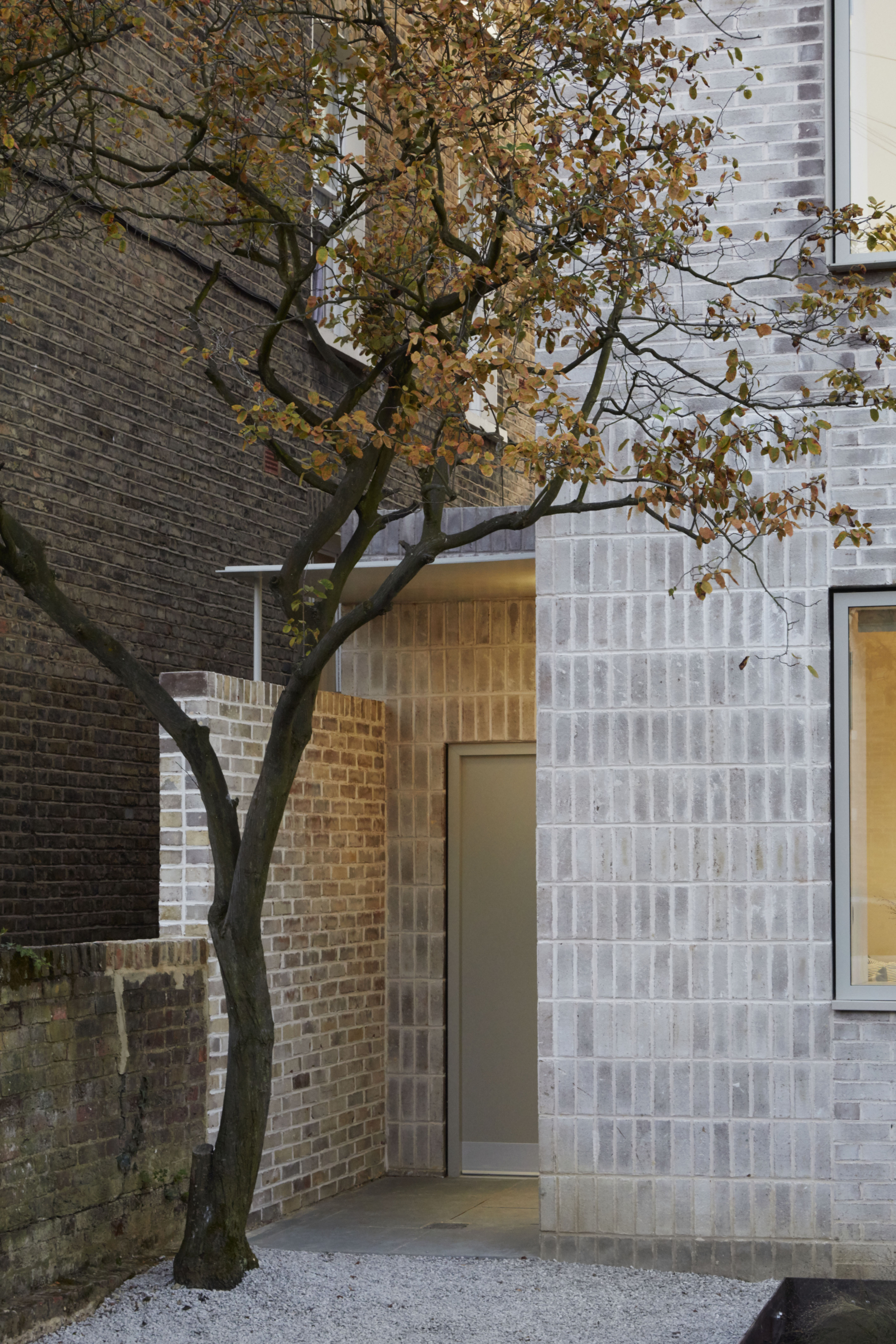
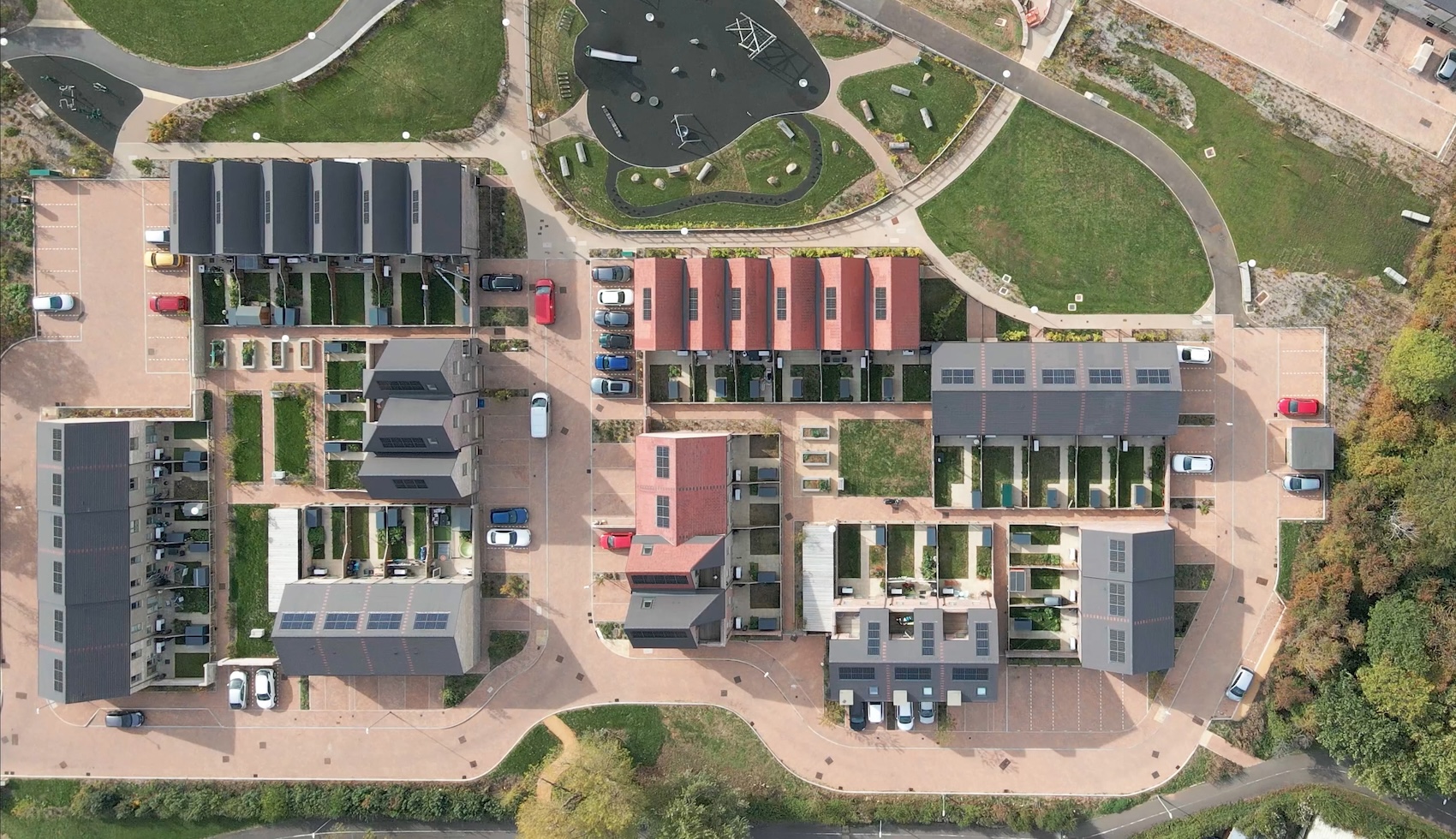
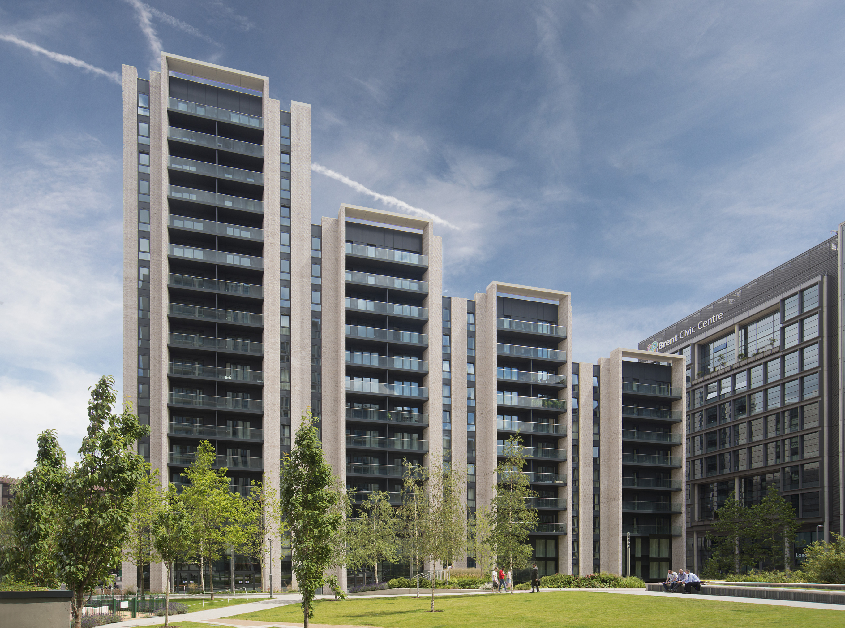
Pastel bricks, such as Floren’s Alaska Rustic, Polaris or Blockleys Park Royal, are appearing more frequently across housing, education and mixed-use developments, bringing a softer feel to the built environment. Pale creams, light buffs, and gentle pinks have always been a staple in brickmaking, often reflecting the natural qualities of the clay from which they were made. Their renewed popularity stems from a desire for buildings that evoke a sense of calm and welcome, rather than feeling harsh or imposing. These lighter tones reflect more daylight and can help larger elevations feel less heavy, particularly in dense urban settings. Used well, pastel bricks can create façades that feel warm and human in scale, while still offering the durability and depth that clay provides. Subtle changes in tone across a wall also add interest without relying on strong contrasts or decorative elements.
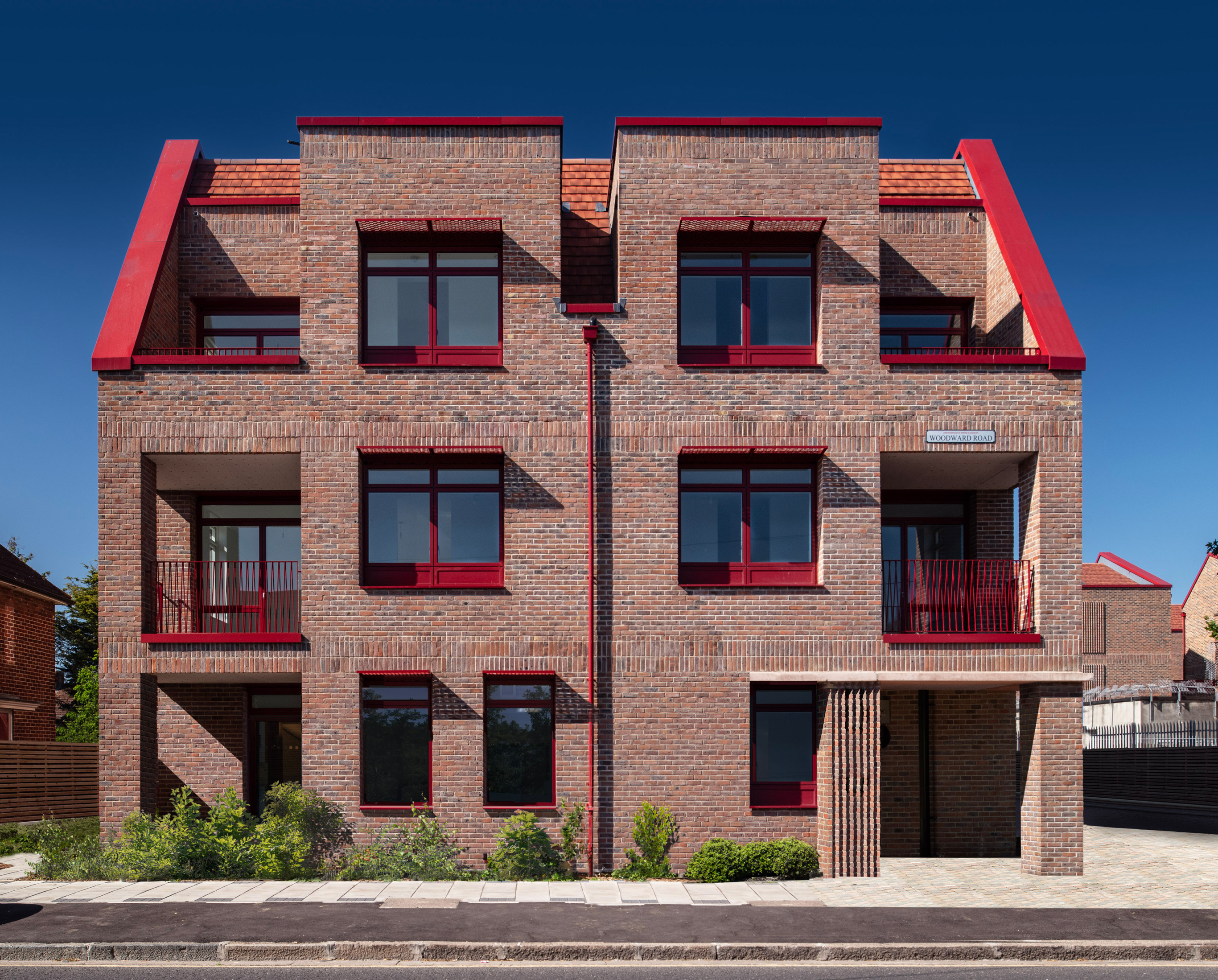
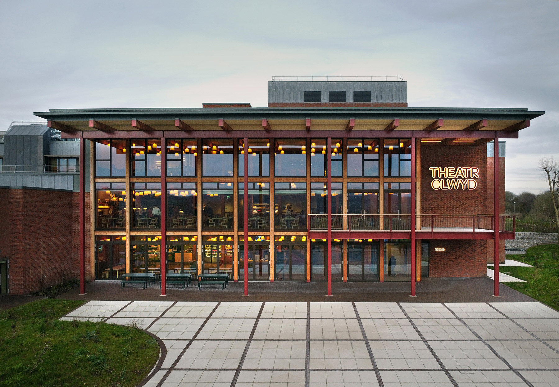
Traditional brick colours remain as important as ever. Reds, oranges and warm browns that are seen on Michelmersh products continue to define much of Britain’s architectural identity, from Victorian terraces to industrial warehouses and rural farm buildings. These colours are closely tied to local history, as bricks were once made from nearby clays and to this day, still are – with local products typically only travelling 60 miles from their point of origin and giving each area its own recognisable character.
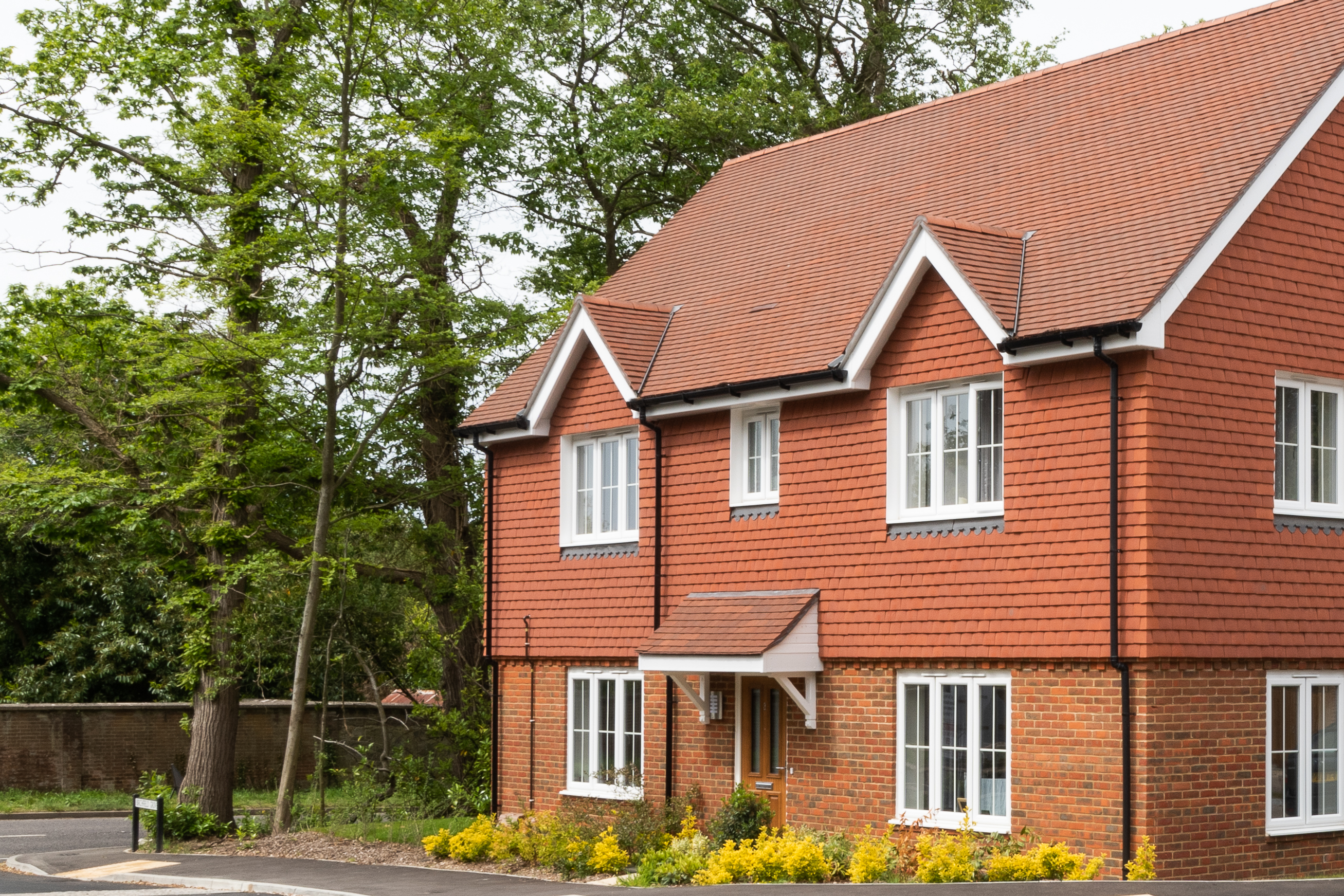
That sense of place still matters today, especially on extensions, refurbishments and developments in conservation areas where new brickwork needs to sit comfortably alongside old. Matching these bricks is about more than finding the right shade. Mortar colour, joint profile and surface texture all affect how the finished wall looks. When done carefully, traditional bricks allow new work to blend naturally into its surroundings, creating buildings that feel naturalised rather than newly inserted.
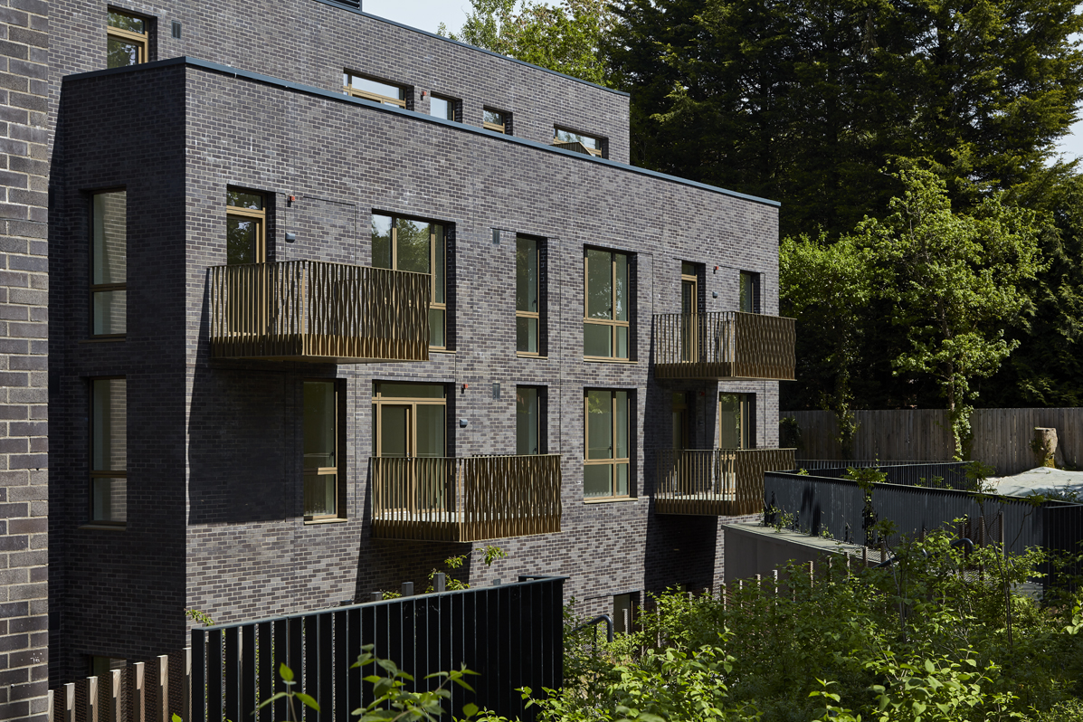
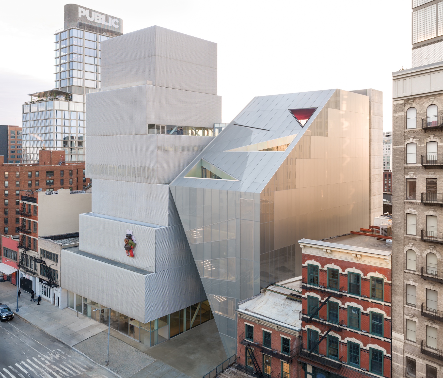
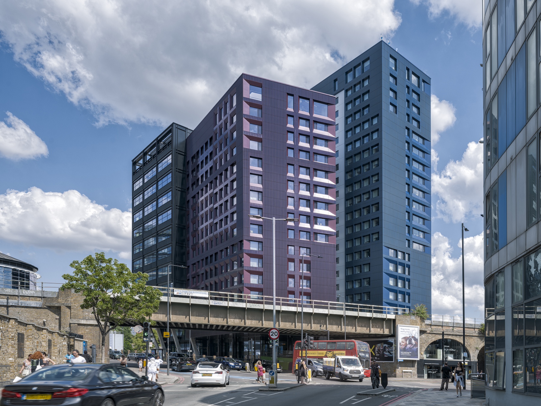
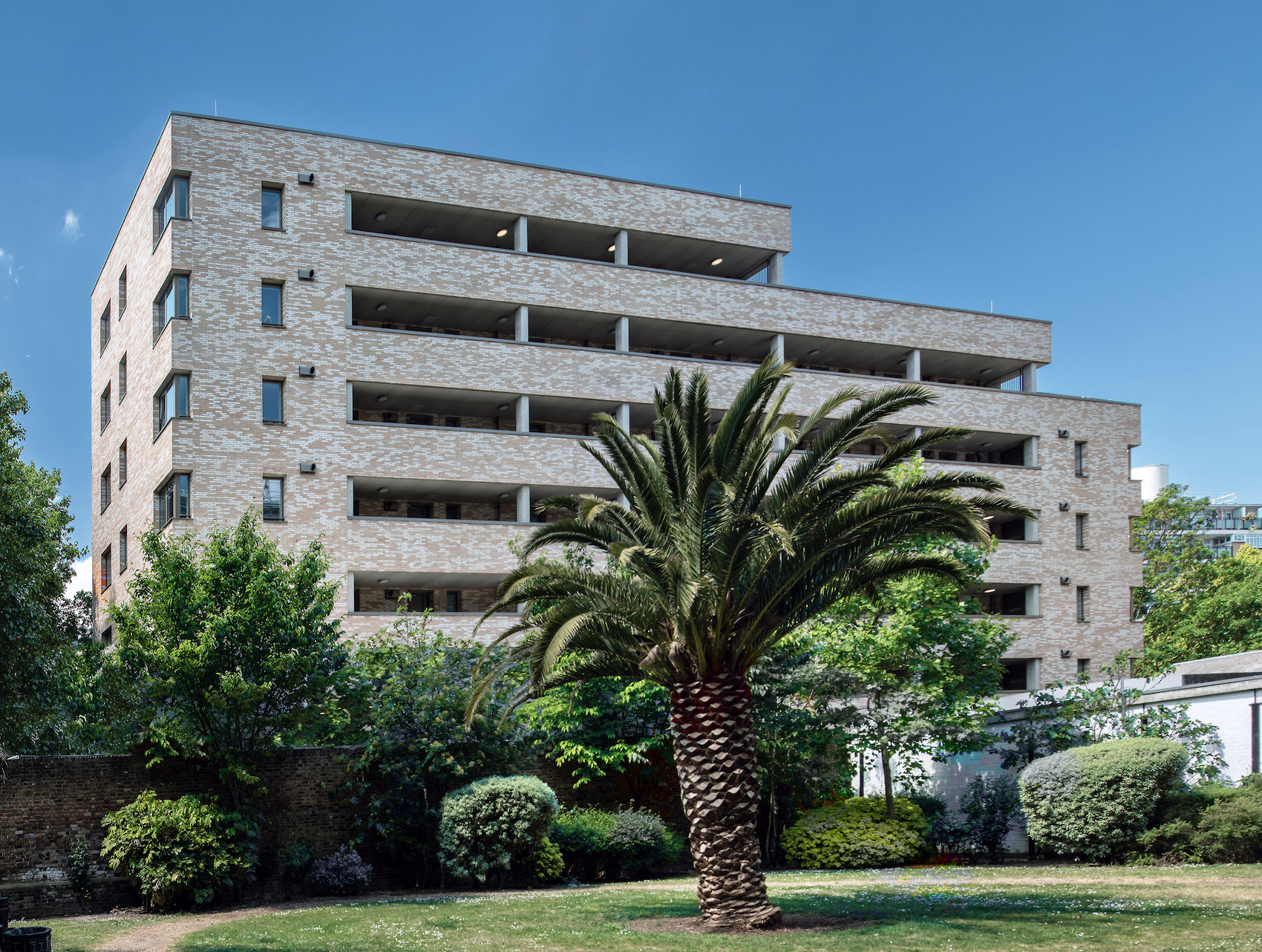
Alongside these familiar tones, darker and cooler bricks have become a strong feature of contemporary architecture. Grey, white and black bricks sit comfortably alongside steel, glass and concrete, making them well-suited to commercial buildings, apartment blocks and urban regeneration schemes.
Pale greys and soft whites can bring clarity and brightness to narrow streets or large façades, while deeper charcoal tones create strong outlines and dramatic shadows that highlight the form of a building. These colours are often used to give projects a crisp, confident presence without relying on complex detailing.
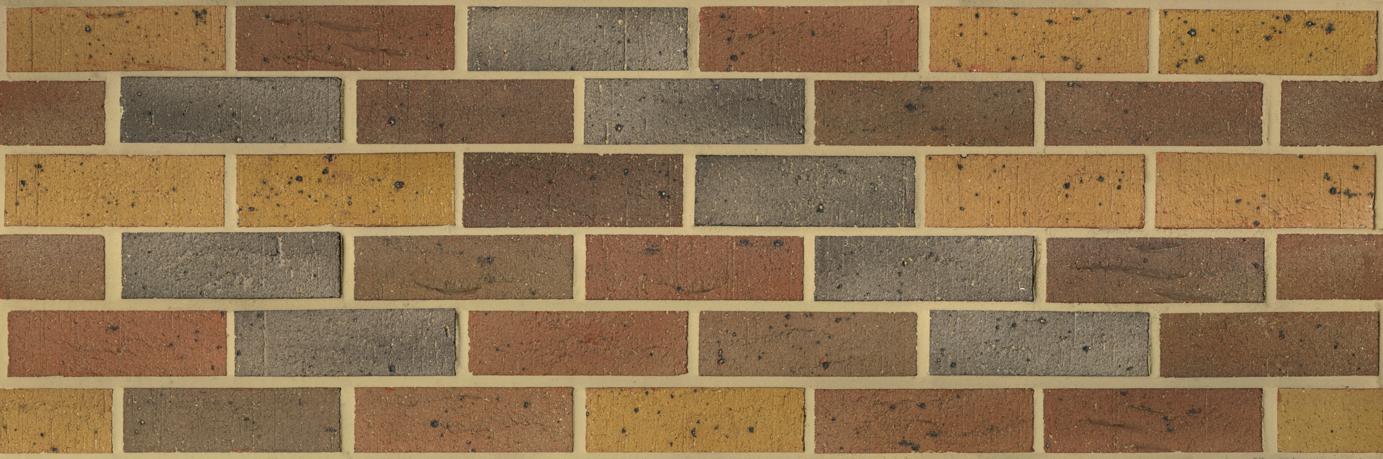
Through the selection process, and as colour choices become more refined, seeing bricks clearly before they reach the site has become increasingly important. High-quality digital imagery now allows designers to examine tone, texture and variation in far greater detail, helping them make more informed decisions and achieve better matches between new and existing brickwork. To help out with vital decisions, you can easily order samples or view super hi-res panel scans at mbhplc.co.uk
Together, pastel, traditional and modern monochrome bricks offer a wide palette for designers to work with. Each brings its own atmosphere and sense of place, showing that colour remains one of brick’s most powerful and expressive qualities.
Contact Details
For help picking your ideal brick, contact sales@mbhplc.co.uk or visit www.mbhplc.co.uk