Dow Jones Architects weaves references to local architecture and landscapes into a Maggie’s cancer care centre in Cardiff, finds Niall Maxwell

Maggie’s Cardiff is the nineteenth building to be completed by the Maggie’s Centres charity, which provides practical and emotional support to people with cancer. All follow the ideas about cancer care originally laid out by the late Maggie Keswick Jencks, in which good design is a central tenet. Sadly, the growth of the portfolio reflects a growing demand. Today, there are two million people living with or after cancer in the UK, a figure which is rising steadily, so Maggie’s Cardiff and the five new centres in development will start to address this need, while also providing a more even geographic spread.
The Cardiff facility, designed by Dow Jones Architects, is located at the Velindre Cancer Centre, north of the city centre in a post-war suburb near the meandering path of the River Taff. The original intention was for a new centre to serve the planned Velindre Cancer Hospital, on the site of the adjoining Whitchurch Hospital, which closed in 2016. Procurement has not been straightforward, however, so the charity was offered an alternative site in the interim.
If the journey has been more protracted than that of other centres, the wait has offered the architects an opportunity to reflect on the scale of ambition and how a more modest proposal could still deliver on the charity’s aims. Maggie’s Cardiff is smaller than most, but has been delivered for considerably less than many of the other centres, and with a much quicker construction time, which is food for thought as the charity moves beyond the list of stellar architects engaged to deliver the early buildings.
As with other centres, the Velindre site is on the NHS estate and less than perfect, shoved into the corner of a car park close to the boundary of the Whitchurch site, between an outbuilding and the entrance to an outpatient department. It is roughly triangular in plan, with the short, south- and west-facing elevations addressing the hospital complex and the diagonal facing the wooded boundary to the Whitchurch site.
The architects have chosen to maximise the use of the site, in part due to the need to meet the accommodation brief; as it is, the building has a footprint 25 per cent smaller than your average Maggie’s. But as with many triangular buildings there is never an opportunity to view more than two elevations so its sum can be seen to be greater than its parts.
The entrance is on the orthogonal southern corner of the plot, at the edge of a sea of tarmac which forms a crossroads of routes to and from various parking facilities. The site boundary is demarcated by a tightly clustered line of oversized cast iron bollards, of a type originally designed by Antony Gormley for a Peckham regeneration scheme in 1994. They consciously mark out the centre’s territory and defend it from the inevitable pressure of overspill parking. Their corroded colour matches that of the corrugated cladding which adorns the building’s walls and roof.
From a distance this rust-clad form provides a moment of vibrant colour within its drab post-war setting, with a contrasting backdrop of deep evergreen from the tree canopy beyond. The form and colour of the building are intended to resonate with the vernacular language of the Welsh rural landscape, referencing the region’s red sandstone, or the autumnal colour of bracken on nearby hills. This loose narrative becomes a starting point for a simple conceptual language that can be read throughout the building, which is played out with great restraint and modesty.
The corner entrance takes you into a small open courtyard garden, designed by Cleve West, which offers a welcome antidote to the car park. It’s a clever ice-breaker designed to orientate the visitor, providing a view of the reception and a glimpse into the heart of the main space. A glazed entrance corridor that overlooks the courtyard takes you directly into the main space, which contains the kitchen and dining area around which Maggie’s centres are focussed.
It is only at this point that the building’s third elevation becomes evident. The long hypotenuse is fully glazed, as if a square plan has been sliced in half to open up the building. The facade frames a view to the stand of trees beyond the boundary and adjacent ditch, with a concrete terrace in the immediate foreground creating the perfect mise-en-scène, extending the depth of field to give the impression of a deeper landscape when viewed from the interior.
This geometry helps to explain the building’s idosyncratic roofline. The ridges of a series of 45-degree pitched roofs are set perpendicular to the hypotenuse, leading to contingent elevations on the orthogonal sides and asymmetric interior volumes. The main space looks out through the glazed wall to the trees. It is flanked on the orthogonal sides by more private rooms of varying scales that can open up to provide connection and flow, or close down to provide intimacy or focus. They range from the domestic to the communal and reflect their flexible use for contemplation, consultation, group discussion or yoga.
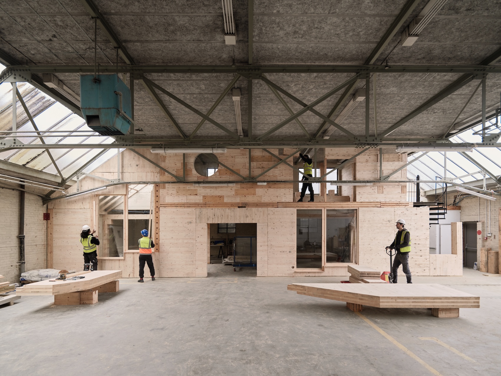
Douglas fir is used throughout the interior as a unifying material to subdivide, frame and enclose spaces by means of what Dow Jones describes as “giant pieces of furniture within the landscape of the building”. This is most evident in the centre of the plan where a small ‘cwtch’ is inserted – a room within a room with a view of the sky from the top of its tall chimney form. Inspired by a visit to St Fagan’s National Museum of History in Cardiff, this hideaway recalls intimate spaces of traditional domestic Welsh architecture, such as a cupboard under the stairs or a small inglenook range in a rural farmstead. It epitomises the domestic scale and warmth evident within the building, working to provide visitors with familiar points of reference when trying to make sense of their personal situation.
This warmth is set against a polished concrete floor which runs throughout the building, only broken by carefully selected rugs and soft furnishings that domesticate the range of rooms and break-out spaces, while also softening the acoustic. This concrete is extended onto the terrace where its edge follows the geometry of the overhanging roof, as if cast in shadow. It’s all very subtle, understated and confident in execution.
The triangular constraint, if one can call it that, is certainly the strength of the building, as the plan form represents a confident handling of such geometry to create a simple but spacious domestic interior. There is an economy at play with the material, scale and reference of this building, which sincerely reflects the Welsh community it is designed to serve; a comfort for those looking for familiarity when in their greatest need.
Additional Images
Download Drawings
Credits
Architect
Dow Jones Architects
Structural engineer
Momentum
Services engineer
Mott Macdonald
Quantity surveyor
RPA Cardiff
Corten cladding
APL
Bollards
Antony Gormley
Furniture
Coexistence
Sanitaryware
Duravit
Ironmongery
Eisenware
Douglas fir panels
Tily Triboard
Windows and doors
Dilwyn Lear


