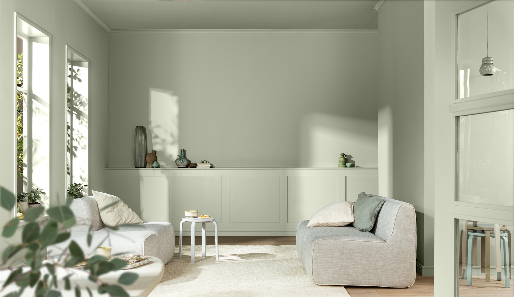
At a School of Specification webinar, Dulux has named Soulful Sage™ its Colour of the Year for 2027. Dawn Scott, Dulux Trade Senior Colour Designer at AkzoNobel explains how this soft, silvery green sits at the heart of three carefully developed colour palettes that give architects, specifiers and designers a coordinated framework for developing schemes across sectors.
To deliver projects that add lasting value, architects, specifiers and designers must consider how colour can support the intended purpose of a space, its functionality and the experience of the people using it. AkzoNobel’s annual ColourFutures™ research helps to inform this by translating emerging social and design trends into a practical colour direction that professionals can interpret and adapt for real projects.
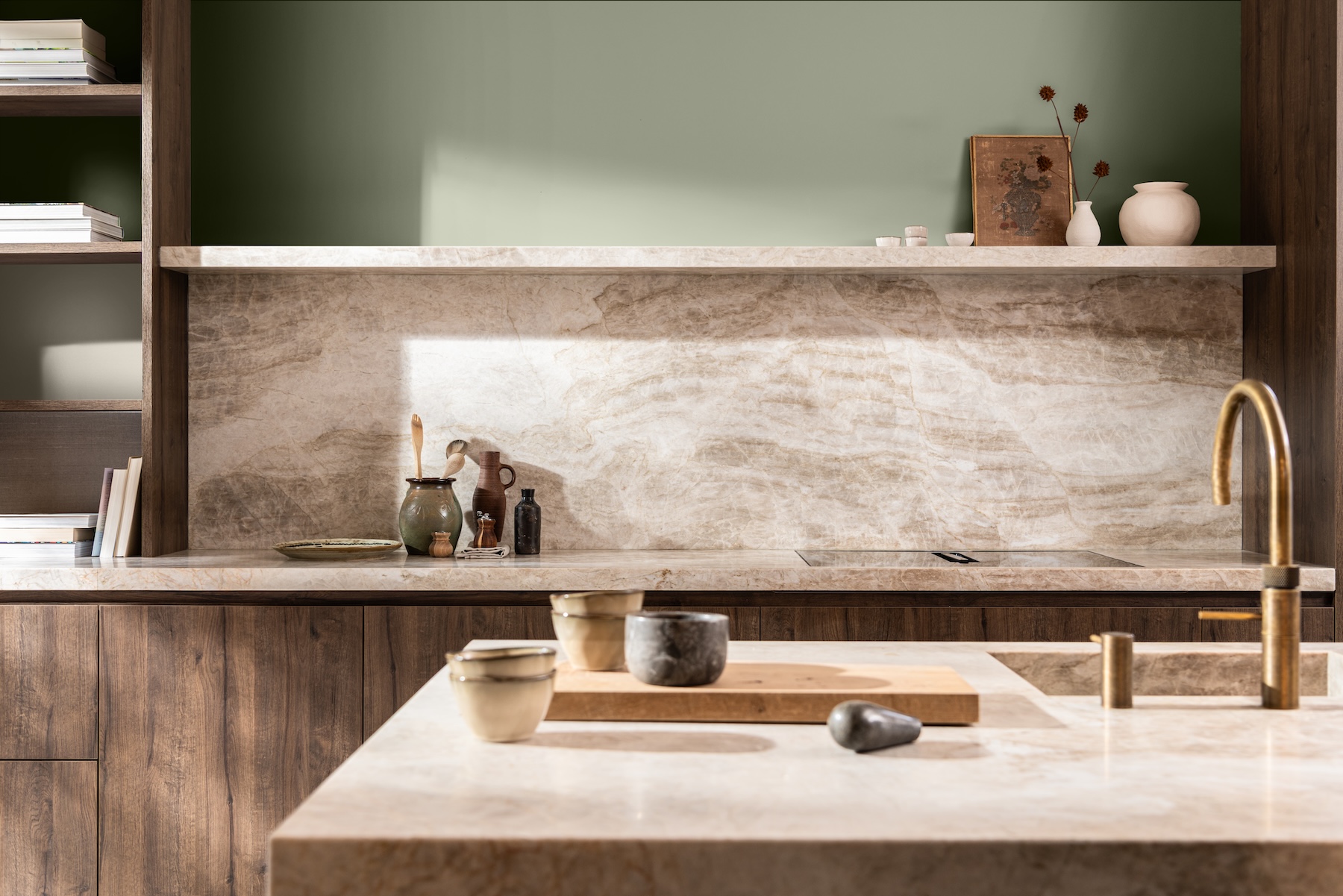
For 2027, the research identified a move towards lighter, more considered environments that respond to the information overload and wider global uncertainty that people are experiencing. These insights shaped Soulful Sage™, a versatile green that provides a flexible foundation for schemes requiring different levels of warmth, neutrality or visual energy, depending on the brief.

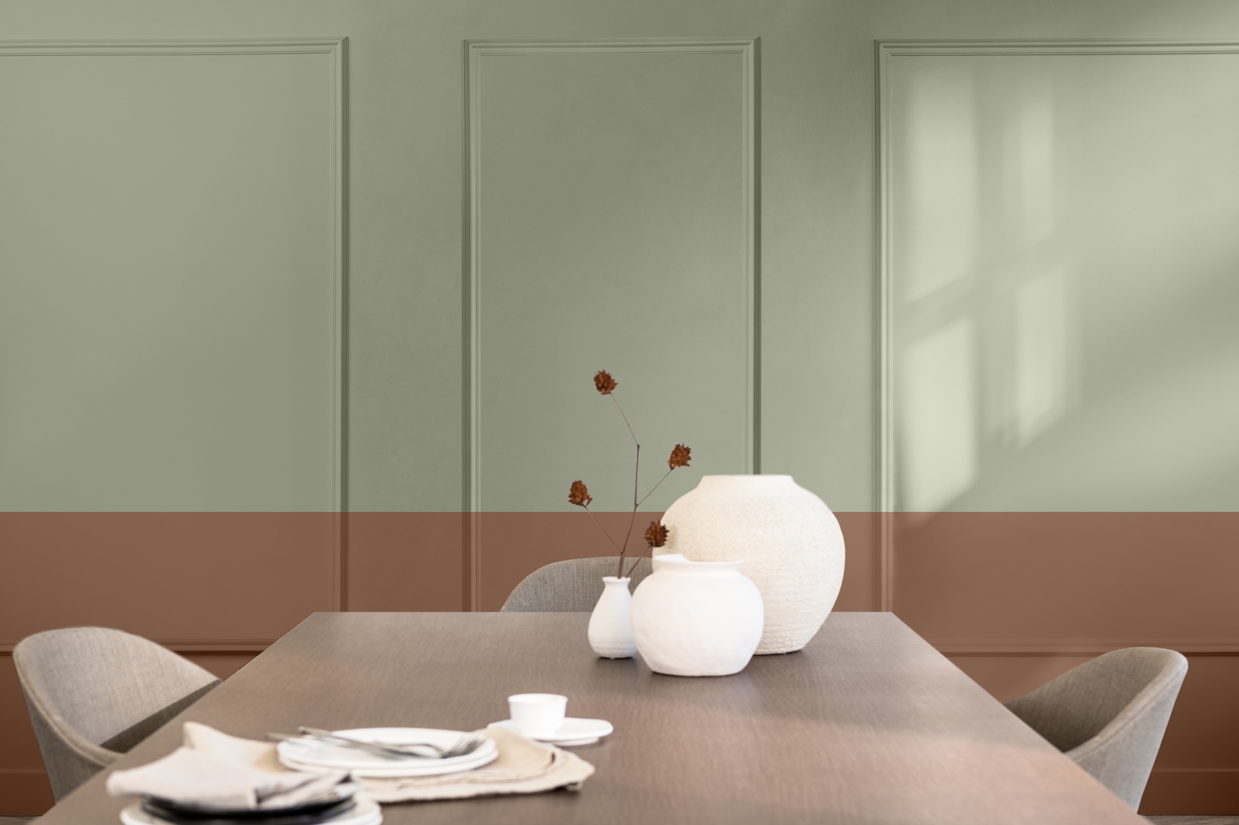
To make Soulful Sage™ easier to introduce into projects, Dulux has developed three complementary colour palettes. Each one provides a coordinated starting point that can be adapted to the function, users, materials and design intent of every project.
- Glow Colours – combines soft clay and terracotta tones with lilac and Soulful Sage™ to create a warmer colour direction. The familiar, earthy tones can provide a useful starting point for residential and hospitality schemes, particularly where the brief calls for warmth, character and a welcoming visual identity.
- Light Colours – brings together greys, browns, blues and Soulful Sage™ in a neutral palette designed to create a visually quieter scheme. This palette is particularly useful where clarity, simplicity and a sense of visual order are important considerations, including workplaces and healthcare environments.
- Lift Colours – combines ochres, pale pinks and greens alongside Soulful Sage™ to create a more expressive and energetic theme. These colours can help create upbeat backdrops in education, workplaces or other settings where the brief calls for a more vibrant identity.
Dawn Scott, Dulux Trade Senior Colour Designer at AkzoNobel, said: “Colour is an important design consideration and, when it is considered early alongside materials, finishes and the function of a space, it can help to ensure the finished scheme reflects the original design intent.
“The challenge is translating emerging trends into a colour direction that is practical, credible and adaptable enough to use on a real project. Soulful Sage™ and its complementary palettes are designed to provide a starting point and give professionals the flexibility to develop schemes around the brief, the building and the people using the space.
“Whether the project calls for warmth and connection, simplicity and calm, or energy and inspiration, the Colour of the Year 2027 offers a flexible framework to shape interiors and exteriors across sectors.”
To help the transition from inspiration to application, Dulux has created the Dulux Trade Colour of the Year 2027 Specifier Guide. Professionals can also use the Dulux Trade Paint Specification Creator to create specifications for projects – and, for further advice, contact the Dulux Commercial Colour Services team.
The Dulux Colour of the Year 2027: Soulful Sage™ and colours from the accompanying palettes can be mixed at Dulux colour mixing retailers from September 8, 2026. Soulful Sage™ is also available as a Peel & Stick Sample.
For more information, visit the dedicated colour of the year page on duluxtradepaintexpert.co.uk and follow #CF27 #ColourOfTheYear2027 #AkzoNobel #DuluxTrade and #SoulfulSage™ on social media.