Dulux Trade’s Dawn Scott and Jayne Roughan, in conversation with AT’s Technical Editor John Ramshaw, discuss how evidence-based colour strategies and high-performance paint systems can support learning, wellbeing and long-term performance across education projects.
In association with![]()
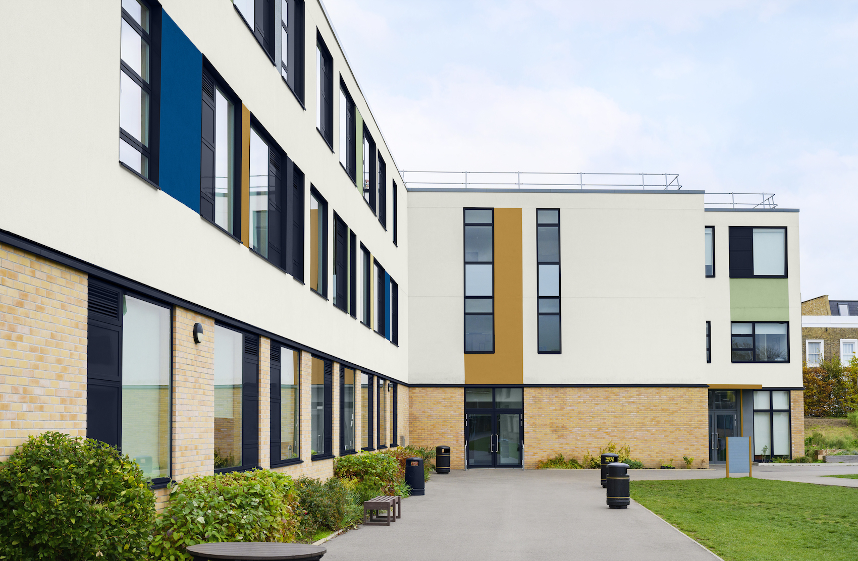
From primary schools to universities, education environments place complex and often competing demands on architects. Spaces are expected to foster concentration and creativity, withstand intensive and wide-ranging activities, respond to diverse user needs, and align with evolving standards for accessibility, health and sustainability. Colour and paint specification play a critical role in resolving these demands. Far from being a purely aesthetic decision, the careful use of colour can influence behaviour, improve wayfinding, support neurodiverse learners and contribute to healthier, longer-lasting buildings.
Dulux Trade’s Dawn Scott (Senior Colour Designer) and Jayne Roughan (National Account Manager Education & Retail), in conversation with Architecture Today’s Technical Editor John Ramshaw, outline how architects can approach colour and finish specification in education settings, drawing on research-led design principles and practical guidance from Dulux Trade’s Education Sector Guide.
Why are colour and paint specification so important in education environments today?
Dawn Scott Research and practical experience show that colour can influence focus, reduce visual fatigue, and create a sense of calm. This is particularly important in spaces where students spend long periods of the day. At the same time, the right paint specification supports durability, ease of maintenance, and reduced disruption during refurbishment cycles. Ultimately, it’s about creating environments that perform consistently for the people using them every day.
The Dulux Trade Education Sector Guide brings together colour, product and performance guidance. What was the thinking behind producing it, and how should architects use it in practice?
Dawn Scott The guide was developed to bring clarity to a complex process. Education projects require architects to balance compliance, durability, sustainability, and wellbeing. Colour is often considered late in the specification process, but it has a significant impact on how a space functions. The aim was to bring colour principles, product performance, and regulatory guidance into one coherent resource.
In practice, it’s a working tool, which helps architects to:
- Apply colour strategies appropriate to different learning environments
- Understand contrast and LRV requirements
- Align with inclusive design standards
- Select finishes suited to each space
It’s not prescriptive, but it provides a clear framework to support confident specification.
Your guidance refers to evidence-based colour palettes. What principles or research underpin these recommendations?
Dawn Scott The palettes are informed by research, sector insight, and real-world application. There is strong evidence linking colour to cognitive performance and emotional response. While individual preferences vary, consistent principles emerge around supporting focus, reducing overstimulation, and improving spatial clarity.
Key design principles include:
- Balance: avoiding overly stimulating or overly flat schemes
- Contrast: supporting legibility and navigation
- Hierarchy: guiding attention through colour placement
- Context: responding to light, orientation, and use
The emphasis is on creating environments that feel comfortable and easy to understand, rather than purely decorative.
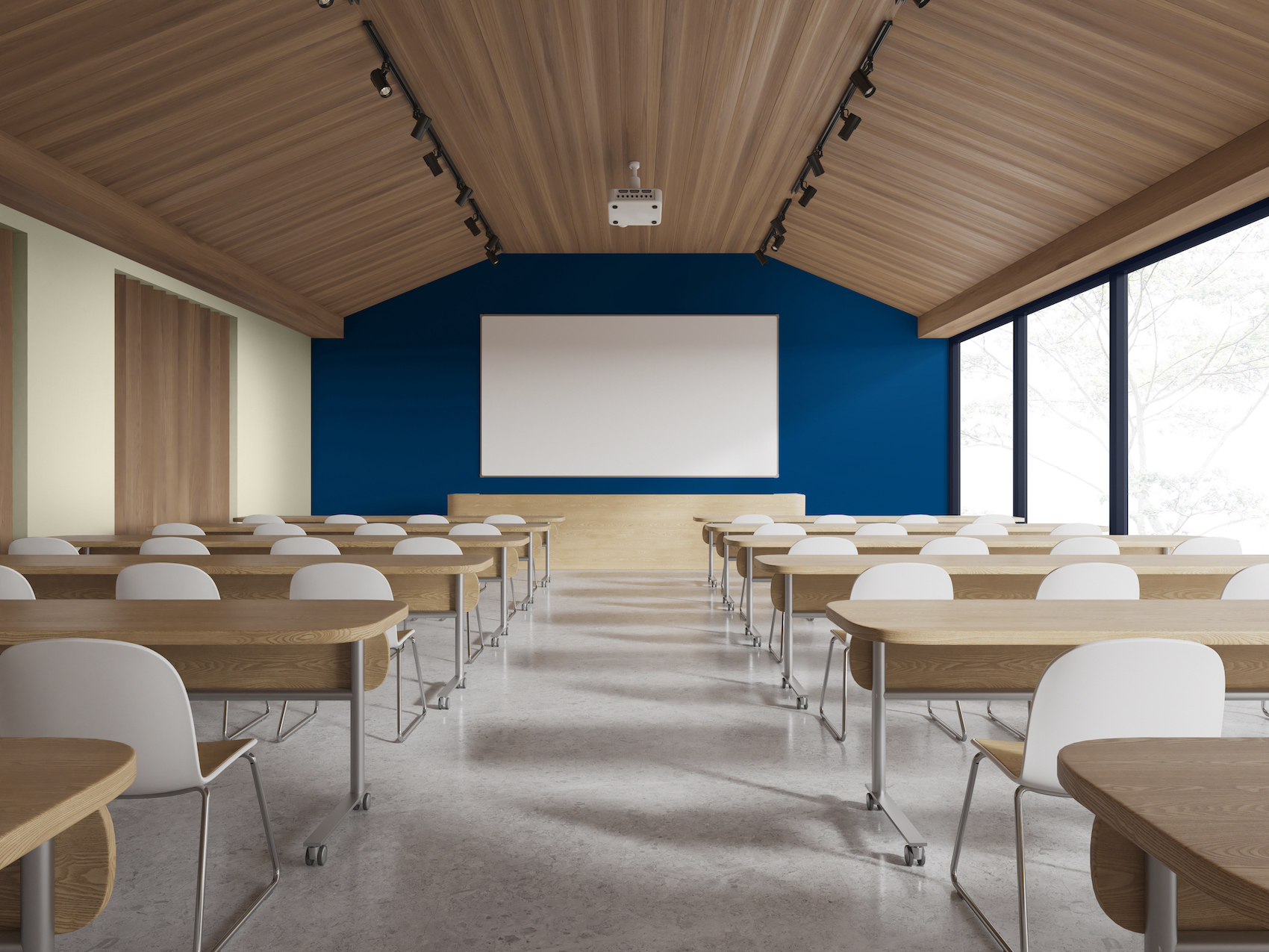
How should colour strategies differ across education stages, from early years through to secondary and higher education?
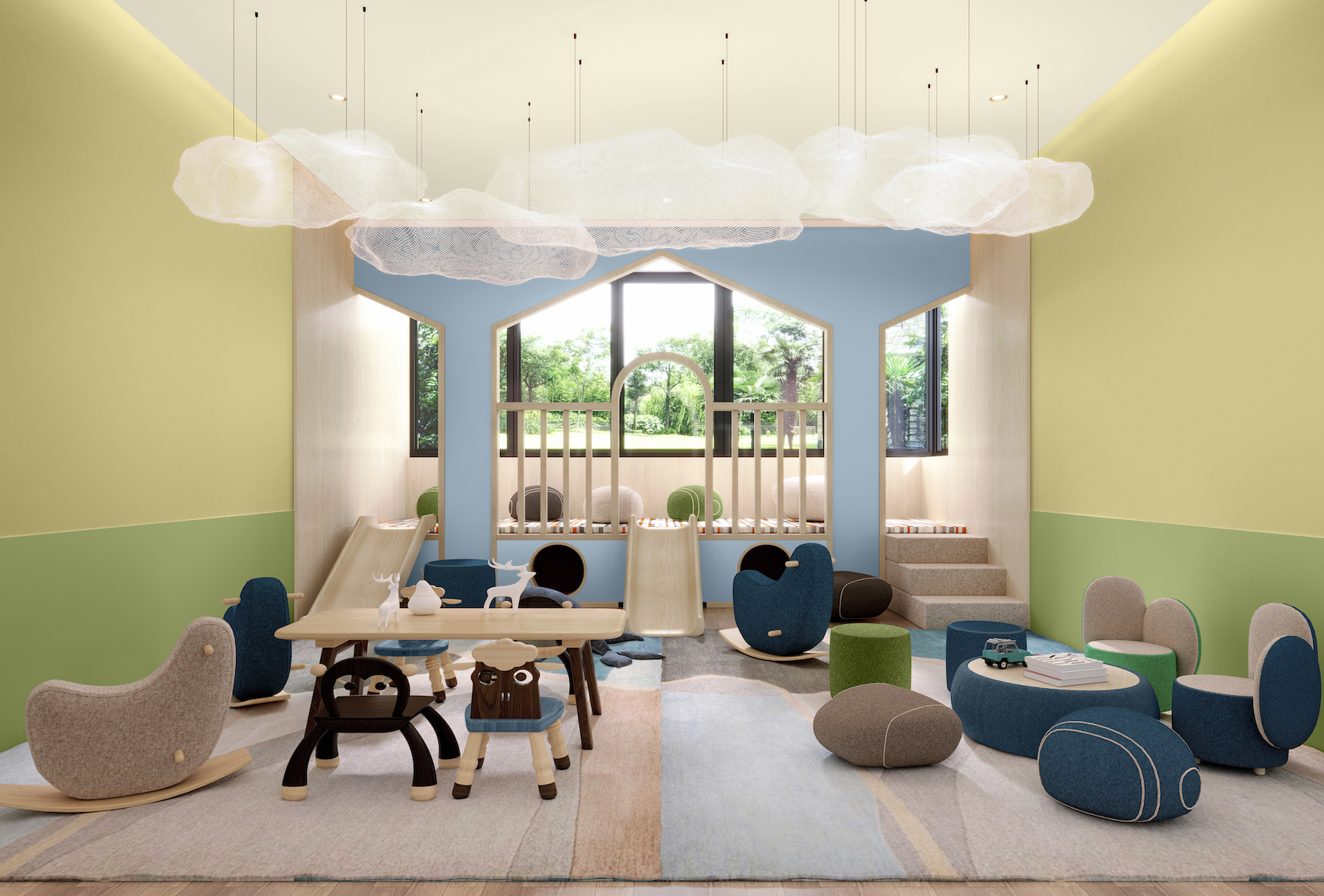
Dawn Scott Colour strategies should reflect the needs of each stage of learning. In early years, colour supports engagement and development. Brighter tones can encourage curiosity, while colour coding helps with navigation and independence. For primary settings, palettes become more balanced, combining calm backgrounds with targeted areas of colour to support focus and group activity.
Moving on to secondary education, and more restrained, mature schemes help minimise distraction and support concentration, with colour used more selectively. In higher education, subtle, calming palettes are typically more effective in study environments, while social spaces can introduce warmer or more energising tones. Across all stages, the approach should be responsive rather than uniform.
How can colour be used to support different learning modes, such as focus, collaboration and creativity?
Dawn Scott Colour can help define how a space is used. For focused learning, softer, neutral tones reduce visual distraction and support sustained attention. In collaborative areas, slightly stronger or warmer tones can encourage interaction without overwhelming the space. For creative environments, colour can be more expressive, but still needs balance to avoid overstimulation. Using colour to zone different activities within a space helps users intuitively understand how to use it, without relying on signage or instruction.
How does colour design need to adapt for neurodiverse learners and SEND environments?
Dawn Scott Designing for neurodivergent learners requires a more sensitive approach. Many individuals experience heightened sensory sensitivity, so colour, contrast, and lighting can significantly affect comfort and focus. Calmer, more muted palettes are often more appropriate, helping to reduce overstimulation and create a sense of safety. At the same time, contrast remains important as it supports orientation and spatial understanding. Overall, the goal is to achieve balance, avoiding harsh contrasts or busy patterns while maintaining clarity. This is less about removing colour, and more about using it carefully and intentionally.
How can colour be used as a wayfinding tool in complex education buildings?
Dawn Scott Colour can support intuitive navigation, particularly in larger or more complex buildings. Clear contrast between key elements, such as walls, floors, and doors, helps users move through spaces more easily. Colour coding different zones or departments can also reinforce identity and orientation. When applied consistently, colour reduces the need for excessive signage and lowers cognitive effort, making environments easier to navigate for all users.
Can you explain the role of Light Reflectance Value (LRV) and how it supports accessibility and compliance?
Dawn Scott Light Reflectance Value (LRV) measures how much light a surface reflects, on a scale from 0 (black) to 100 (white). It provides a clear, measurable way to assess contrast between surfaces, which is essential for accessibility in education environments. Building Regulations Approved Document Part M and BS 8300 recommend a minimum 30-point LRV difference between adjacent critical surfaces, such as walls, floors, and doors, to support visual clarity and safe navigation. This contrast is particularly important for users with visual impairments or cognitive challenges, helping spaces feel easier to interpret and move through. LRV also contributes to overall brightness, with Department for Education guidance setting minimum reflectance levels for ceilings and walls to support well-lit, comfortable environments.
What are the key performance criteria architects should prioritise when specifying paint systems in high-traffic education environments?
Jayne Roughan Consistency and clarity in specifications. We often see M60s with vague or inconsistent paint descriptions, for example ‘emulsion to walls’. The guidance was created to provide clear direction on which products to use and where they should be applied. Having the right product in the right place is essential. Factors such as durability, scrub resistance, stain resistance, hygiene, VOC levels, and fire performance are all considered, so that whatever product is chosen meets a defined performance level for each area of the building.

How can the right product selection reduce maintenance cycles, while also contributing to healthier indoor environments in education projects?
Jayne Roughan Specifying Low-VOC or VOC -free paints reduce odours and harmful emissions, improving indoor air quality from day one of application. Specifying hard‑wearing, scrub‑resistant paints reduces scuffing in corridors and classrooms, providing a longer‑lasting finish. This means fewer repaints, less disruption to learning, and lower lifecycle costs.
For high traffic areas, such as corridors, we recommend Scuffshield. For canteens, toilets, and changing rooms, our new Durable Kitchen & Bathroom 99.9 per cent VOC free product is recommended. Other products we would specify in schools are Diamond Matt, Diamond Eggshell, Diamond Satinwood and Heritage Eggshell.
What specific tools and services does Dulux Trade offer to support architects undertaking education projects?
Jayne Roughan Dulux Trade offers a range of tools and services including project‑specific paint and coating specifications (NBS‑compatible, M60 support); area‑by‑area guidance for classrooms, corridors, washrooms, sports, and externals; and advice on durability classification, scrub resistance, VOC levels, and compliance in line with the Department of Education guidelines. We also provide digital colour tools to integrate colour choices into drawings and BIM models, and on‑site assistance from Dulux Trade Technical Support Managers to help contractors deliver the specification.
If you could give architects one key piece of advice when specifying colour for education projects, what would it be?
Dawn Scott Consider colour early, and consider it as part of how the space works, not just how it looks. The most effective schemes balance aesthetics with function, responding to light, age group and activity to create spaces that genuinely support the people using them.
Contact Details
Click here to download the Dulux Trade Education Sector Guide.
For more information about specifying colour and paint on education projects, please call 0333 222 70 70, email or visit the Dulux Trade website.