6a Architects’ extension to MK Gallery reflects the diverse influences that shaped the New Town, finds Sam Jacob


I ♥ Milton Keynes. It’s a place that, in its ordinary way, somehow managed to respond to the whole history of English planning. In the hands of its young designers back in the 1970s a vast array of ideas, experiences and expertise and imagination were catalysed into the fabric of the last of the post-war New Towns. And its great achievement should have been the beginning of something. But of course was in fact the end. The idea of public planning – even the idea of the city as a place for public good – was explicitly and aggressively dismantled by a right-wing government whose terrible effect is felt still in the tragic fate of our increasingly privatised cities. Any love for MK is tinged with a sadness of all the other possibilities for British city-making that never happened.
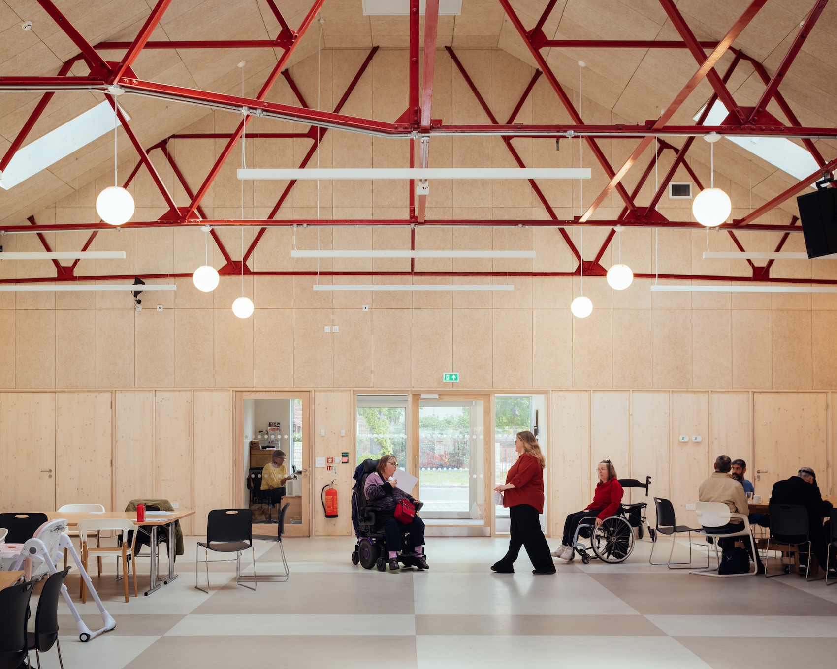
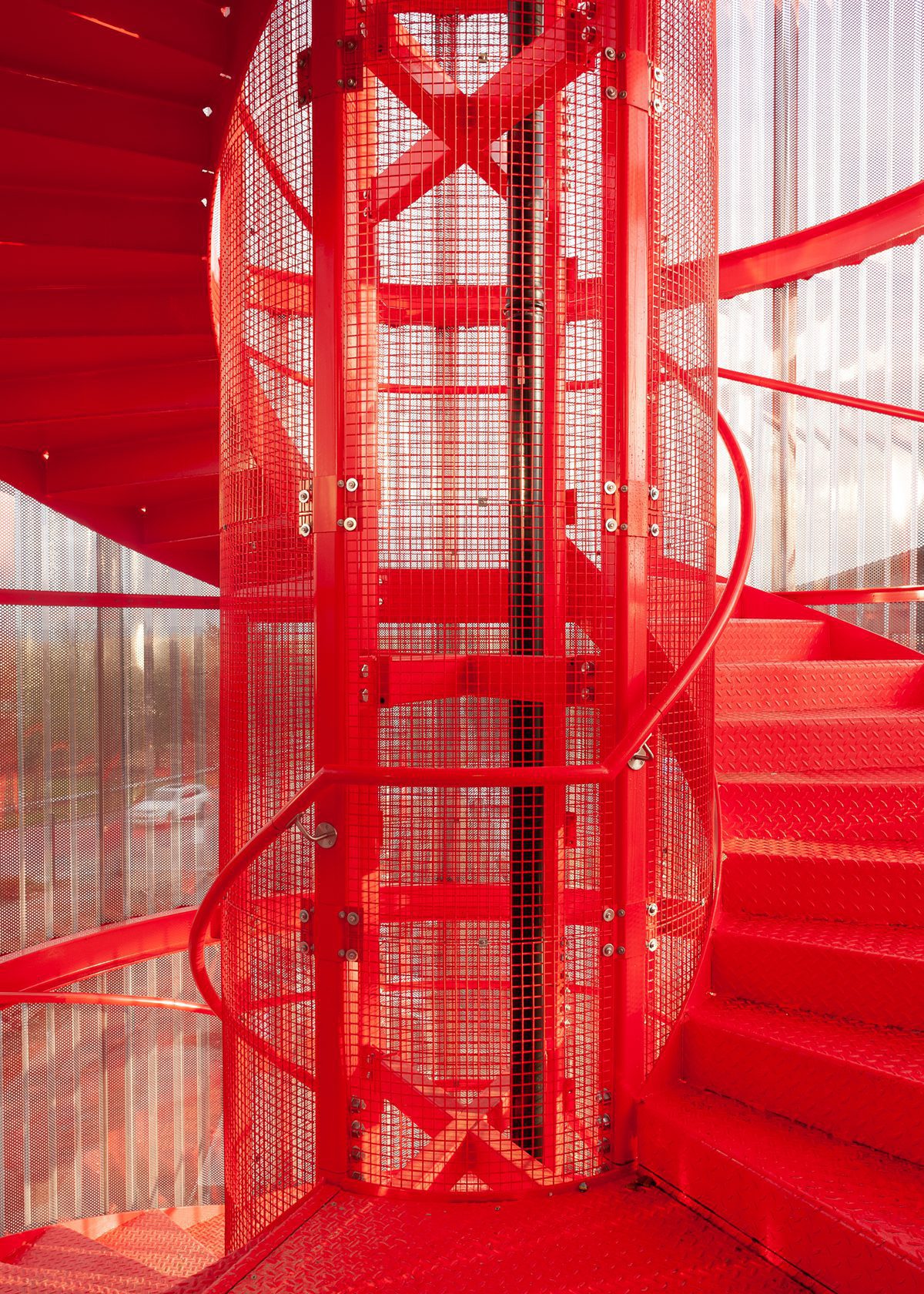
Yet at the top of Midsummer Boulevard, in the form of a mirror-concertina-clad box, a giant round window, red spiral staircase, neons and super graphics, is a little burst of the kind of vision that is really necessary to make cities for people.
Under the directorship of Anthony Spira, the Milton Keynes Gallery has reimagined itself as a kind of twenty-first-century leisure centre, where culture acts as a catalyst and frame for art, yes, but also social and community activities. In the hands of architect 6a working with artists Gareth Jones and Nils Norman, the project became something rooted in place, expansive in its outlook and engaging in its form.


Top: aerial view during construction of the gallery (phs: Iwan Baan)
What used to be a mini-kunsthall has become something far more complex. The existing galleries have been added to, extending them in a linear sequence. While they have all of the stripped back blankness of contemporary art space, there are other resonances at work too.
In part it recalls the linear geometries of the Central Milton Keynes plan (say the straight-as-a-ley-line Midsummer Boulevard). The urban connection between interior spaces and landscape beyond is emphasised by windows at each end of the sequence. These reinforce the axis through galleries and give views out to the urban square on one end, to the park on the other.


One of two new galleries lies at the western end of a string of three existing galleries. Openings between the galleries have been realigned to create an enfilade, and a long axis between windows at either end (phs: JD)
The galleries feel solid with thick walls, grand height, large openings between spaces so that the axis also feels like an enfilade sequence of rooms running the length of the building in a way that recalls something of a stately home.
And the galleries do feel like rooms. One is even named the Long Gallery, in part because of its abstract quality – longness – but also because of the allusion to a spatial/ typological country house trope. This produces a set of sequential spaces that oscillate between art-space abstraction and something more specific. The sequence is punctured in places with other openings to left or right, sometimes at high level from other interior spaces, at others to make more intimate lateral connections to the surrounding landscape. These more intimate relationships puncture the white cube and bring moments of life and introduce complexities of occupation that will in time provoke the exhibitions that will come to occupy them.
We could see the new gallery spaces as a cocktail steeped in MK’s own myths – part Stowe, part Mies by way of Albion”
On one hand this is an argument about gallery space, about cracking open (at least in parts) space of art. But this marriage of the contemporary with specific historic reference also responds to the origin story of Milton Keynes itself. The city’s design team was immersed in visions of the past and the future – lectured to by Buckminster Fuller in a nearby pub, visiting Stowe, riffing on new-agey myths of old Albion, excited by electronic communication, jazzed up on rock festival social life, enamoured of the pastoral as seen through pop eyes, garden cities fulled by West Coast autopias and so on. In this we could see the new gallery spaces as a cocktail steeped in MK’s own myths – part Stowe, part Mies by way of Albion.


Sky Room with bleacher seating (phs: JD).
Upstairs is the other set piece – the SkyRoom, running the width of the building and facing Campbell Park. Its architectural finish is deliberately plain, clad in ply panels, with exposed bits of acoustic foam at high level and a raw floor. But this only serves to highlight the room’s two great features: the semi-circular window that gazes out over the park, and the glorious horizontal big-banded colour phenomenon of the wrap-around curtain. This singular decorative device has been scaled up to grand proportions and in this also takes on functional tasks of organising the space in different ‘modes’ (current gallery favourite: ‘disco mode’).
With the curtain a domestic element has been blown up to a civic scale, both ornamental and Miesian (like his and Lilly Reich’s 1927 Café Samt & Seide, or the gauzy curtain around the Farnsworth House, a different strand of the architect’s oéuvre to that quoted by Milton Keynes’ giant shopping centre). It’s 1970s home décor gone supergraphic, yet also perhaps like the tapestries that hang on the walls of a grand room, say at Blenheim Palace.

The cafe was influenced by Norman Foster’s 1970s design of Milton Keynes’ architects department (ph: JD)
Between the galleries and the Sky Room, the rest of the building is far more ad hoc, reorganising the existing spaces into a looping ground-floor visitor journey through galleries, retail, and a cafe. Remember that this is MK, where commercial and leisure was always conceived as part of its higher-minded social democratic ambitions. Gallery as leisure activity feels part of this tradition of lifestyle-driven urban plan.
These spaces are more prosaic yet are utterly transformed by the décor, handled so precisely that it vibrates with pulses of pure optical pleasure. Banded strips of colour, painted steel structure, wayfinding graphics, furniture. You might even find yourself wondering if you are really in a 6a project – all this pop pleasure is a long way from the post-Lisson Gallery sensibility with which the practice is often associated. This ain’t no whisper, it’s full of purrs and yelps at each encounter.


A toilet shows some of the colour palette developed by artists Nils Norman and Gareth Jones, which was derived from a Habitat catalogue dating from the time of Milton Keynes’ early development. Warm colours predominate in the most interior parts of the building while cooler shades appear where there are outward views (ph: JD)
In the Learning Studio, as elsewhere in the building, 6a plays with the Milton Keynes motifs of the circle and the grid (ph: JD)
If you look hard, you can find more typical 6a moments (a little patch of untreated timber floor in the gallery for example). But its also interesting to consider how signatures get attached to offices. The tendency to compress an architect’s spectrum of interests into a neatly wrapped package is always at odds with questions of expression, circumstance and context.

The main entrance is in the existing building, from the forecourt of the adjacent Milton Keynes Theatre, designed by Blonski Heard (1998). A new steel entrance canopy is modelled on the structures put to various purposes throughout the town. A neon heart is among the installations by artists Nils Norman and Gareth Jones and recalls Milton Keynes’ first ever logo (ph: 6a).
Here, the context isn’t just MK; it’s the process of the project too. And something special has come out of the collaboration between 6a, Gareth Jones and Nils Norman. The artists’ work on curtains, signage, furniture, facade treatments and external landscaping (a space for sculptural display and children’s play, reinterpreting the fabled 1970s proposal for the MK City Club leisure centre) is intrinsic to the building, to the point where the difference between art and architecture is dissolved. Décor becomes active as a social framework. Surface and colour organise space and use at a fundamental level.
The references to old Habitat colour schemes, to pop-tech architecture (like The Point, the nearby space-framed pyramid, Britain’s first multiplex cinema), these things are all fun. But it’s how the new gallery mobilises these references, mixes them with history and an idea of culture as a popular and open-ended framework that is the heart of the project. In this it resonates with those old origins of the city itself.
Additional Images


Download Drawings
Credits
Architect
6a architects
Contractor
Bowmer & Kirkland
Project management, contract administration
Jackson Coles
Structural engineer
Momentum
Environmental engineer
Max Fordham
Quantity surveyor
Gleeds
Artists
Gareth Jones, Nils Norman
Graphic designer
Mark El-khatib
Client
MK Gallery