Dulux Trade’s Dawn Scott, in conversation with Architecture Today’s Technical Editor John Ramshaw, explores how colour, contrast and sensory choice can help architects create more comfortable, legible and inclusive environments.
In association with
People experience colour, light and visual complexity in different ways. An environment that feels calm and intuitive to one person may be distracting or overwhelming to another. Designing for neuroinclusion means moving beyond the idea of a single solution and considering how spaces can accommodate a broader range of sensory and cognitive needs.
Colour can play an important role in this process, supporting navigation and spatial understanding, creating different levels of sensory stimulation and helping to define environments for concentration, interaction or restoration. Its effectiveness, however, depends on how it works alongside contrast, lighting, materials and the wider spatial design. Dawn Scott, Senior Colour Designer at Dulux Trade, in conversation with Architecture Today’s Technical Editor John Ramshaw, discusses these principles and introduces the new Dulux Trade Colour Design for Neuroinclusive Spaces guide.
Why should neuroinclusivity be considered when developing colour strategies, and how can the physical environment affect people with different sensory and cognitive needs?
Across the built environment, colour plays an important role in shaping how a space looks, feels and functions. It can influence how easily people understand and navigate their surroundings, as well as contributing to the overall sensory experience of a space. This becomes particularly important when considering neuroinclusion. People process sensory information in different ways: some may be hypersensitive to colour, light, pattern or visual complexity, while others may be hyposensitive and benefit from greater sensory input. Individuals can also experience a combination of both across different senses.
There is therefore no single environment that will work perfectly for everyone. Rather than designing around a perceived ‘typical’ user, architects and designers should consider the function of the environment, the people likely to use it and the range of sensory and cognitive needs that may be present. This can help create spaces that are comfortable, legible and engaging without becoming unnecessarily overwhelming.
What prompted the development of the Dulux Trade Colour Design for Neuroinclusive Spaces guide, and what does it offer architects and designers?
Awareness of neurodiversity within the built environment has increased considerably, but one of the questions we are increasingly asked is what this means in practice, particularly when it comes to colour. There can be a tendency to associate neuroinclusive design with very pale, muted or neutral environments. While these may suit some people and some spaces, neurodivergent people are not a homogeneous group and their sensory preferences can vary considerably. Removing colour altogether is therefore no more universally inclusive than using too much of it.
We developed the Dulux Trade Colour Design for Neuroinclusive Spaces guide to help bridge that gap between understanding neurodiversity and applying the principles to real projects. It brings together guidance around sensory preferences, colour, contrast, light and biophilic design with a curated colour palette and three adaptable colour themes. The intention is not to provide a prescriptive formula, but to give architects and designers a practical starting point to develop schemes that are appropriate to the people, function and context of an individual space.
There is no single colour palette that works for everyone. How can architects respond to different sensory preferences, including hypersensitivity and hyposensitivity?
Understanding the difference between hypersensitivity and hyposensitivity is useful, but it is important not to treat them as two fixed categories. Someone may be hypersensitive to one type of sensory input and hyposensitive to another, and their needs may also change according to the environment or situation. For people who are more visually hypersensitive, softer or more muted colours, reduced visual clutter, predictable environments and carefully considered transitions between colours may help reduce sensory load. Someone seeking greater sensory input may respond positively to stronger colour, clearer contrast, increased colour intensity or more visually stimulating environments.
This is where choice and flexibility become particularly important. Where possible, buildings should provide spaces offering different levels of sensory stimulation rather than trying to create one universal sensory condition throughout. A workplace, for example, might combine quieter, lower-stimulation areas for focused work with more energising collaborative spaces. Colour can then be used purposefully to help create and communicate those different environments.
What are the key principles for using colour and contrast to create spaces that are comfortable, legible and inclusive without becoming visually overwhelming?
Good neuroinclusive colour design is about balance. Colour can provide visual interest, identity and sensory stimulation, while contrast can help people understand the boundaries between surfaces, identify important features and navigate their surroundings. However, more contrast is not necessarily better. Too many competing colours, patterns or high-contrast elements can increase visual complexity and make an environment harder to process. Contrast should therefore be purposeful, helping to communicate useful information rather than simply adding decoration.
Architects should consider where visual definition is needed, for example around doors, circulation routes and other important features, alongside areas where quieter colour relationships may be more appropriate. It is also important to consider the whole environment. Colour does not operate independently of lighting, materials, pattern, signage or spatial layout. A successful scheme brings these elements together so that the environment provides enough visual information to be understandable and easy to navigate, without creating unnecessary sensory load.
How should colour be considered alongside lighting and Light Reflectance Values (LRVs), particularly in relation to navigation and spatial understanding?
Colour should never be considered in isolation from light. Natural and artificial lighting can significantly alter how a colour appears, while glare, reflections, shadows and changes in illumination can all affect how easily someone interprets a space. Light Reflectance Value, or LRV, provides an objective way of understanding how much visible light a surface reflects. It runs on a scale from 0 (representing theoretical absolute black) to 100 (representing theoretical perfect white). The greater the difference in LRV between two adjoining surfaces, the greater the potential visual contrast between them.
This is particularly important when identifying critical surfaces and features. Building Regulations Approved Document M, vol.2 and the British Code of Practice: BS8300-2:2018, which align with the Equality Act 2010, provide guidance on visual contrast, with a difference of around 30 LRV points commonly used as an indication of adequate contrast between relevant adjacent surfaces. Designers should always refer to the requirements and recommendations applicable to the particular element and project rather than applying a 30-point rule indiscriminately.
Dulux Trade colour notation makes this easier to assess because the LRV is incorporated into the colour reference. For example, in 70RR 64/034, the ’64’ identifies the LRV, allowing designers to compare colours at an early stage of specification. Used alongside a considered lighting strategy, this can help define important surfaces and features, support navigation and improve spatial understanding for a broad range of users.
How can biophilic design and spaces offering different levels of sensory stimulation help architects respond to a range of individual needs and preferences?
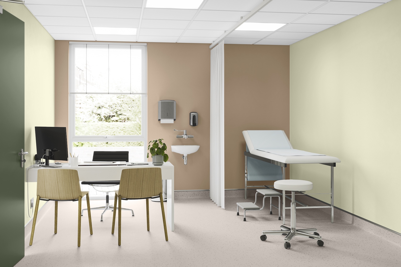
Connection with nature can be an important part of creating restorative environments, and colour provides one way of introducing biophilic principles into a space alongside natural light, planting, materials, views and natural forms. Importantly, biophilic colour does not simply mean green. Nature contains an enormous spectrum of colour, from earthy ochres and mineral tones to blue skies, yellow flowers and softer seasonal hues. These references can be used to create spaces that feel grounded, familiar and connected to the natural world.
The same principle of variety applies to sensory stimulation. Because people have different sensory preferences, it can be valuable to provide a range of environments within a building. Some spaces may offer lower levels of colour and visual complexity, while others can provide stronger colour and greater sensory engagement. This gives people greater choice over the environments they use and allows the sensory character of different spaces to respond to their function, rather than assuming that every neuroinclusive environment needs to look or feel the same.
The guide includes a curated colour palette for neuroinclusive spaces. How can architects adapt it to different users and environments, and what roles can pale, mid and deeper tones play within a scheme?
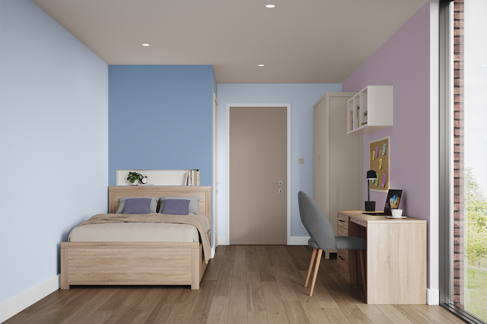
The curated palette has deliberately been designed as a flexible starting point rather than a fixed set of prescribed combinations. Colours can be selected according to the needs of a particular project and can also be combined across the three themes within the guide. Paler tones can help create openness and visual calm and work particularly well across ceilings, larger wall areas and other expansive surfaces. Mid tones provide a balanced level of colour strength and can be useful on walls, doors, joinery and feature areas, helping to define spaces without dominating them. Deeper tones can introduce emphasis, contrast and visual definition, making them particularly useful for doors, joinery, focal points and other elements that need to be clearly identifiable.
The palette has also been organised to make scheme development easier. Designers can work vertically to create tonal combinations from related colours, or horizontally to develop harmonious multi-colour schemes. The important point is that the palette should be adapted to the environment rather than applied as a formula. Lighting, materials, scale, function and the needs of the people using the space should all inform the final selection.
The guide introduces three themes: Nurturing Nature, Welcome Comfort and Gentle Engagement. What experiences are these palettes intended to create, and where might each be appropriate?
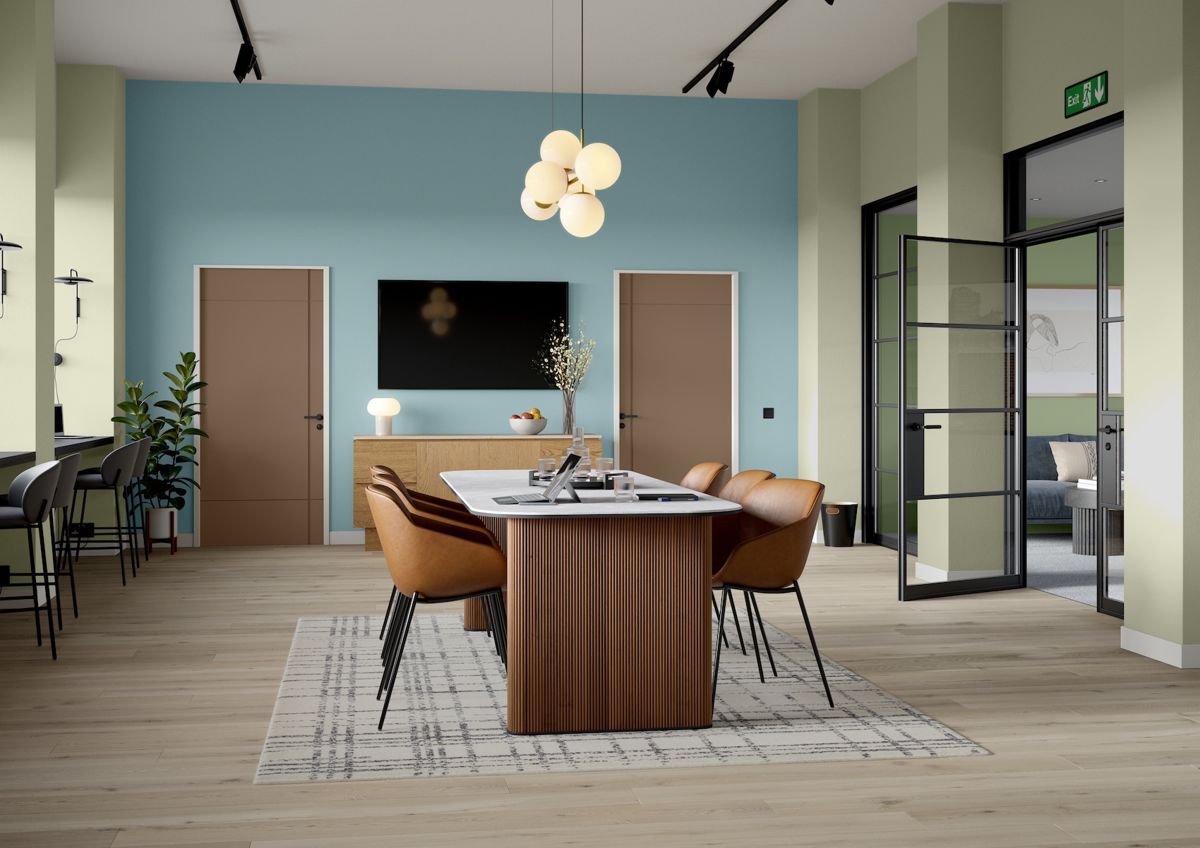
The three themes demonstrate different ways in which the wider palette can be combined to respond to different sensory experiences and spatial requirements. Nurturing Nature uses soft greens, muted blue-greens and natural neutrals, lifted by warmer yellows and earthy ochres. It is intended to create calm, restorative and nature-inspired spaces, making it particularly useful where reducing sensory load, supporting regulation or creating a sense of ease is important.
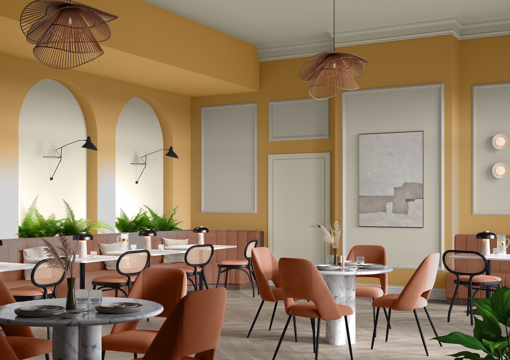
Welcome Comfort combines warm neutrals, terracottas, muted pinks and lilacs with gentle blues. The result is softer and more familiar, creating environments that feel welcoming and reassuring. It can work particularly well in spaces where people may spend longer periods of time or where a sense of comfort and familiarity is important.
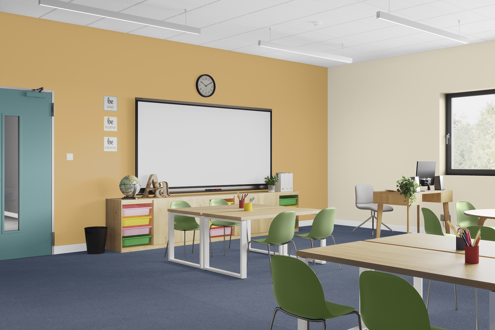
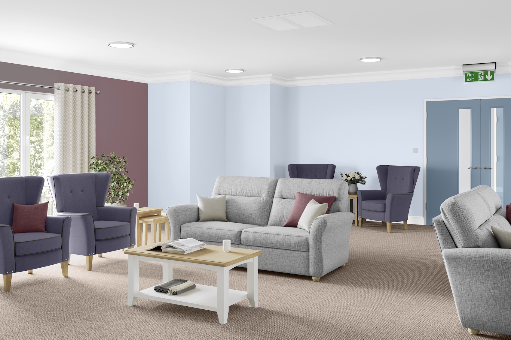
Gentle Engagement introduces slightly greater colour energy through warm pinks, sunlit yellows, fresh greens and uplifting blues. It is designed to encourage positive interaction and engagement while retaining a balanced overall scheme, making it useful for collaborative, social or activity-based spaces. These aren’t sector-specific palettes. The same principles might be appropriate in a workplace, school, healthcare setting, hospitality environment or residential scheme depending on the function of the individual space and the experience designers want to create.
How can neuroinclusive colour principles be applied across different building types, from workplaces and education to healthcare, hospitality and residential environments?
The underlying principles remain consistent across sectors, but their application should respond to the function of the space and the people using it. In workplaces, for example, colour can help distinguish between spaces for concentration, collaboration and restoration. In education, it can support orientation and help create environments with different levels of stimulation for learning, social interaction or quieter activity. Healthcare environments may place greater emphasis on clarity, reassurance and ease of navigation, while hospitality spaces need to balance atmosphere and identity with sensory comfort. In residential and care environments, familiarity, comfort and the clear identification of important features may become particularly significant. What changes is not necessarily the principle, but the balance. Neuroinclusive design is therefore less about creating a recognisable ‘neurodivergent aesthetic’ and more about understanding how colour, contrast, light and the wider sensory environment can be adjusted to support the particular activities and people within each space.
What tools, guidance and expertise does Dulux Trade offer architects looking to put neuroinclusive design principles into practice?
Dulux Trade offers a range of resources to help architects and designers move from understanding inclusive design principles through to applying them within real projects. The new Colour Design for Neuroinclusive Spaces guide provides practical colour guidance, curated palettes and examples of how these can be applied across different environments. This sits alongside our broader Inclusive Design Guide, which explores inclusive colour design across sectors including workplaces, education, healthcare, hospitality and residential environments.
For practices wanting to explore the subject in greater depth, our Designing for Neurodiversity CPD examines neurodiversity, sensory processing, colour psychology and practical approaches to creating more neuroinclusive environments. These resources are complemented by Dulux Trade’s specification support and digital tools. The Paint Specification Creator can help architects identify appropriate coating systems and produce detailed specifications for tender documentation, while Dulux Trade colour tools and Light Reflectance Value information can support colour and contrast decisions. Together, these resources are intended to help specifiers consider inclusive design from the earliest colour decisions through to detailed product specification.
Contact Details
Click here to download the Dulux Trade Colour Design for Neuroinclusive Spaces guide.
Click here to access the Dulux Trade Paint Specification Hub.
For more information about specifying colour and paint on healthcare projects, call 0333 222 7070, email or visit the Dulux Trade website.