Neven Sidor visits the Centre Building at the London School of Economics by Rogers Stirk Harbour & Partners


It is not often that architectural ingenuity within a single project transforms the surrounding urban context, but that is what has been achieved at the London School of Economics’ new Centre Building, designed by Rogers Stirk Harbour & Partners. The idea is very simple: massage the building form by building high on one corner, where existing taller buildings permit, and hollow it out on another to create a new public square. This is what we now have at the confluence of Clare Market, Houghton Street and Clements Inn Passage. Where there was once a disorientating array of narrow back streets there is now clarity.


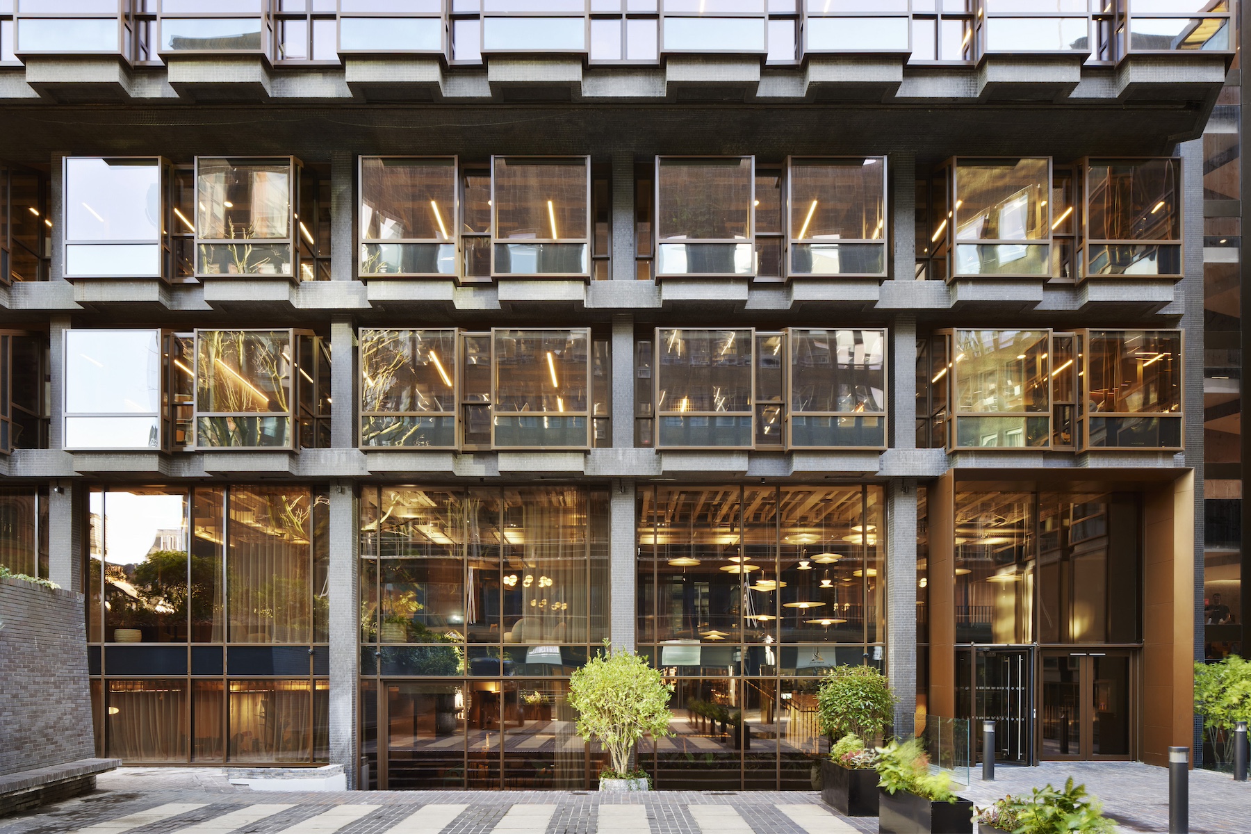
The Centre Building viewed from the north-west, and site plan. The £78m building comprises a 13-storey block and a six-storey block (ph: MG).
While modest in terms of its size, the new public space makes a huge difference to the LSE campus. When a new mural on the severed face of an adjoining building to the west and some new terracing to the north are complete, the new building accommodating five social sciences departments above cafes, study space and lecture theatres will face the existing forecourt of the LSE library. The ‘heart on the site plan’ has become a tired architectural cliché but here one can confidently be drawn. I am told that this move won RSHP the design competition. It must have infuriated competitors not to have discovered it themselves.
This project has had a protracted six-year growth. There was a multi-million pound hike in the cost of the facade system pre-contract owing to the Brexit referendum and the corresponding fall in sterling. Prior to that there had been extensive rounds of user consultations and there was of course the inevitable value engineering. Along with the briefing pack for this piece I was sent RSHP’s competition submission video and it’s very interesting comparing the initial aspiration with the finished product. The former consisted of two parallel offset blocks of column-free space separated by a narrower slip plane filled with a stepped “vertical square” of social space. In the built scheme, half of this has been subsumed into the taller block and dramatically expressed as a climbing void within the facade.


North-south elevation; ground floor plan.
There is now a complete division between the lower student floors and the higher academic floors. Only the latter benefit from the climbing voids while the former are given a more conventional continuous amphitheatre-style stair. The exuberant glazed lift core which was the focus of the whole external composition has been swallowed up in the middle of the tall block.
This must have been painful for a practice that has been crafting beautiful stair and lift structures for over three decades with the same dedication as medieval masons developing the Gothic vault. There is also not quite the level of transparency between Houghton Street and the ‘student commons’ on the ground floor of the new building as suggested in the video.


Houghton Street facade – whose stonework and bay widths echo the elevation of the facing building – and an open ground-level teaching and learning space which looks out to the public realm of Houghton Street
However all the ideas framed by the competition scheme are still there. The architects have also picked up that roof terraces are a recurring feature of LSE academic life and provided three – one for students and two for staff. The highest, at the southern end of the tall block, enjoys the best panorama of the City and the West End I have ever seen. The lower student terrace separates the scheme from a neighbouring building to the east where rights of light have been preserved without any compromises to the building diagram, and my favourite moment within the whole interior is the wonderful long-distance vista from deep within the plan just next to this terrace all the way down to the library steps at the opposite end of the square.


Roof terrace over looking Houghton Street, on the lower block. Another terrace, to the east, is located next to the stair that descends through the heart of the plan. Additional terraces are at high level on the taller block.
Striking as the two-storey voids are from outside, I found them disappointing from inside. I can see they meet the aspiration of breaking down barriers between academic disciplines and departments but to me they achieve this too literally. The diagonal vistas through them are dramatic without being welcoming. The architecture of “bump-ability” must do more than just bring people face to face, it must encourage them to pause and have a conversation. How it makes you feel is as important as how it works.
Something similar can be said for the straight, amphitheatre-style stair leading down to the basement-level lecture hall under the square, particularly when viewed from the bottom. It was empty on the day I was there and perhaps the presence of large numbers of students will help. It will be interesting to read the LSE’s planned post-occupancy survey to see if these concerns are borne out or if life within the building will adapt to these features positively.


An amphitheatre-style stair descends to the basement, where there are two lecture theatres, located below the new LSE Square.
This uncompromisingly modern steel, concrete and glass building has achieved a BREAM Outstanding rating. Being in the centre of London’s West End and therefore well-connected to public transport will have helped, but to achieve the highest rating the architects and engineers will have had to look at the numbers very carefully. The result should be applauded because this is a difficult feat. The building is almost entirely naturally ventilated on account of its relatively narrow floor plates. Glazed areas exposed to the sun have been extensively shaded while carefully balancing daylight and views. All concrete soffits are exposed to maximise the effect of structural thermal mass. Heating is provided by a biomass boiler burning chip fat. The embodied energy of the fabric has also been carefully scrutinised and ‘green’ cement specified. The contractor, Mace, and client will have also had to play their part.

Informal study space; cladding detail.
The detailing is robust. Concrete soffits and most of the steel frame are exposed, as are all internal services. There has been very little effort to mollify the sensibilities of the more squeamish and every electrical conduit and sprinkler pipe can be clearly seen. While there is a reasonable surface area of exposed timber, one is left with the impression that this has been deployed to differentiate components. The visual palette is full of extreme contrasts of colour and tone. Where stone has been introduced around the perimeter to respond to the cornice line of the Houghton Street Old Academic Building this has been done within inverted commas.
While there is something a little obsessive in the whole approach, one cannot fault the rigour with which it has been applied. How you respond depends on your personal taste, and these are in fact minor quibbles. Apart from a scheme in Reading in the 1990s this is RSHP’s first foray into the world of academic buildings and represents a fine display of what insightful architecture can bring to the sector.
Additional Images